Client cases Case 09
Lijia Accounting & Tax: how a 30-year-old firm used design by subtraction to win 20+ qualified inquiries in two months
Lijia Accounting & Tax

Industry
Accounting, tax, and business servicesServices
Website refresh for a younger image, UX optimization, conversion-led designDuration
2 monthsResult
20+ company inquiries within 2 months of launch
Background
Lijia Accounting & Tax is based in Chiayi City and has more than thirty years in the profession, working mainly with small and medium-sized businesses on tax, business registration, accounting, and management consulting. They wanted to break away from a traditional online image with a "younger" website, moving from passively waiting for clients to actively reaching the next generation of founders and business owners online.
The owner was clear from the start: no complex features, just efficiency. Prospective clients should quickly understand what the firm can do for them, then send an application without friction.
The challenge
The job was to turn thirty years of experience into a website that feels modern, friendly, and efficient. Bookkeeping and tax already feel complicated and distant, so the site had to do three things in very little time:
- Convey thirty years of experience and reliability without feeling old-fashioned
- Make the services readable at a glance, with no jargon to decode
- Get people through the application form quickly and smoothly, the single most important goal of the design
What we did
Three principles run through the whole site: people-led imagery, a modular grid, and subtraction. There are only three main kinds of page: the homepage, tax updates, and the online application. The homepage keeps only four sections (About us, Three strengths, Services, and a company setup application block), and each of them ends at the same action: apply online.
Desktop
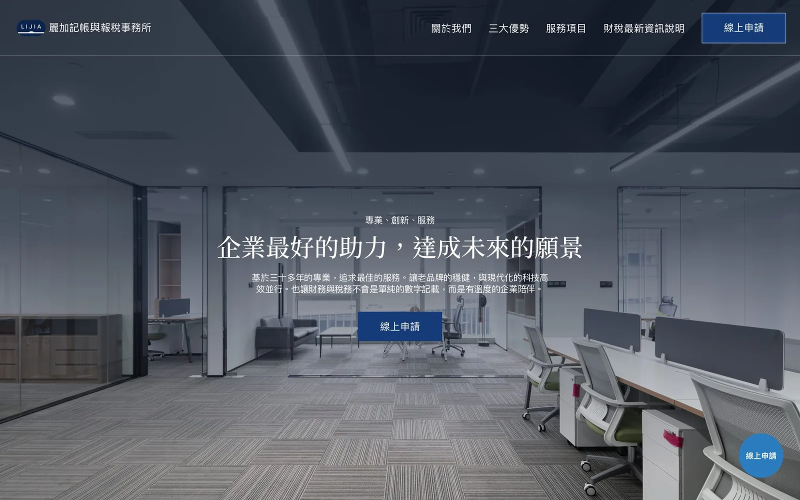
The first screen shows a bright, tidy modern office under a dark overlay that keeps the white type readable. The eyebrow line reads "Professionalism · Innovation · Service," and the headline promises to be a business's best support in reaching its vision. One sentence covers more than thirty years of expertise and a partnership "with warmth," and then there is a single "Apply online" button. The navy header stays fixed at the top with the same button on the right.

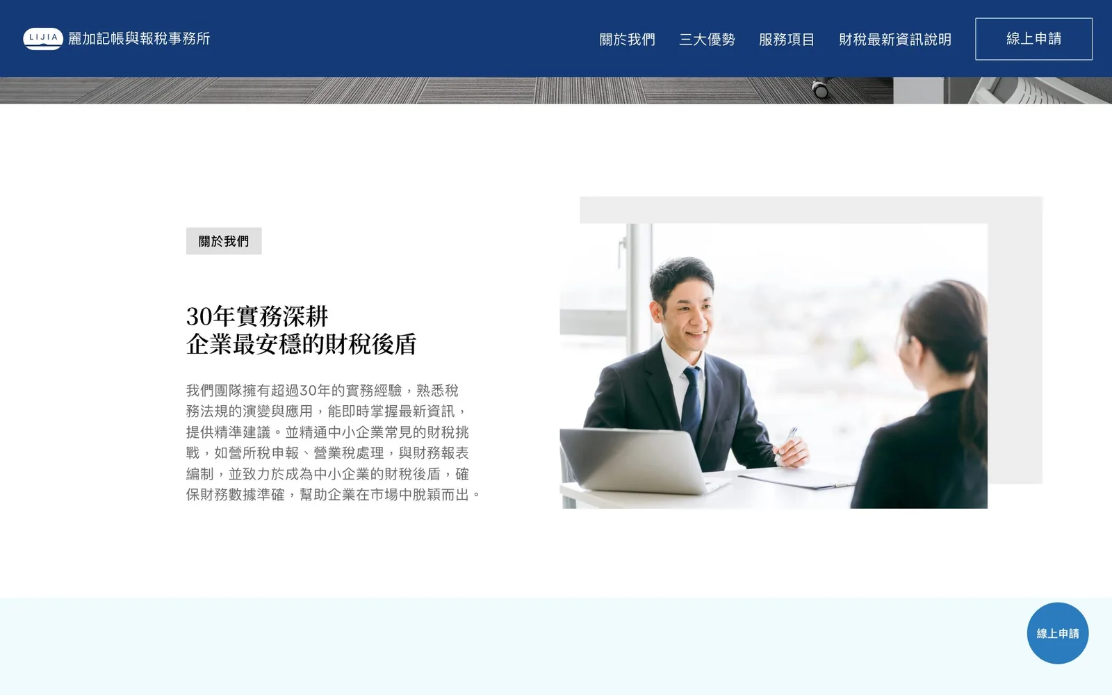
"About us" is headed "Thirty years in practice, a steady tax partner for your business," with a photo of an advisor meeting a client and a single paragraph on experience and expertise.

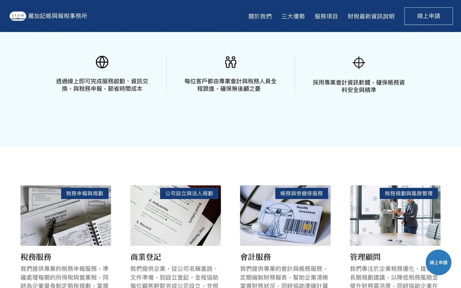
The three strengths each get a line icon and one sentence: services can be started and tax returns filed entirely online, dedicated accounting and tax staff follow each client from start to finish, and professional accounting software keeps data secure. Below, the four services sit side by side, with the scope labeled on each image (tax filing and planning, company setup and corporate planning, bookkeeping and labor and health insurance, and tax planning and risk management) and a short paragraph underneath.
Straight after the services comes a navy "A new way to set up your company" block. Visitors have just read what the firm offers, and the next step is right in front of them. The footer repeats the address, registration number, opening hours, phone number, and email.


Mobile
On the phone the header keeps only the logo and a menu button. When opened, the menu keeps the navy background: four section links, followed by an outlined "Apply online" button, so even the last step in the menu is the application.
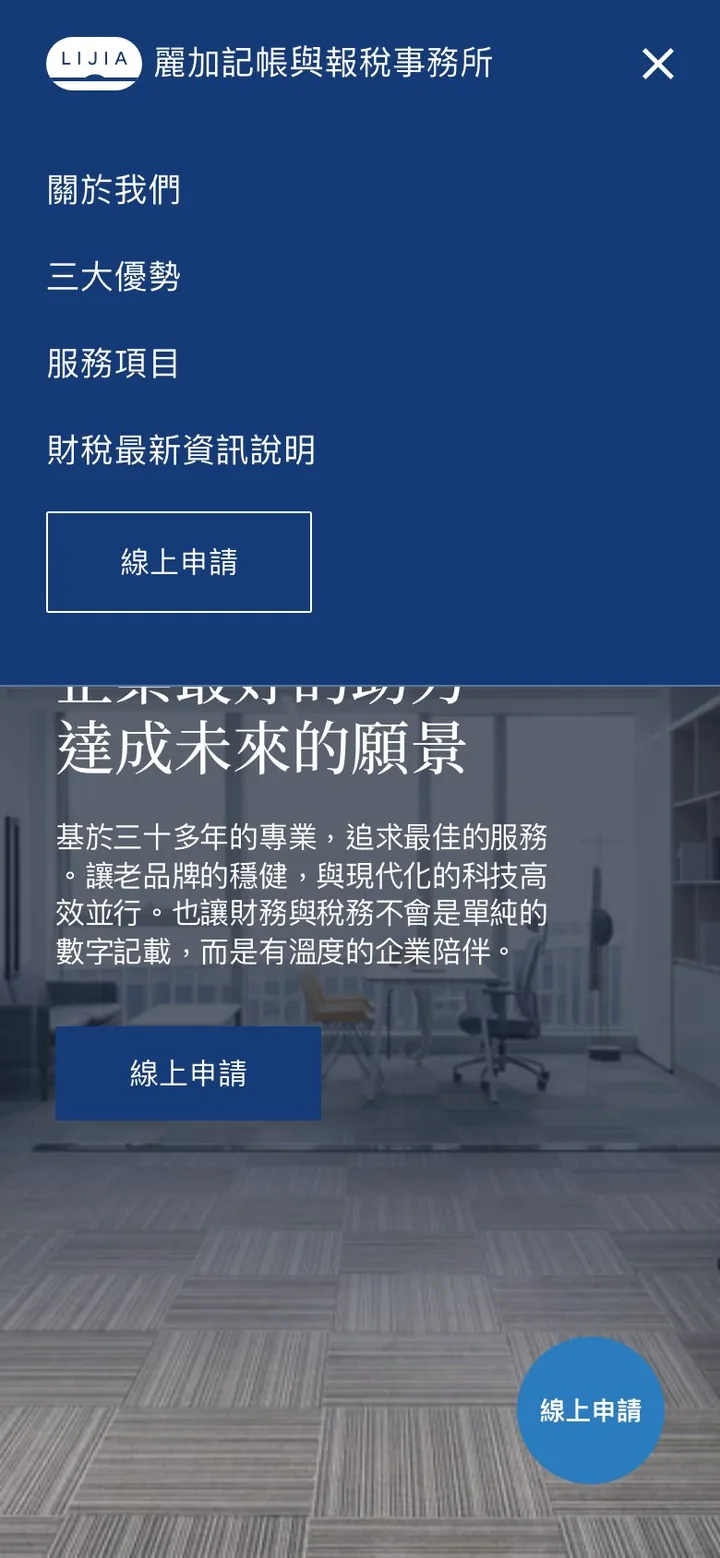
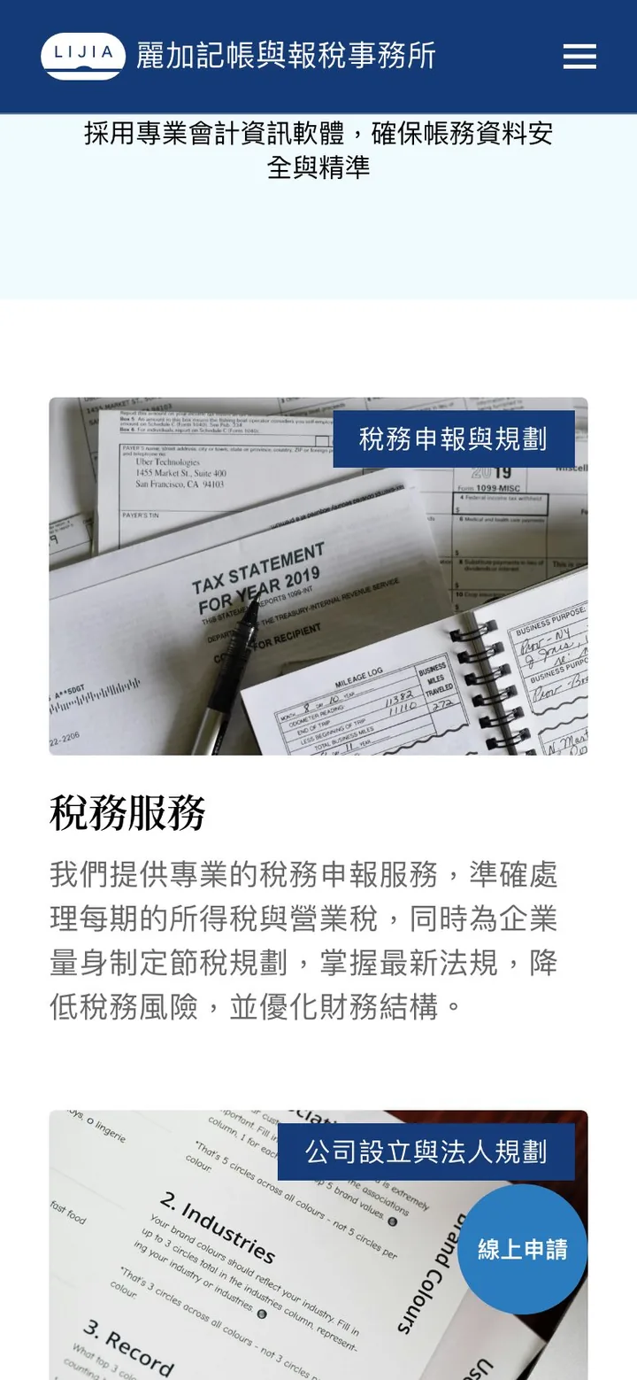
The four service cells stack into one column on the phone, each reading from top to bottom: image, title, then paragraph. The round blue "Apply online" button stays in the bottom right corner as you scroll, within easy reach of the thumb. On article pages, the "Latest articles" sidebar moves below the text, so the next article is waiting when you finish.
Key design decisions
No complex features, just efficiency
The owner's words became the test for every decision. Anything that pushed the form further away or made a page longer was left out. The header stays fixed at the top with "Apply online" on the right, and a round blue floating button sits in the bottom right corner, so wherever visitors are and however far they have scrolled, the application is within reach.
People instead of regulations
We replaced dry regulatory text with people-led imagery, so a young founder's first impression is of a partner they can trust, not a wall of unfamiliar terms. From the About us section and the company setup block to the article covers, the images show people talking face to face.
A grid you can scan in three seconds
Founders and business owners have very little time. The modular grid gives each service its own cell so they can be compared at a glance; one pass tells you what the firm can help with, and then you decide whether to read more.
Tax updates: answering founders' questions with content
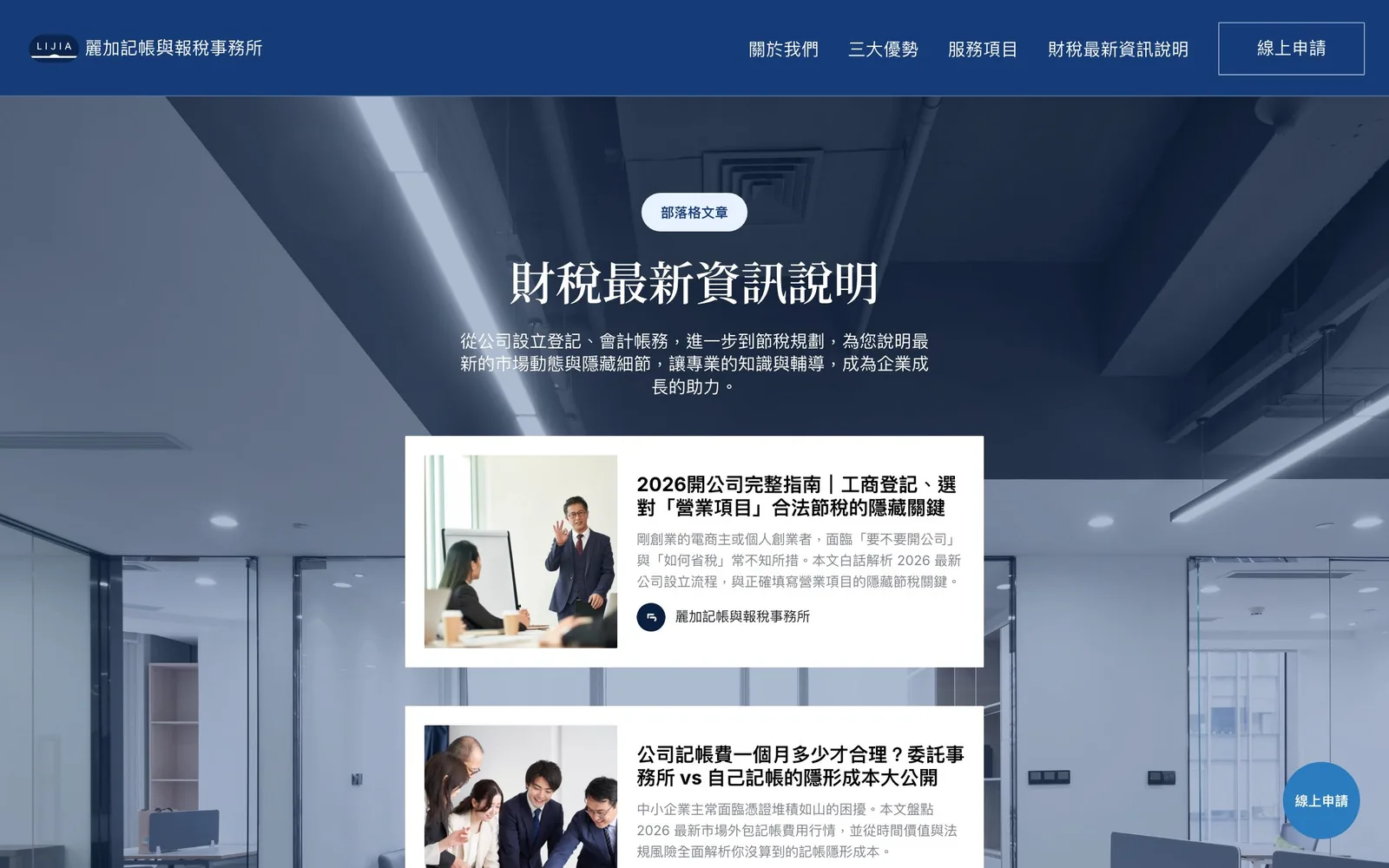
The tax updates section collects the questions founders ask most, such as how to set up a company, what bookkeeping costs, and how the integrated housing and land tax works. The list page reuses the homepage's office background, with each article on a white card showing its cover, title, summary, and author.

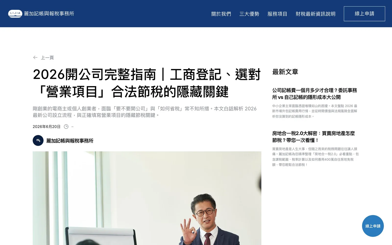
Article pages feature a large headline, a plain-language summary, the date, and the author, with the latest articles listed on the right.

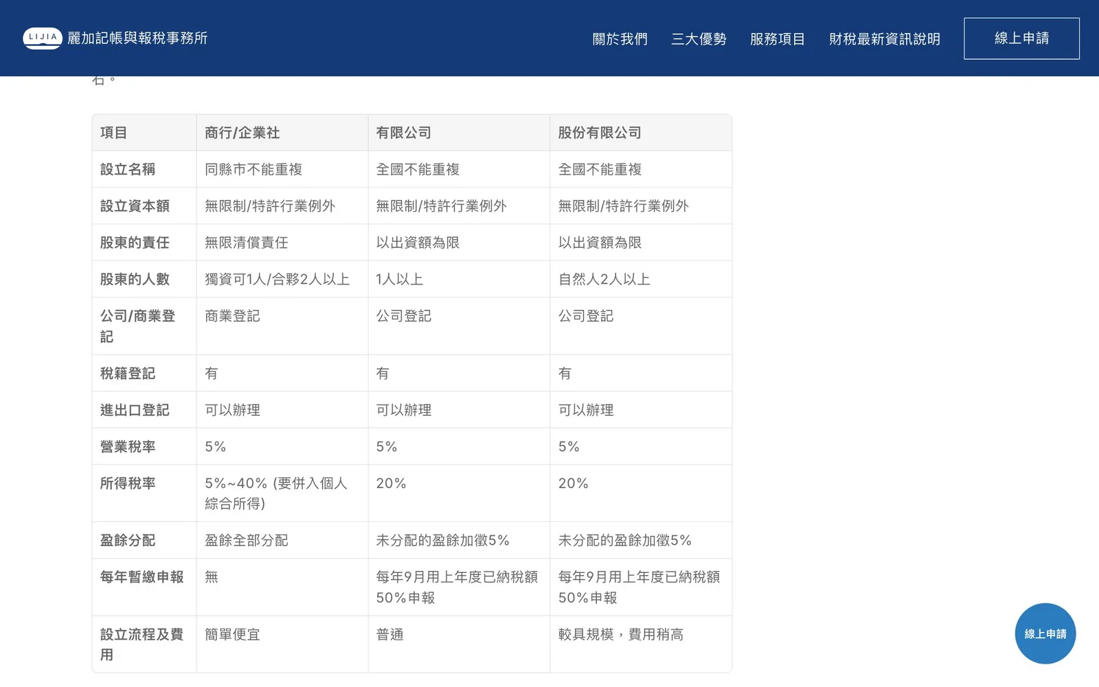
Inside an article, easily confused ideas are set out as tables, such as how a sole proprietorship, a limited company, and a company limited by shares differ in capital, shareholder liability, and tax rate, and the steps of setting up a company are given as a numbered list, so readers do not have to dig them out of long paragraphs.
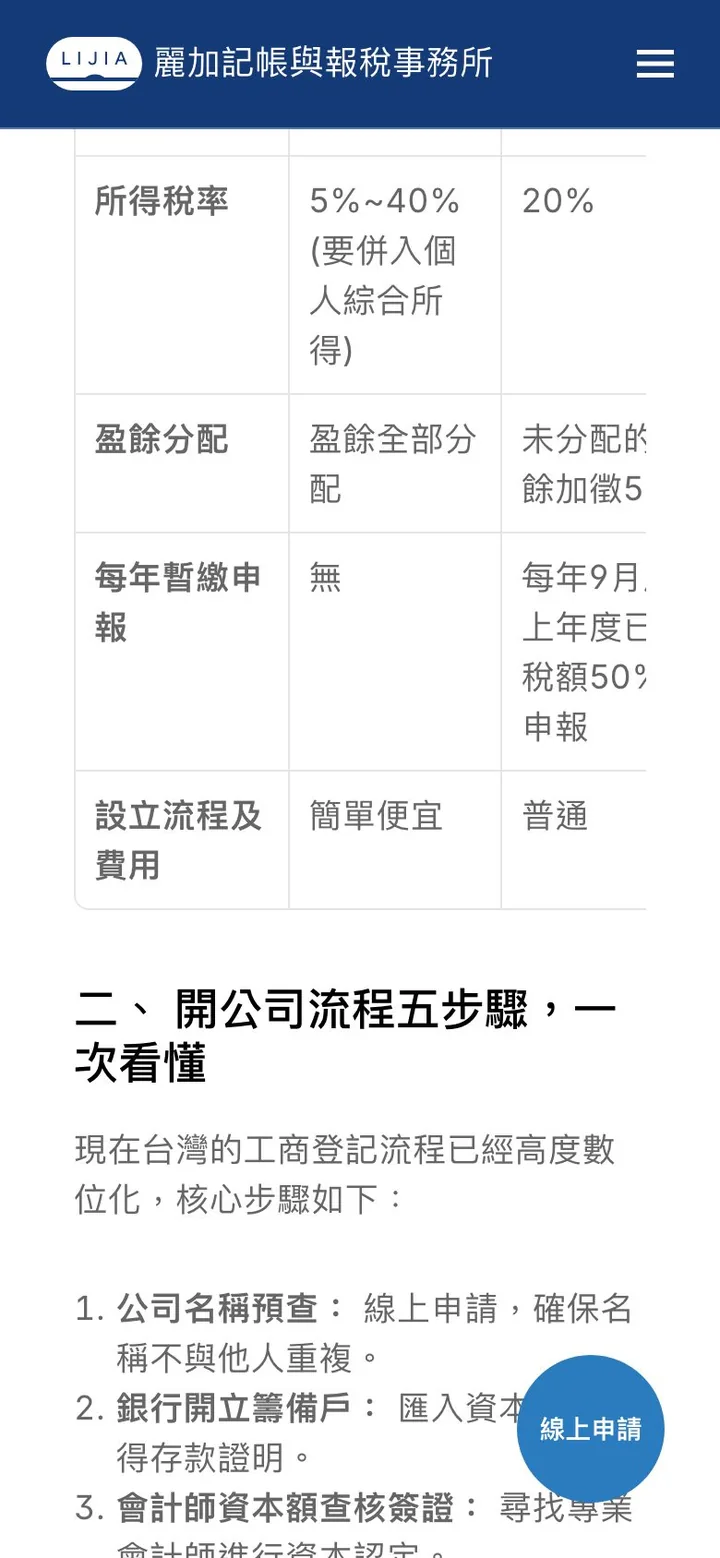
The article closes with one line, "Leave the complexity to Lijia and keep the vision for yourself," followed by the "Apply online" button. Readers can apply the moment the article has struck a chord.


Online application: the form as four questions
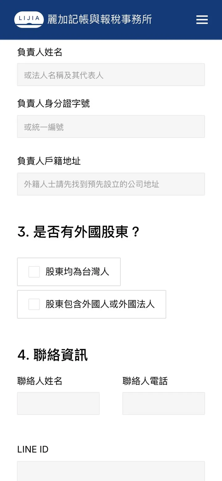
The application form is where the whole site leads, and where friction matters most. We organized the information into four questions answered in order, each with a one-line explanation in plain language. The first, "Do you have a tax ID?" splits visitors into two paths with two options: no tax ID and a new company to set up, or an existing company that only needs bookkeeping.


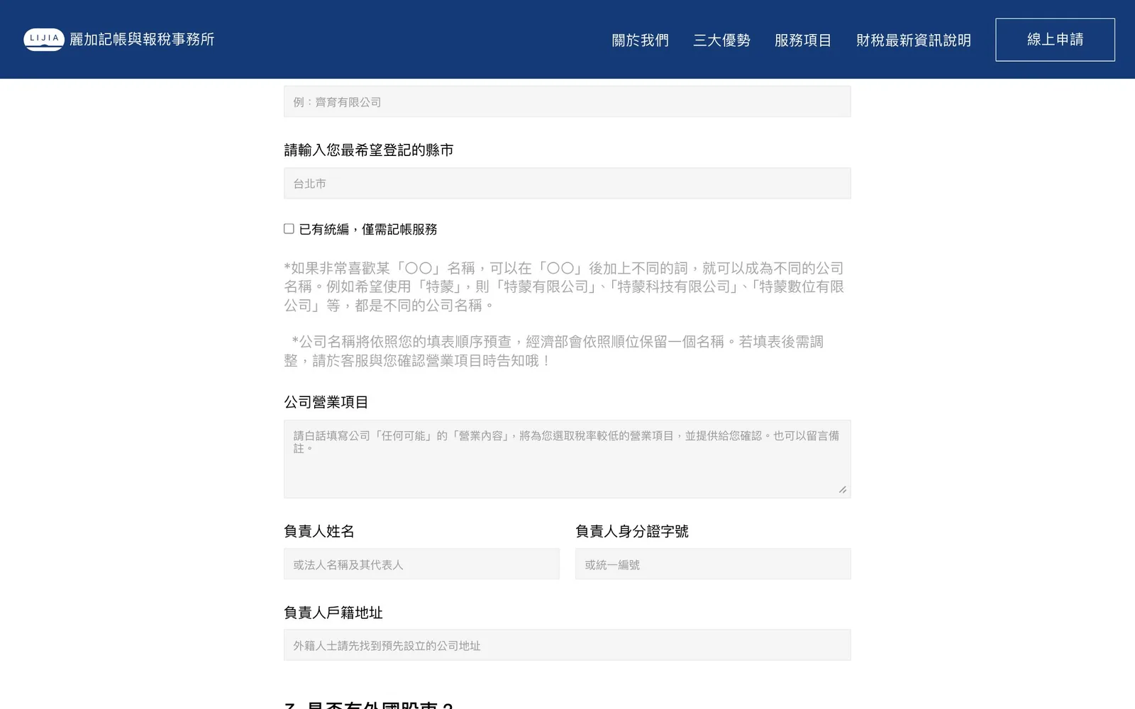
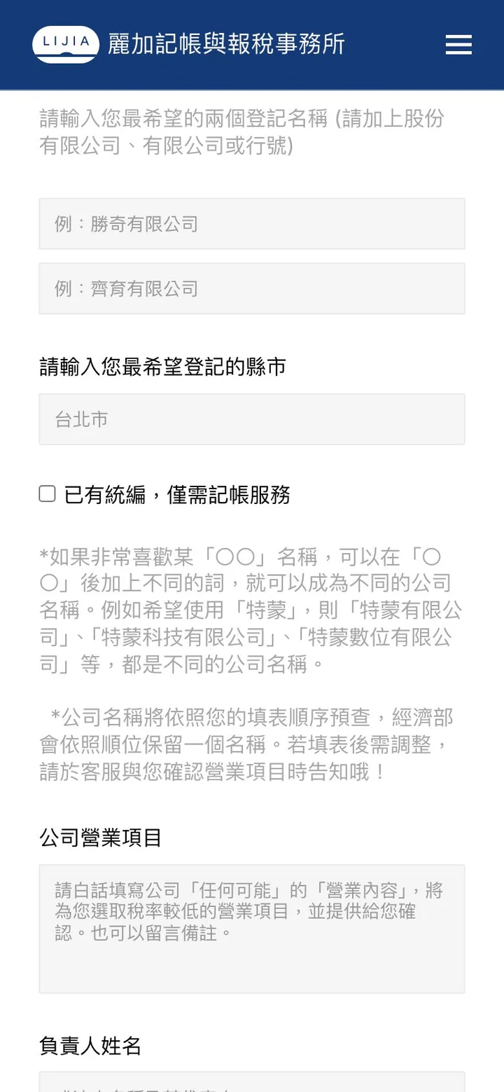
The second asks for two preferred company names and the city or county of registration, with naming rules and the name-check process explained right alongside, followed by business activities and the responsible person's details, which cuts down on back-and-forth.
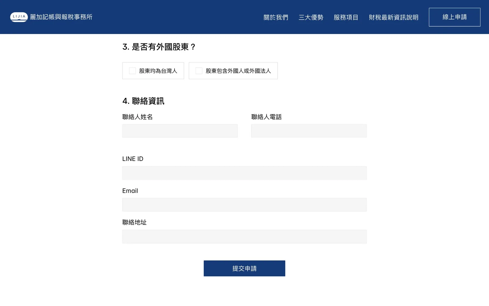
The third asks about foreign shareholders, and only the fourth asks for contact details: phone and email, plus a LINE ID field, matching how most clients prefer to be reached. Once submitted, the application goes straight to the firm's inbox.
Results
- 20+ companies submitted inquiry forms within two months of launch
- A successful brand refresh for a younger audience
- Email notifications set up, so applications go straight to the firm's inbox
Advice for professional services firms
In professional services such as accounting, law, and consulting, clients care about trust and convenience. Before a redesign, check:
- Does your first screen say who you help and with what? Save the terminology for the service pages.
- How many fields does your inquiry form have? Keep only what you need to get back to someone; everything else can wait for the first call.
- Can visitors see people? In professional services, clients are buying people; let them get to know you before they call.
For the full approach to an accounting firm's website, see the NEXA Accounting case study and How should a bookkeeping or accounting firm website be built to win clients?
Next caseDongji DevelopmentGet a quote“We've been in this business for thirty years, and this is the first time we've seen a website deliver such direct results. The design team truly understood that we didn't need complex features; we needed efficiency. The new website hasn't just given us a fresh image; it brings in business directly!”