Client cases Case 05
NEXA Accounting: a brand built from nothing, and starting a company turned into six steps online
NEXA Accounting Visit the website

Industry
Bookkeeping, tax, and company setup servicesServices
Brand identity design, website design and development, online company setup flow, CMS admin panel and SEODuration
8 weeksResult
A 6-step online company setup with a company-type helper
Background
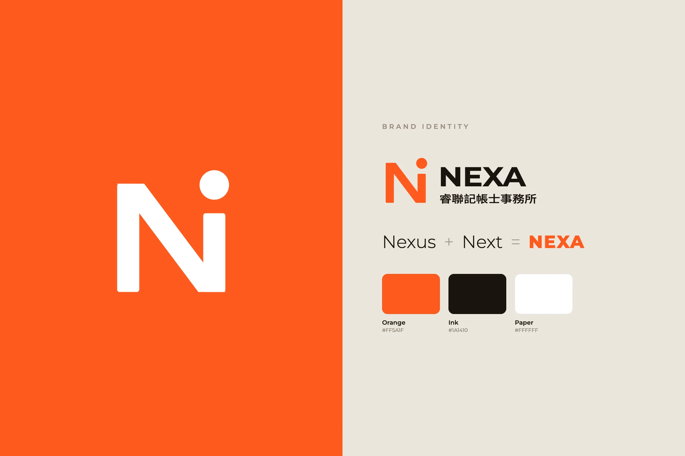
NEXA serves a new generation of founders. When they came to us they had no visual assets at all: no logo, no brand color, no website. The name combines Nexus (connection) and Next, and the firm wanted the brand to say "We'll walk with you to your next step," not "We'll file your taxes."
So our scope started with the brand (logo, brand color, and opening animation) and went on to the website, the online company setup flow, and the CMS admin panel, all delivered together.
The challenge
Bookkeeping is a commodity. Most firms' websites list services and a phone number, clients cannot tell them apart, and the decision comes down to price.
So we started from the revenue model. An accounting firm lives on long-term engagements: monthly bookkeeping, VAT filed every two months, and the annual income tax return. And those engagements are most often decided at a single moment: when the company is set up. Whoever registers the company tends to keep the books.
The website's job, then, was not to show off, but to catch founders at their earliest decision point and turn a one-off company setup into a long-term client. And since the firm has no dedicated IT staff, the website had to be easy for them to update themselves, without locking them into a monthly platform fee.
Site structure
The site is deliberately just two pages: the home page introduces the firm, and the registration page lets visitors start a company right away. The home page’s seven sections are linked by a side navigation, and the registration page follows the real registration process in six steps.
What we did
The site has two pages: one to get to know the firm, one to start setting up a company straight away. The home page builds trust; the registration page turns that trust into a complete application.
Desktop
The first screen carries only "CONNECTING NEXT." and the subhead "Connecting tax expertise to your company's next step," over a full-bleed photograph of people. An orange "Register a company" button stays fixed at the top right, and a vertical section menu and a call button run down the right edge, visible wherever you are.


As you scroll, the background photo changes with each section and the content sits on a narrow white card. About opens with the firm's belief that books are not just numbers but the basis of every business decision, then explains the name: Nexus + Next = NEXA.


Firm details and history are laid out as a table and a timeline: the principal, the year founded, opening hours, phone, address, and each milestone from its founding as a studio in 2019 to its 2026 renaming as NEXA. This is what founders look for when deciding whether to trust a firm, so it sits inside About rather than on a separate page.


Mobile
On phones the same photo-and-card structure stays, with section titles set as large horizontal type. The key difference is at the bottom: "Call us" and "Register a company" are fixed to the foot of the screen, always within thumb reach, so nobody has to scroll back to the top to find the way in. Services, FAQs, and contact details unfold in order above those two buttons.
Key design decisions
Identity: an N that grows a node
The logo grows out of the letter N: its last stroke rises into a dot, linking two sides and pointing to what's next, a direct expression of Nexus + Next. Tax and accounting brands lean on blue, green, and gray, so we chose a saturated orange as the only brand color, recognizable at a glance in search results and shared links. Every call to action uses that color and nothing else does, so the eye lands where the click should.
On the home page the logo draws itself stroke by stroke, the letters rise, and once the progress counter completes, two panels lift away, turning the wait into brand exposure. The registration page deliberately skips it: someone ready to act should not wait a second.
Service cards that lead to the application
Five services appear as numbered cards: company setup and changes, bookkeeping, tax filing, payroll and labor and health insurance, and financial advisory. Each has one plain-language sentence and a few keyword tags. The first card, company setup, carries a direct "Apply online" link, putting the most valuable entry service where it is read first.


FAQs that answer what founders actually ask
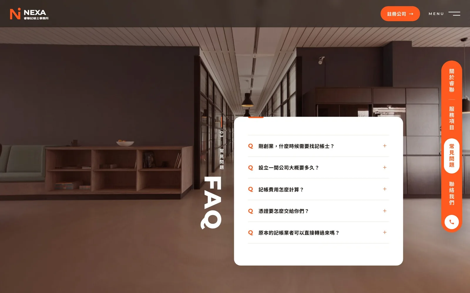
The FAQ holds only the five questions founders really ask: when you need an accountant, how long setting up a company takes, how fees are worked out, how to hand over receipts, and whether you can switch from your current bookkeeper. Questions are collapsed and open on tap, keeping the page clean.

"Register a company" instead of "Contact us"
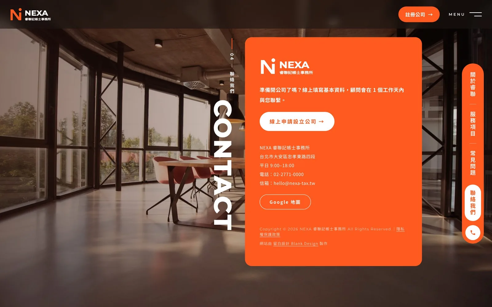
"Contact us" asks visitors to work out their question first. "Register a company" is a concrete, low-effort next step aimed squarely at the most valuable entry service. It appears in the header, the fixed bar on mobile, the service cards, and the contact block. The contact block is solid brand orange, and its headline reads: "Ready to start a company? Fill in the basics online, and an advisor will contact you within one business day." The address, phone number, and email come after the button.

Six steps to register, each with a short lesson
The registration page opens by explaining that starting a company is less daunting than it looks: the form takes about five minutes, the five stages of setup are listed with rough timings, and a note says which documents are worth having ready. All the steps are listed on the left, so visitors know from the start how far they have to go.


The form follows the real formation process in six steps: entity type, company name, business activities, capital and shareholders, registered address, and contact details. Step one is where most founders get stuck, so it offers two paths. Those who know what they want pick it directly; those who don't hand it to the company-type helper, answer a few questions in about a minute, and get an initial recommendation with reasons, applied to the form in one click.


Once a type is chosen, a summary card appears on the left: legal personality, owners, liability, capital, invoicing and VAT, income tax, and fundraising and shares. One card per entity type makes them easy to compare.

Business activities are the second common sticking point. In step three, visitors can search the official activity codes by keyword or code, or tap tags for common trades, while the short lesson beside it explains how to choose codes and which trades need a license first.


Step four collects the capital amount and each shareholder's contribution and flags a mismatch immediately, so the firm never receives an application with an error built in.

The last step collects contact details and any follow-on services, such as monthly bookkeeping, VAT filing, company seal engraving, or labor and health insurance enrollment. The form deliberately does not ask for national ID numbers, and the bottom left of the page states that data is encrypted in transit, that only what is needed is collected, and why, which makes founders more comfortable filling it in. Before submitting, visitors can review everything on a single page.


Commercially, a vague phone call ("I want to start a company but don't know what I need") becomes a complete application in the firm's inbox. The advisor can quote on the first call, and the follow-on service choices put the long-term engagement on the table from the very first contact.
CMS admin panel and upkeep
Copy, photos, services, FAQs, and each page's SEO title, description, and share image are all editable in the CMS admin panel, and changes go live as soon as they are saved. Structured data and search-indexing settings are built in as a foundation for local search. The site needs no database; the source is handed over in full, with no monthly fee and no platform lock-in.
Results
- A complete identity built from zero: logo, brand color, and opening animation
- A conversion path built around "Register a company," one click away in the desktop header and the fixed mobile bar
- A six-step online company setup form with a company-type helper, entity summary cards, activity-code search, and live capital checks
- Applications emailed to the firm, with no national ID number collected
- A CMS admin panel with no monthly fee, where the firm updates copy, images, and per-page SEO itself
The thinking behind this website, and a step-by-step breakdown of the six-step application form, are in How should a bookkeeping or accounting firm website be built to win clients?