Client cases Case 10
Dongji Development | A brand website redesign that uses design by subtraction to close the information gaps
Dongji Development
Industry
Property development and constructionServices
Web design, development, UI/UX, custom CMS admin panel, information architecture overhaulDuration
3 monthsResult
Type size and line spacing reworked · a CMS admin panel so simple that one walkthrough is enough
Background
Dongji Development was founded in 1987 and is part of the Meiyuan Construction group. Through its "improved self-led renewal" approach and a commissioned-construction model, it helps landowners act as their own developer in urban renewal and in the rebuilding of old, unsafe buildings. Dongji charges a project management consulting fee and does not take a share of the finished units. It is a business built on long-term trust: owners are handing over the biggest asset of their lives, and the website is often the first thing they see.
The old site had gaps in how it got its message across: its design and information architecture had never been organized systematically, so visitors could not work out what the brand stood for. A sprawling blog and a project login had gone unmaintained and served no real purpose, which made the site look neglected.
The challenge
The team that looks after the site is small, and the clutter on the old site was driving visitors away. We had three things to solve:
- Help a first-time landowner understand what Dongji does and how it differs from an ordinary developer
- Make the site comfortable to read for its core audience of middle-aged and older visitors, without zooming in or getting lost in menus
- Let a few people keep the site current, so no corner is left untended again
What we did
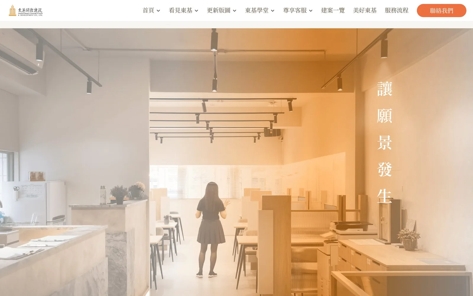
We restructured the site through subtraction: the blog and member login were removed, and the effort went into showcasing projects, introducing the brand, and inquiries. The navigation became a handful of clear entries (About Dongji, Renewal map, Dongji academy, Client care, Projects, Good memories, and Process), with an orange "Contact us" button fixed at the top right. Every page shares the same off-white background, serif headings, and orange buttons, so the whole site reads as one brand.
Desktop
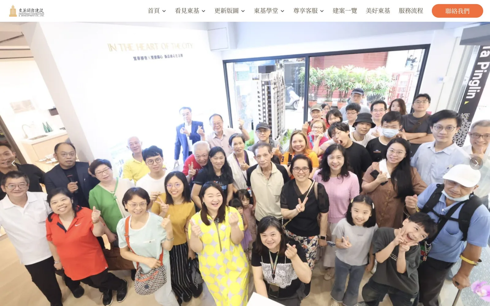
The first screen of the homepage is a large group photo of the team and landowners in the sales center, in front of a building model. For renewal clients, seeing who is actually doing the work is more persuasive than any slogan.
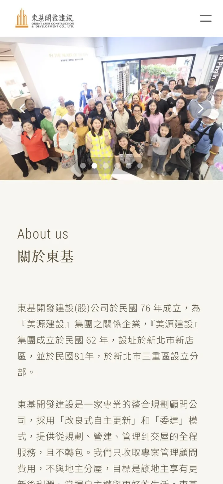
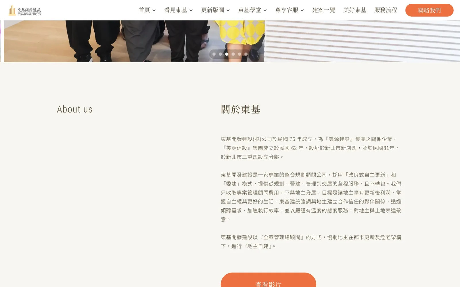
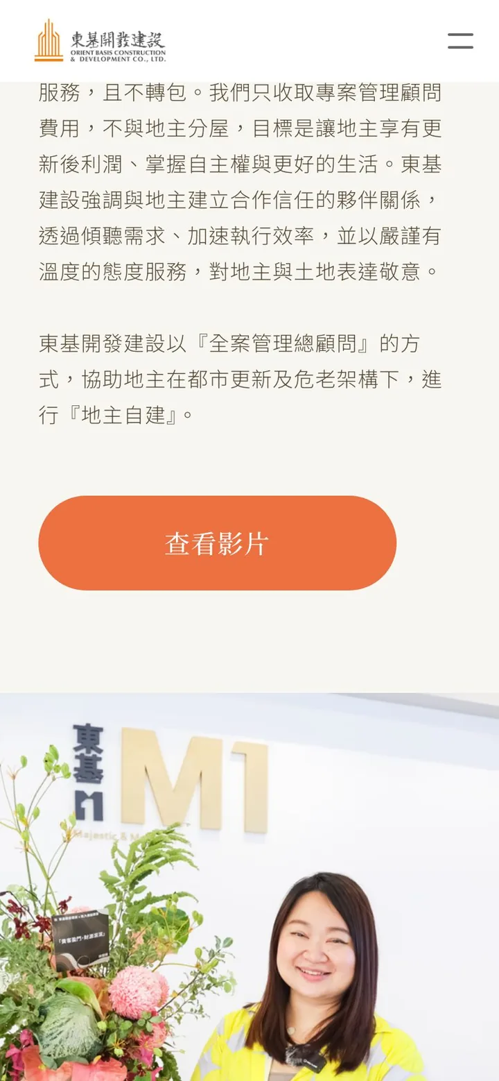
Next comes "About Dongji." The left column carries only a small English label; the right covers the company's history and its renewal model in large type with generous line spacing, ending with a button that leads to the video. On the phone the same text runs in a single column, and the type size stays the same.
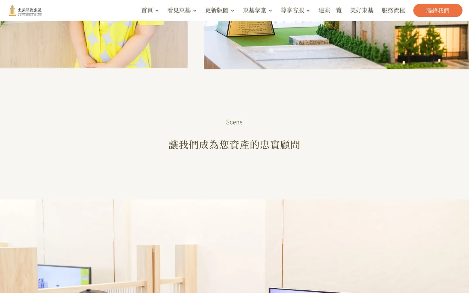
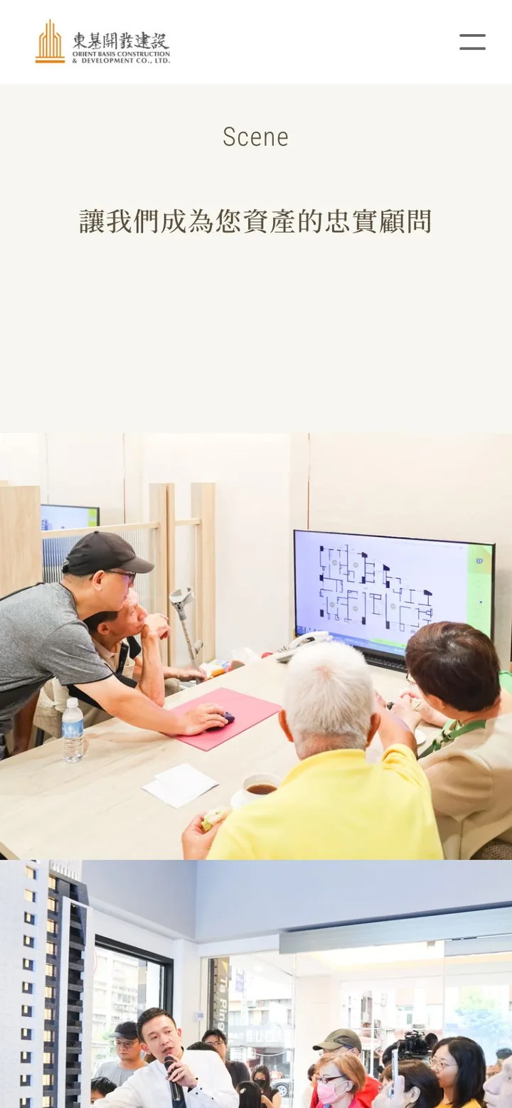
The brand promise, "Let us be the faithful advisor for your assets," has a section to itself: one centered line, followed by a photo of landowners reviewing a floor plan in the sales center.
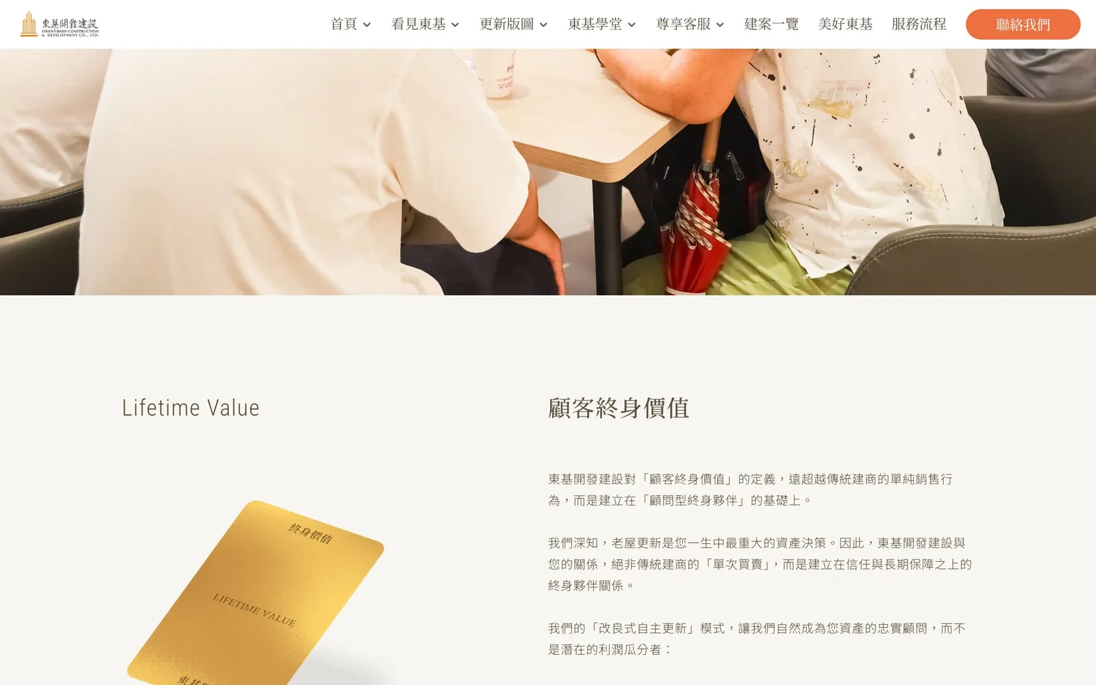
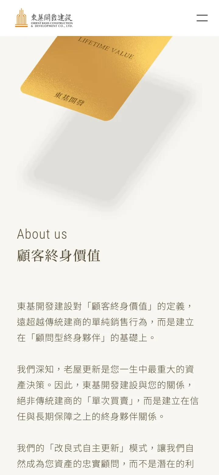
"Lifetime value" uses a gold card as its focal point, with points on the right covering trust and giving back, services that continue after completion, and community well-being. The idea that this is not a one-off sale becomes something you can see.
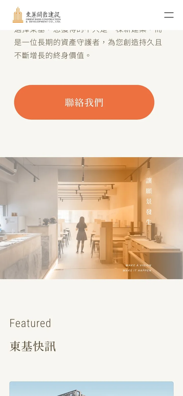
"Let the vision happen" sets a vertical headline over a warm-toned photo of the sales center; this is where the long page slows down. It is followed by "Featured," three photo cards leading to individual projects.
Mobile
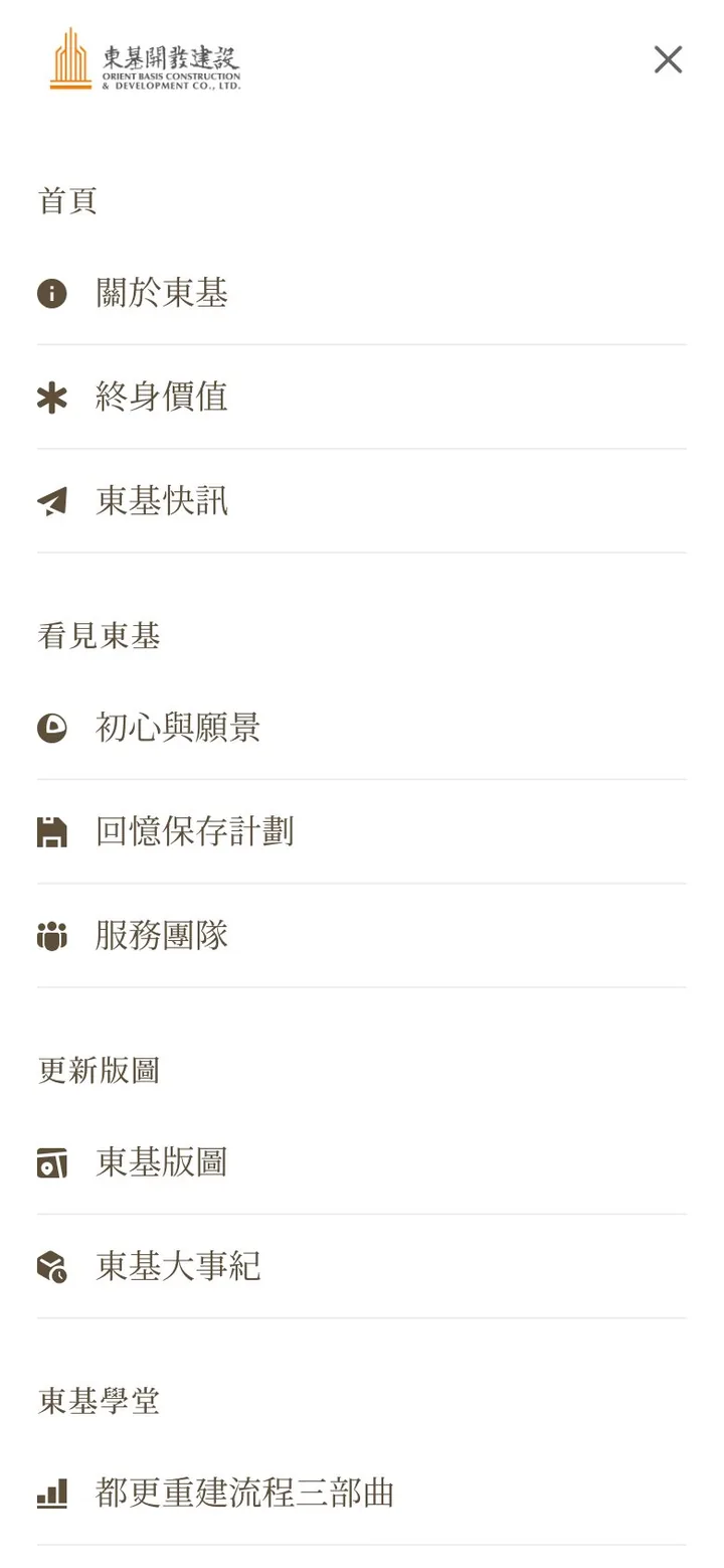
On the phone the header keeps only the logo and a menu button. When opened, the menu is not one long list of links: it is grouped by theme (About Dongji, Renewal map, Dongji academy, and so on), and each item has a small icon, such as About Dongji, Lifetime value, Beliefs and vision, Memorial plan, and Company timeline. Older visitors can find what they want by category rather than guessing what lies behind a link.
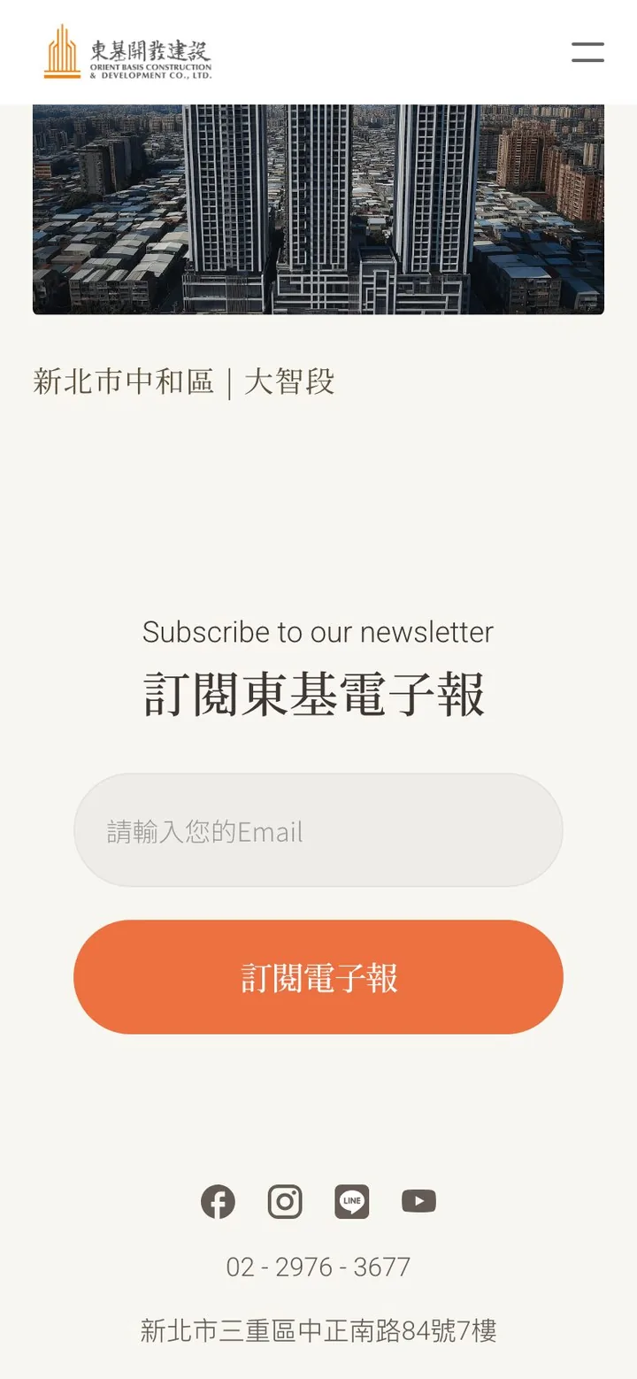
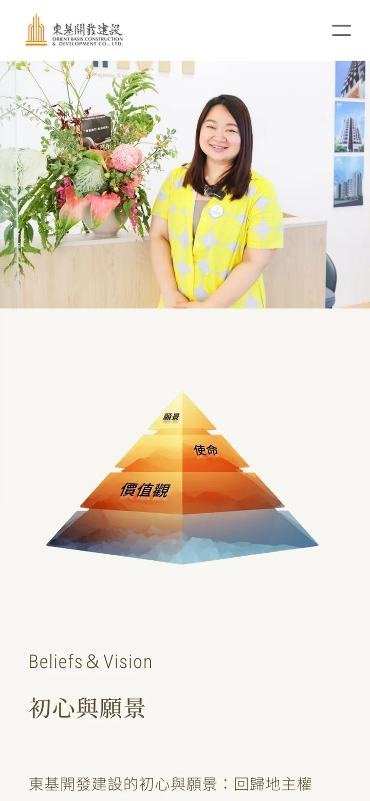
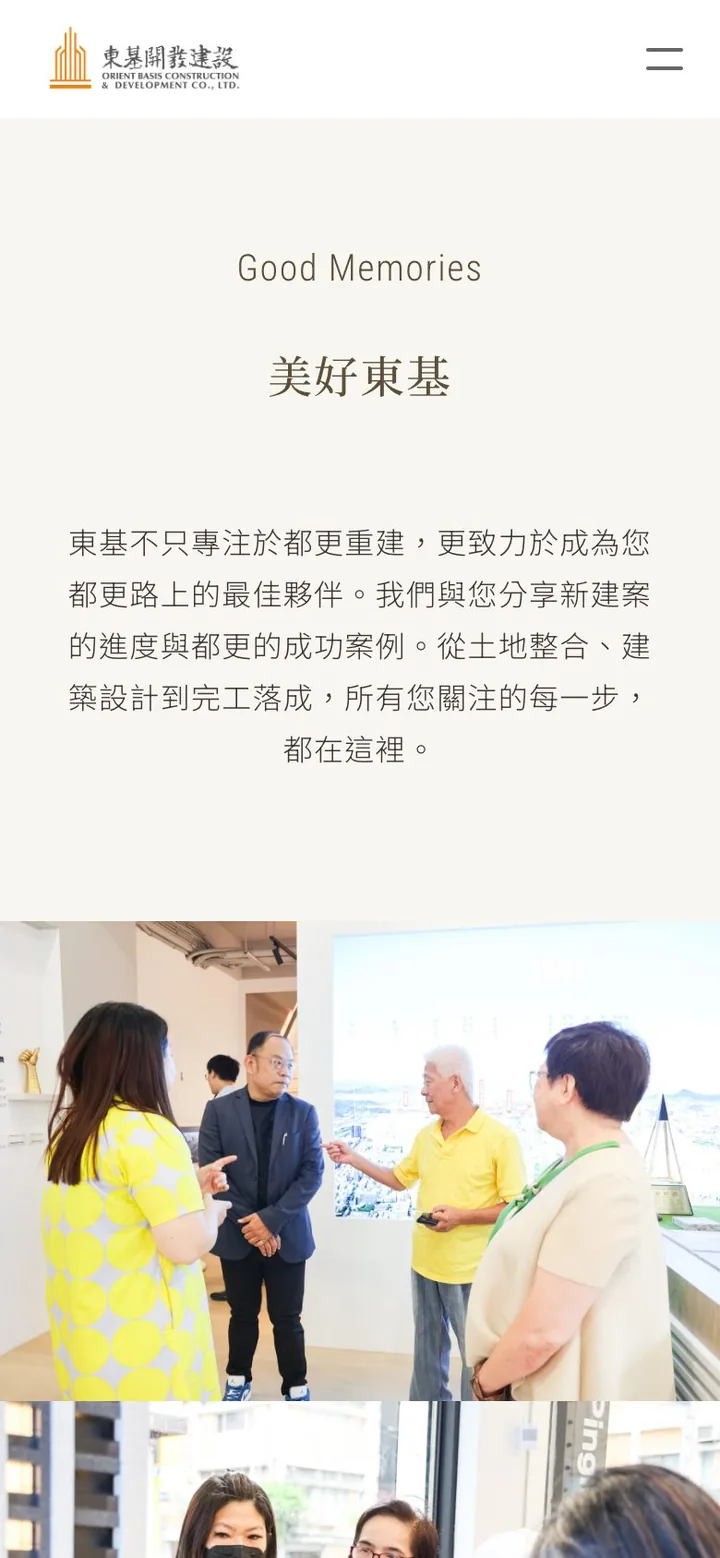
Every inner page becomes a single column on the phone: photo on top, English label and Chinese heading centered, body text still large and well spaced. Every page ends with the same newsletter sign-up, social icons, phone number, and address, and the buttons span the full width so they are easy to tap.
Key design decisions
Removing the blog and member login
More features aren't always better. The old blog and project login had no one maintaining them, which made the site look neglected. With limited staff, we recommended putting the effort where it actually gets used: showcasing projects and introducing the brand. Removing what nobody used made the site more credible.
Designed for older readers
A large share of the people making home-buying and development decisions are middle-aged or older. We enlarged the type, increased the line spacing, and made the navigation paths obvious. Every section follows the same pattern of small English label, Chinese heading, and body text, so once you have read one section you know how to read the next.
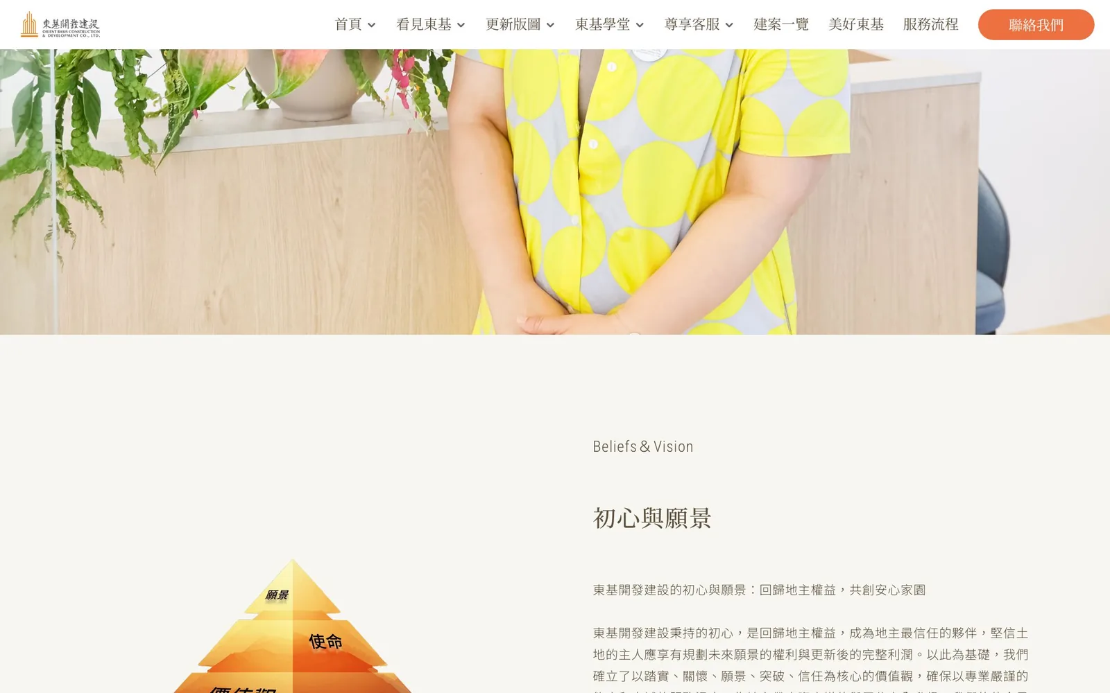
The "About Dongji" page explains values, mission, and vision with a three-tier pyramid next to the full text, so abstract ideas have a picture to anchor them and are easier to take in. The same page introduces the Memorial plan, in which Dongji records the stories of residents in photos and words before an old building is rebuilt.
The renewal map: experience put back on the map
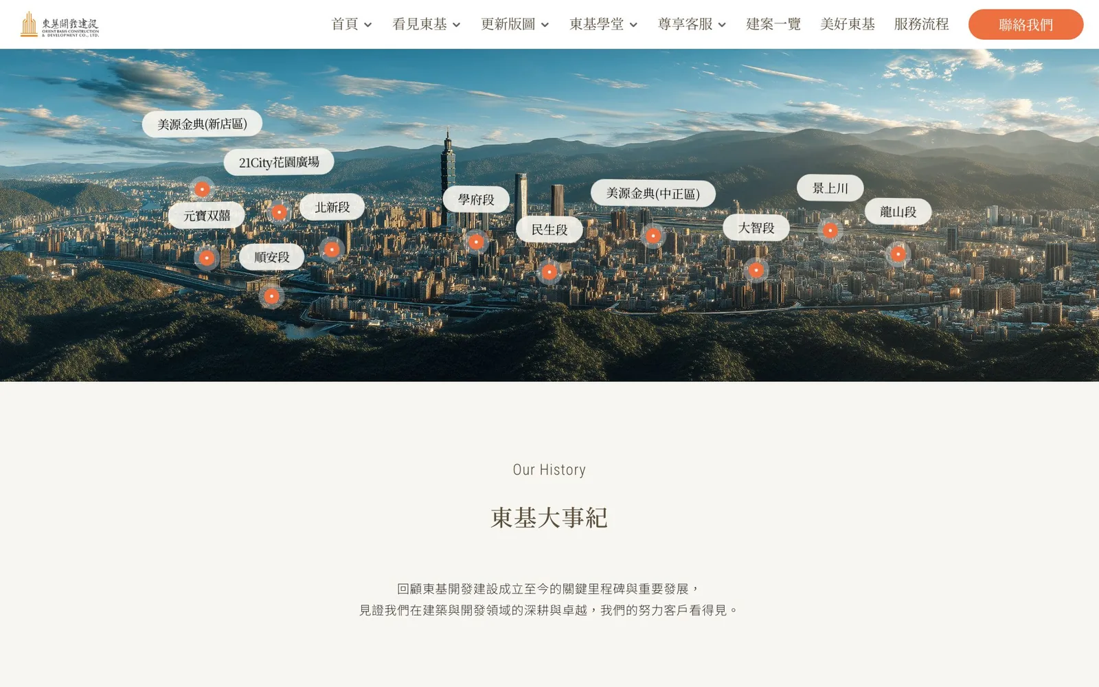
The renewal map pins past projects on an aerial photo of Taipei, with a label for each, such as Minsheng, Dazhi, Xuefu, and Meiyuan Jindian, so landowners can see at a glance where Dongji's experience lies.
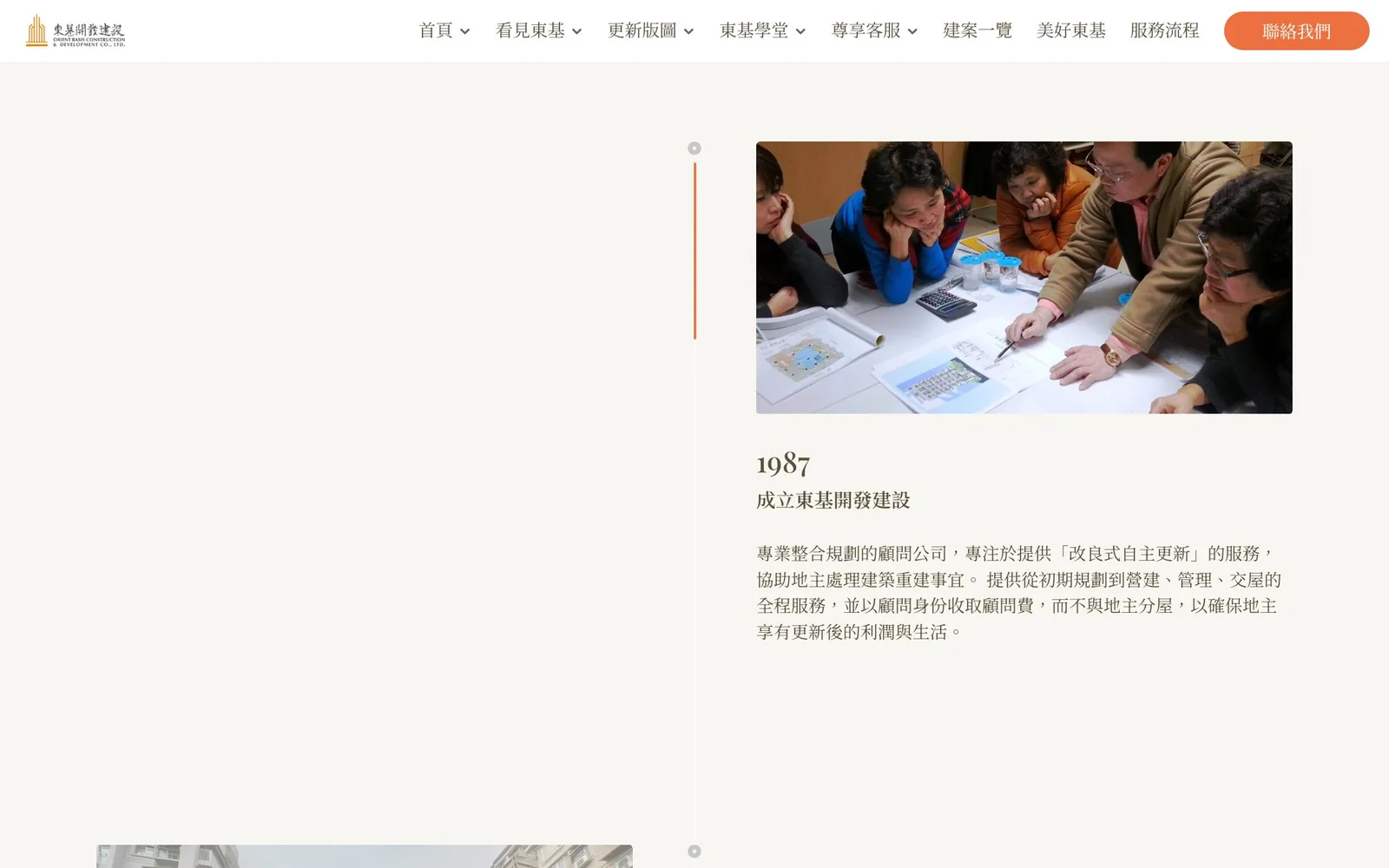
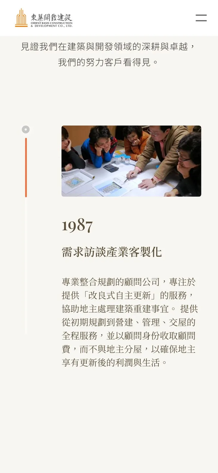
Below it, the company timeline runs vertically from the founding of Dongji Development in 1987, listing completed projects and their land sections year by year, each with a real photo.
Dongji academy: renewal in three stages
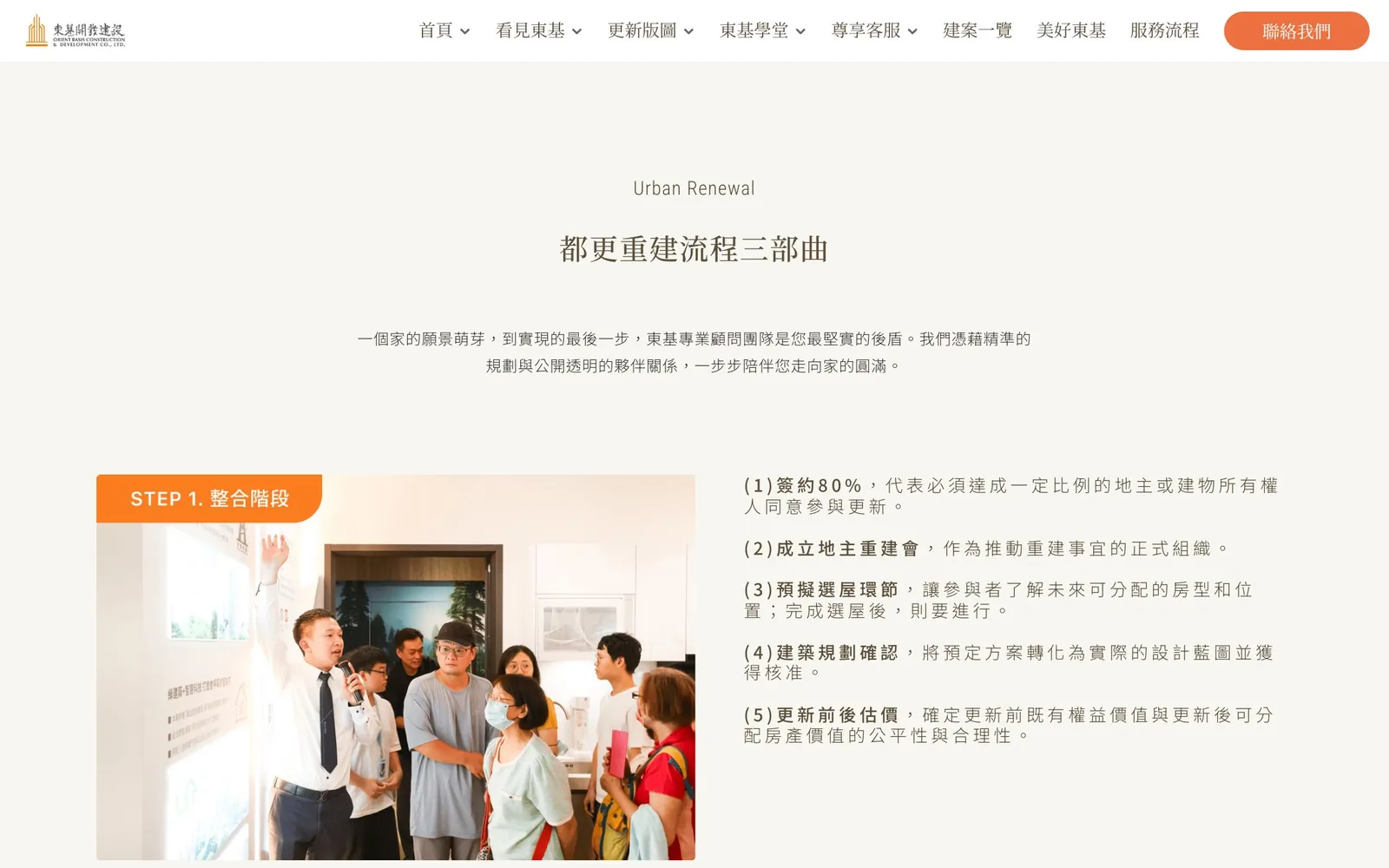
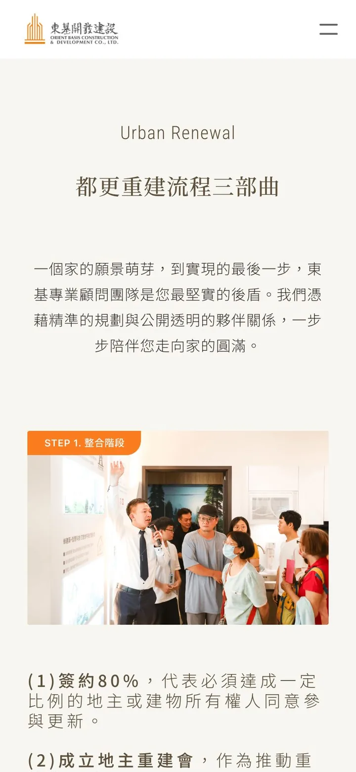
Urban renewal and rebuilding involve many procedures, and the question landowners most often get stuck on is "Which step are we at now?" The academy page sets out the process in three stages (consolidation, review, and rebuilding), each with a photo from the field and a numbered list of steps, such as getting 80% of owners to sign, forming the landowners' rebuilding association, public hearings, and trust financing. Further down, a Q&A grouped by topic answers questions about land trusts and how to judge a building partner.
A project center: every development in one place
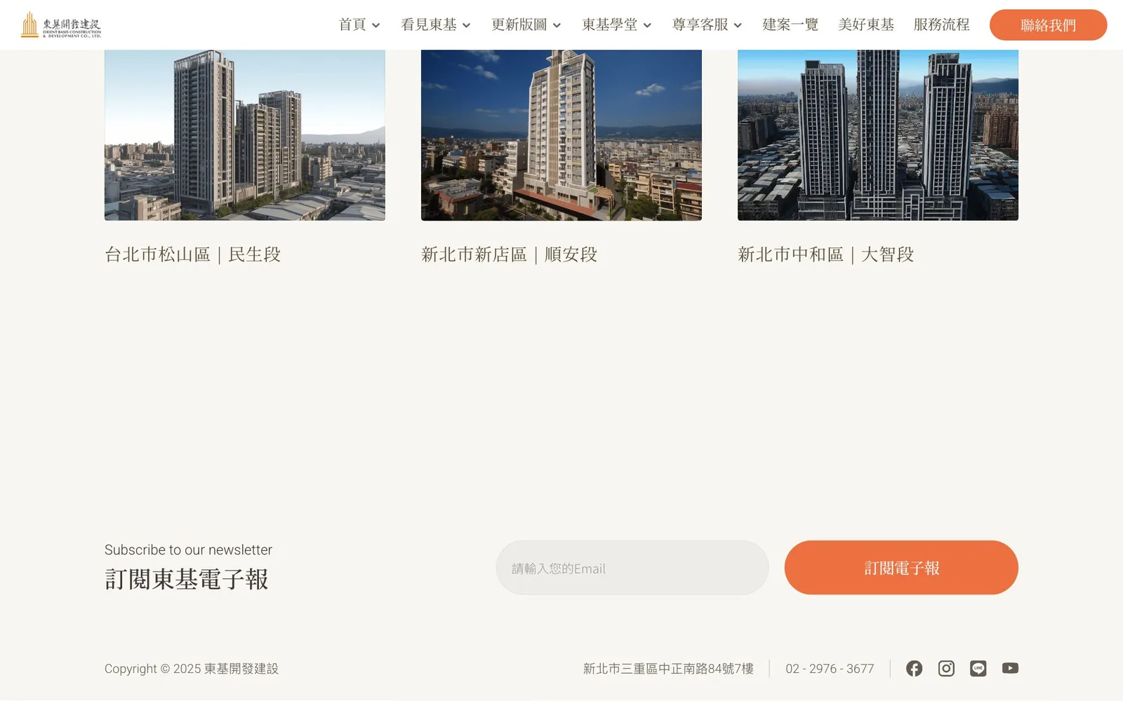
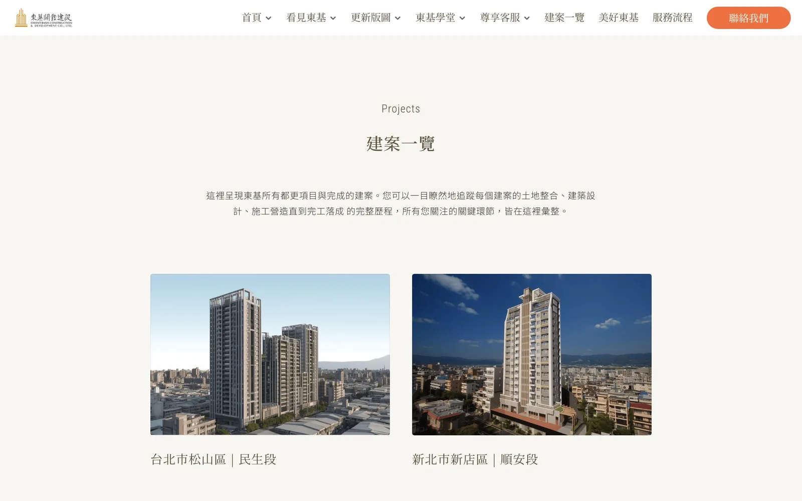
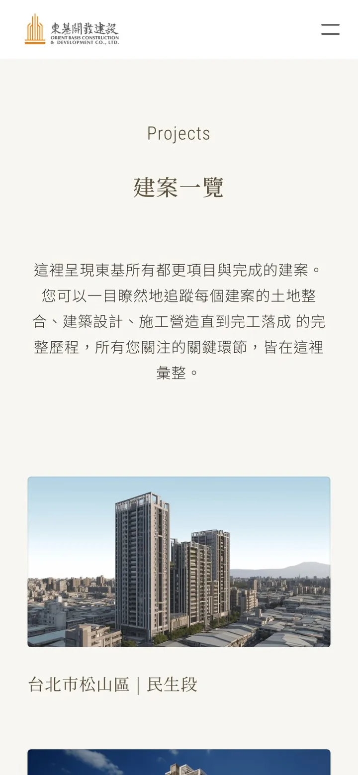
The projects page turns each development into a photo card labeled with its district and land section, such as the Minsheng section in Songshan District, Taipei; the Shun'an section in Xindian District, New Taipei; and the Dazhi section in Zhonghe District, New Taipei. Visitors compare them on one page instead of hunting across several. On the phone the cards stack in a single column with the photos intact.
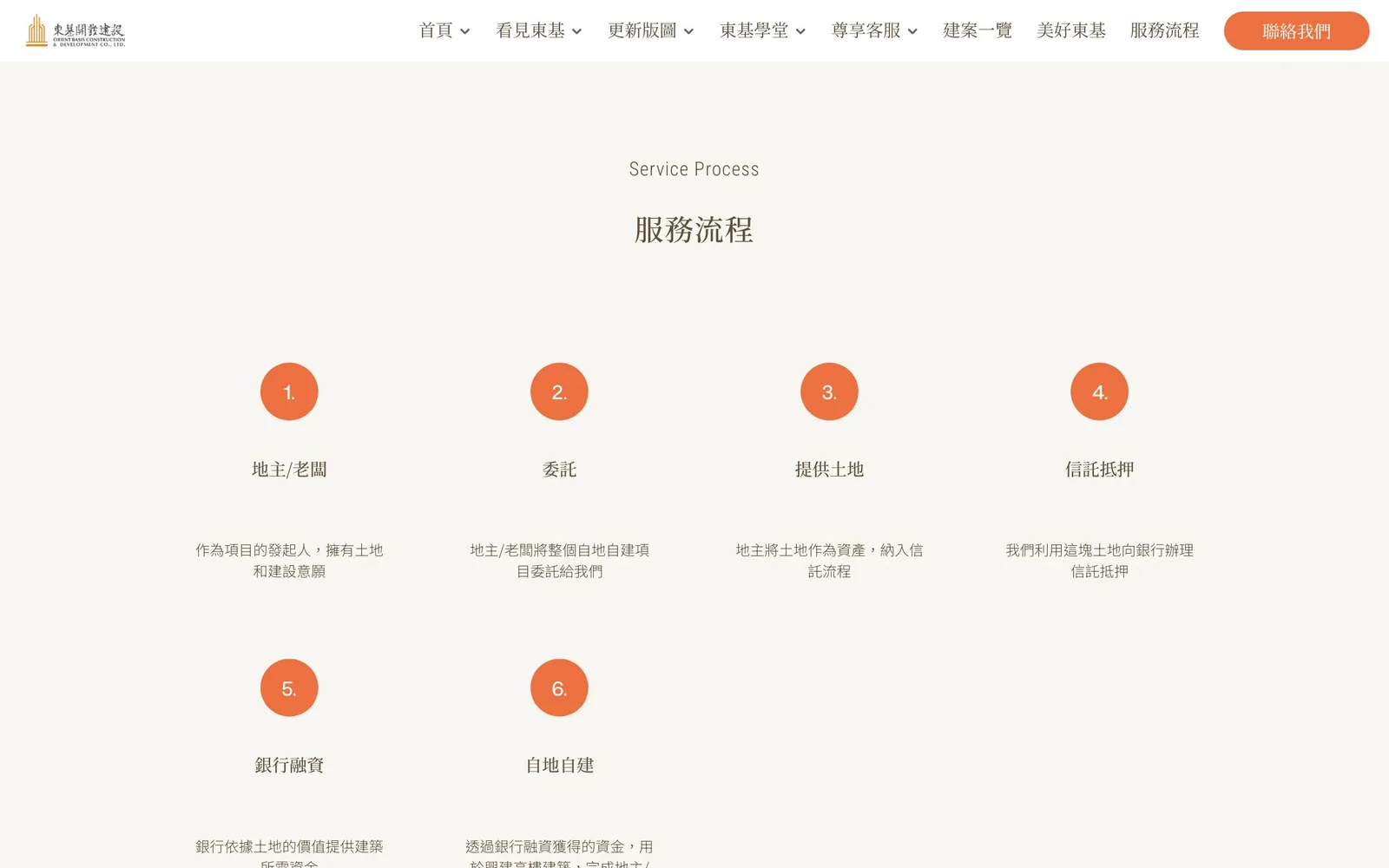
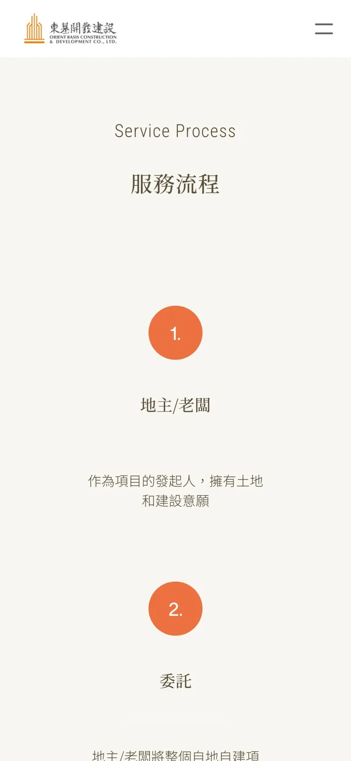
The process page uses six numbered dots, running from landowner or business owner, commissioning, providing the land, trust and mortgage, and bank financing to building on your own land, each explained in a line or two. The page ends with a map of the office, so landowners can find their way straight to the sales center.
A call to action at the point of decision
"Contact us" sits at the top right of every page, set apart from the menu in the brand orange, and long sections such as "Lifetime value" end with their own "Contact us" button. The footer adds a newsletter sign-up, the company address, phone number, and social links, so visitors who are still deciding after browsing projects have a way to stay in touch without having to pick up the phone right away.
Real photos for warmth
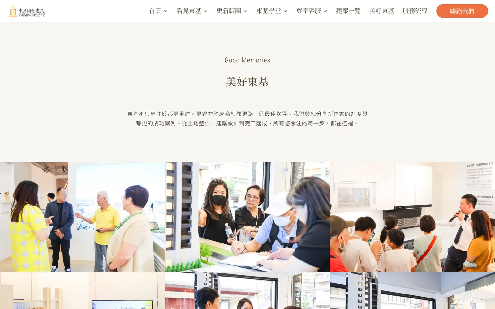
The site relies heavily on real photos of the sales center, events, and the team. The "Good memories" section gathers these moments into a photo wall, and the "Snapshots" carousel on the client care page shows scenes such as a groundbreaking ceremony, so the brand's warmth is not an adjective but something you can see.
CMS admin panel and upkeep
The custom CMS admin panel was designed on the premise that only a few people look after the site. Adding a project or updating images and text works like filling in a form, with no developer needed, so the site stays current.
- Add new projects
- Update images across the site
- Edit the text in each section
Results
- Significantly better readability and longer time on site
- More visitors converted into clients, with more inquiries
- Far lower in-house upkeep costs
- Type size and line spacing reworked, and a CMS admin panel so simple that one walkthrough is enough
Advice for developers and real estate companies
A developer's website is often the first stop for project information. Before a redesign, check:
- Are there features nobody maintains? Stale notices and empty member areas hurt you more than having nothing at all.
- Can your main audience read it comfortably? Type size, spacing, and contrast matter a lot to older readers.
- Who updates it? If it's one or two people part-time, the CMS admin panel has to be so simple that one walkthrough is enough.
Next casePunto GelatoGet a quote“Both the design and the planning went straight to our pain points… The redesigned website isn't just warm and impressive to look at; more importantly, it's actually easy to use.”