Client cases Case 06
POLISH | Website refresh: a brand website with motion design and an immersive experience
Polish Design


Industry
Professional design, creative industriesServices
Engineering (shared project), motion implementation, case study and article system, form integration, mobile layout implementationDuration
2 monthsResult
Engineering for a shared rebuild, with the full site built in 2 months
Background
Polish is a Taiwan-based design and development team working in web 3D and AI applications, for clients that include government agencies, TV networks, and international companies. By their fifth anniversary their work had changed a great deal. Their website had not: it looked dated and could not carry the depth and quality of what they were doing now.
At that milestone, Polish decided to overhaul the website completely and build a digital front door that matches their expertise and invites visitors to linger. The work was shared: the Polish team designed the visuals and interface, and 留白設計 BLANK DESIGN handled the engineering side, turning the designs into a fully working website, including the motion, the case study and article system, the inquiry form integration, and separate desktop and mobile layouts.
The challenge
The website couldn't just be a portfolio. Polish's services span 3D interaction, AI applications, and long-term partnerships, and visitors need to grasp quickly what they do, what they've done, and what working with them looks like. The site needed smooth motion, a clear system for case studies and articles, and an inquiry form people would actually fill in, with all of the custom design built and live within two months.
What we did
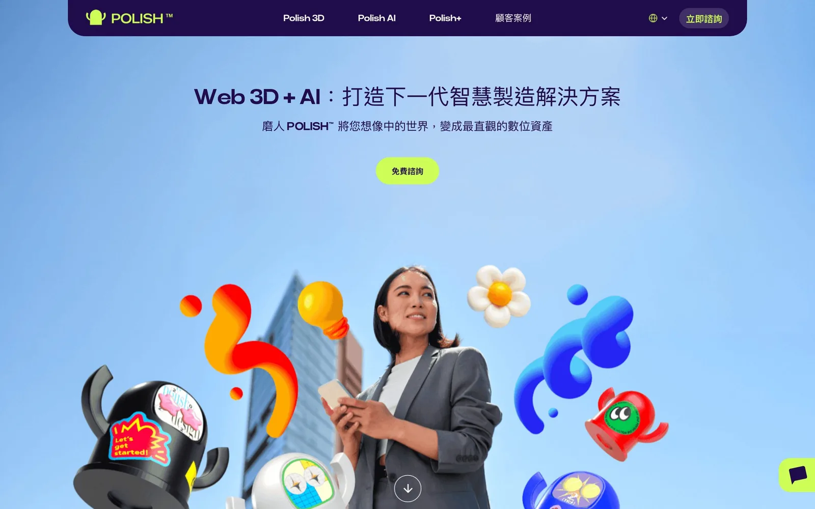
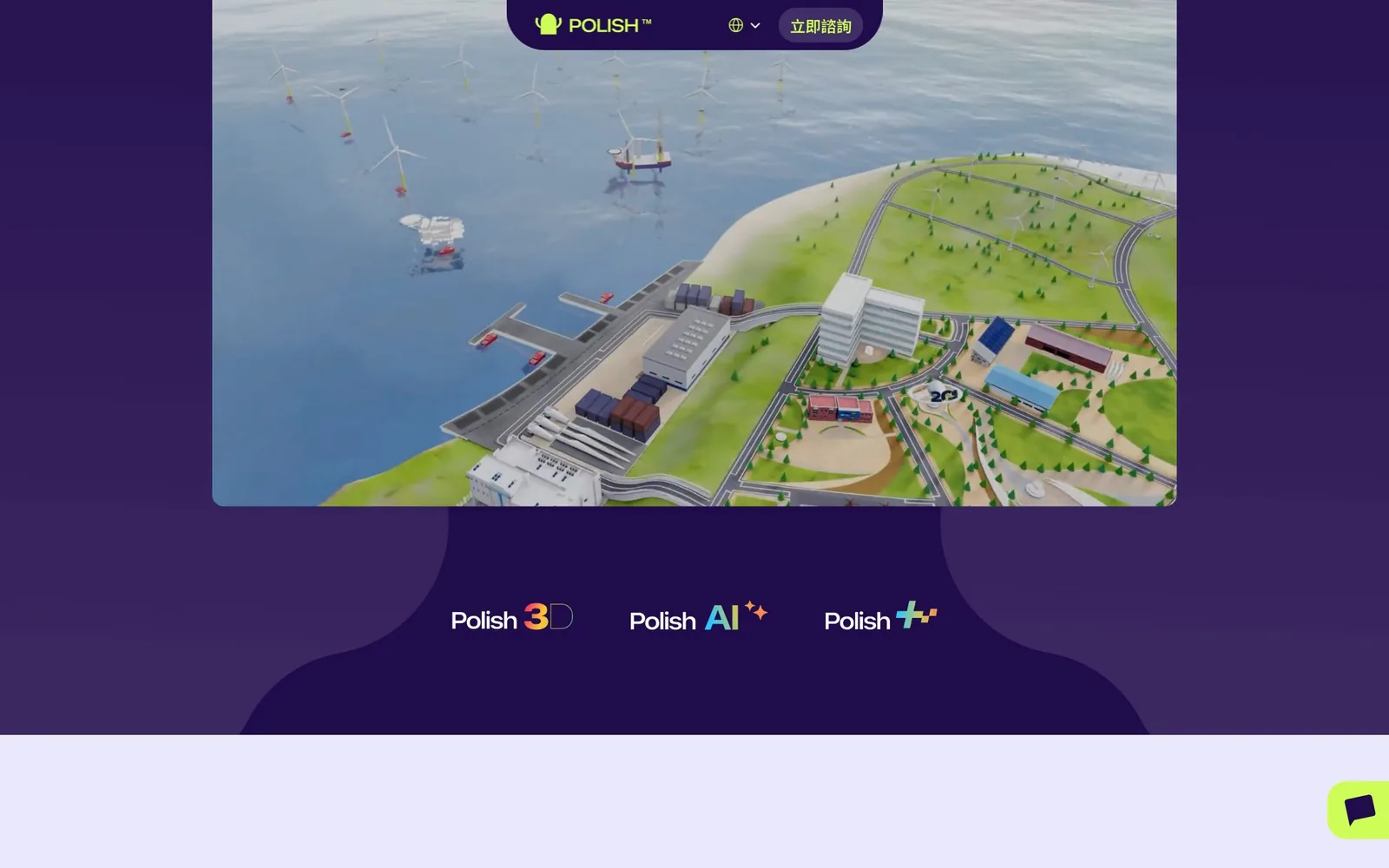
Polish designed the home page as a route with a rhythm: say who they are, prove it with work and numbers, explain the services and how a project runs, then bring the visitor to the inquiry form. Deep purple with a bright lime accent stands out without shouting, and 3D characters alongside professional photography give a technical service some warmth. Our job on the engineering side was to make that route play out exactly as designed on every screen and stay smooth as you scroll.
Desktop
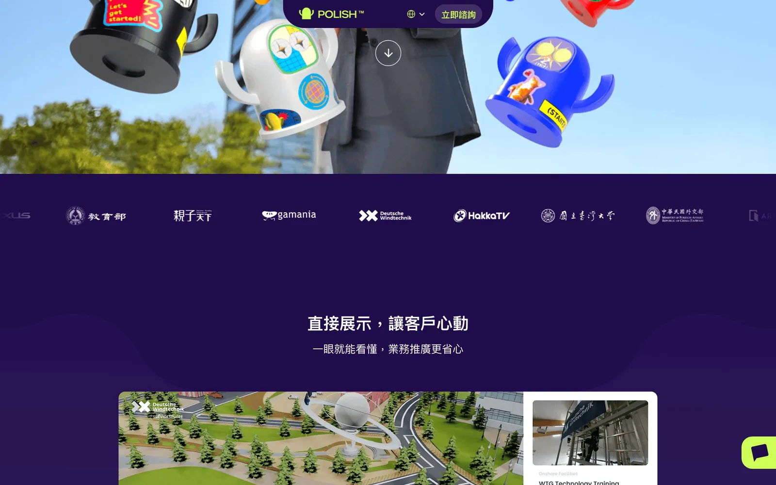
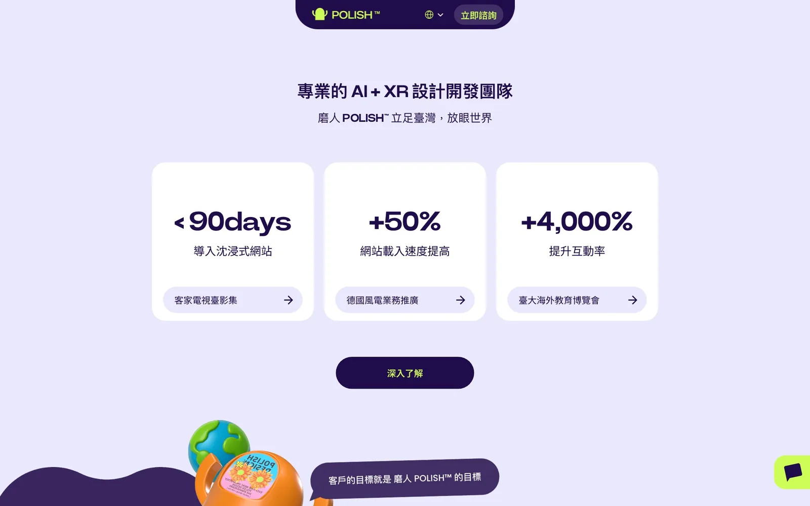
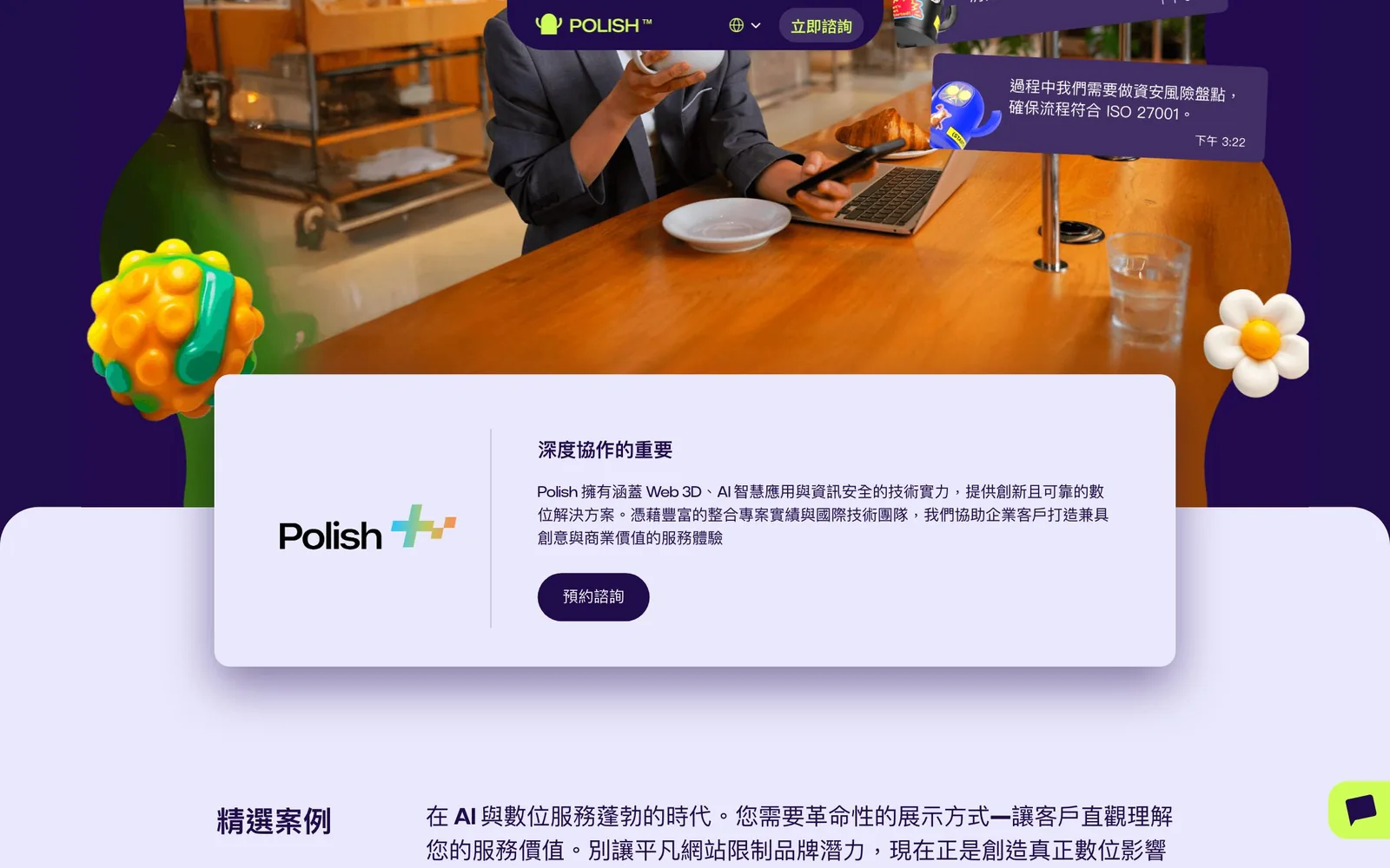
On desktop, large rounded blocks in alternating dark and light purple divide the page, so each section feels like a change of scene. The navigation is a centered pill that stays with you as you scroll, keeping "Inquire now" in view at all times.
Mobile
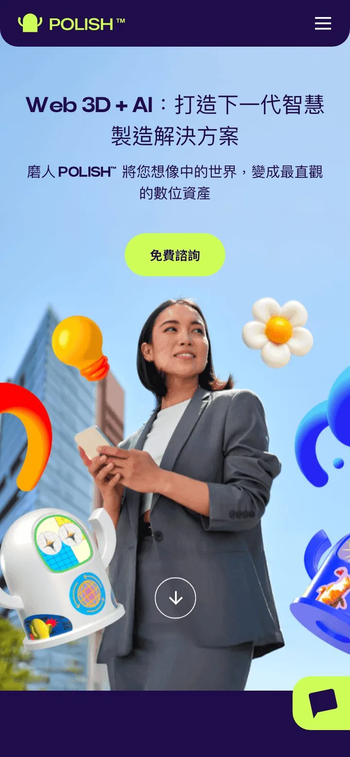
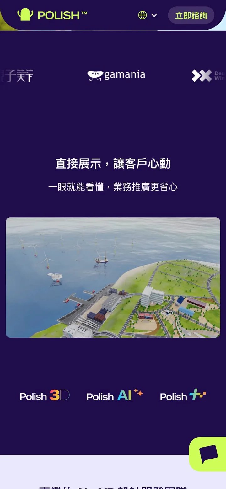
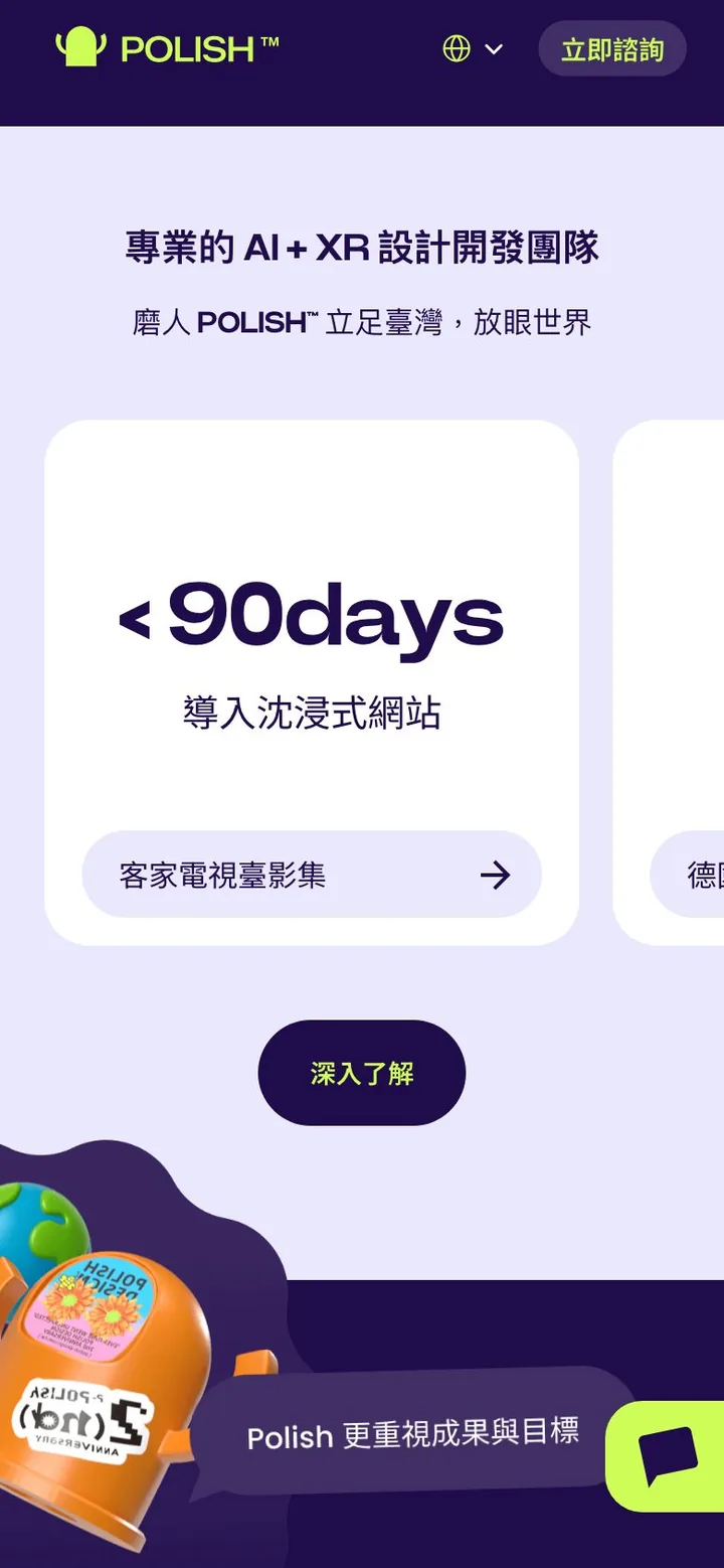
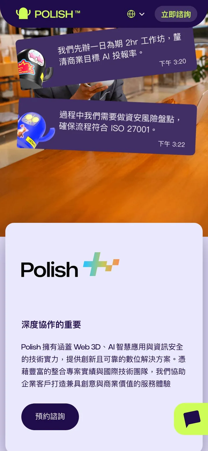
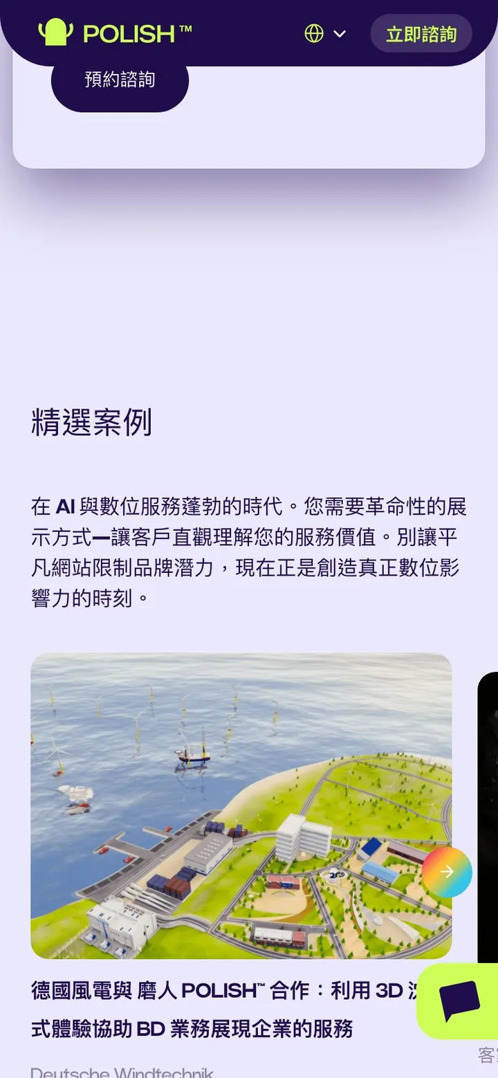
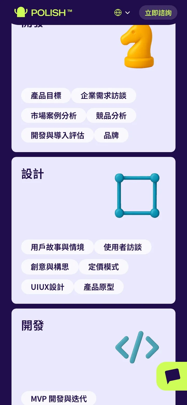
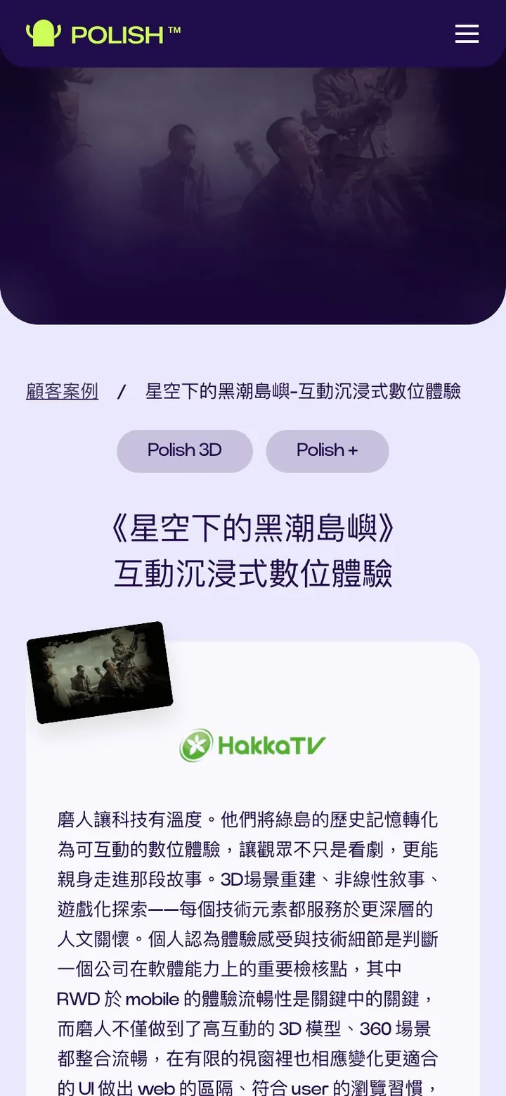
Rather than shrinking the desktop version, we built a separate mobile layout from the design: headings break differently, cards scroll sideways, the number cards come one at a time, and navigation moves into a menu at the top right. The 3D characters and chat bubbles stay, so the brand keeps its personality on a small screen.
Engineering highlights
Rhythm before effects
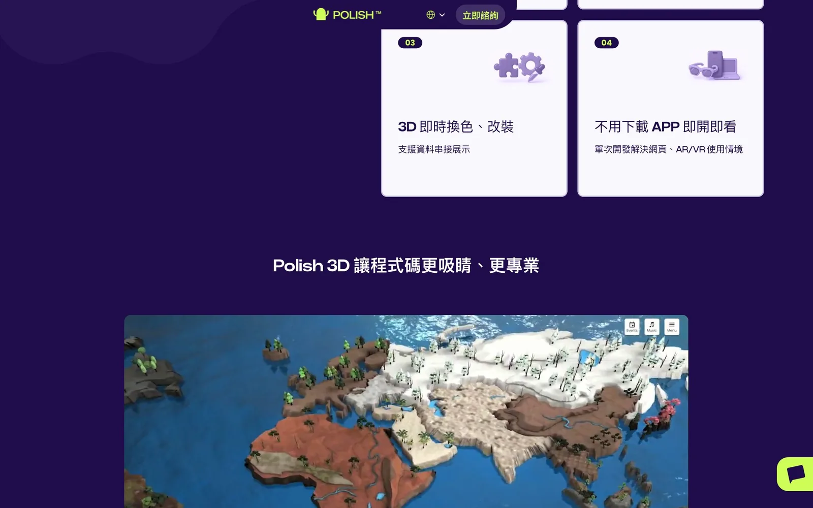
Polish's work is strong on its own; the site's job was to keep visitors looking. So in building the motion, we held to one rule, guide rather than perform: transitions show where you came from and where you are going, elements arrive in order as you scroll, and the visitor sets the pace instead of waiting on an animation. Service features sit in numbered cards, with the 3D work placed right next to the explanation.
Let numbers and case studies do the talking
Three number cards, for immersive websites adopted, faster load times, and higher engagement, each link to the case study behind them, so a figure is never just a slogan. Polish+, their in-depth partnership, closes the section as a card floating over a photo, with a "Book a consultation" button.
Selected work and how a project runs
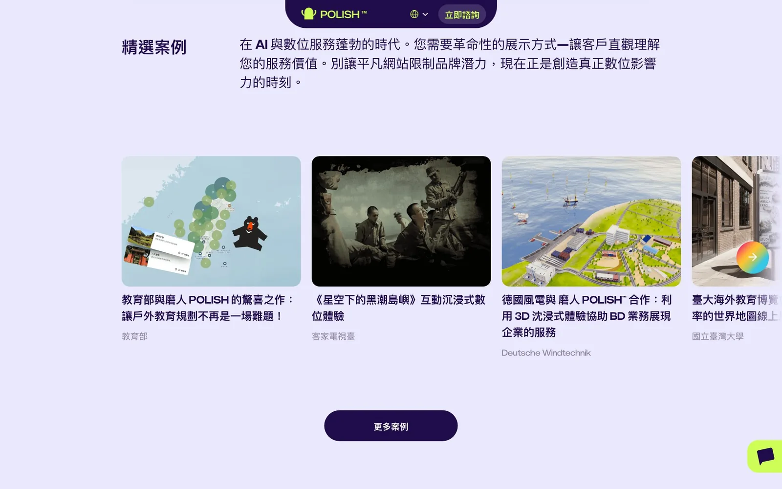
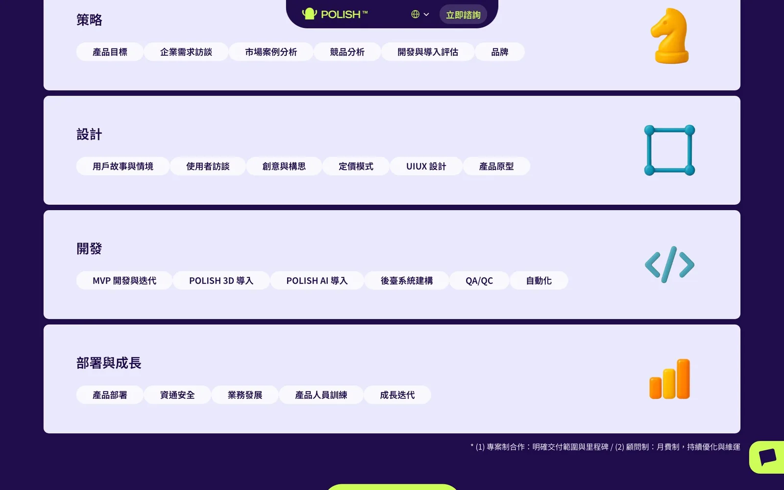
Selected cases run as a horizontal row of cards, each naming the client, with "More cases" leading to the full list. The process is split into strategy, design, development, and launch and growth, each with tags for the actual tasks, so a company knows what to expect before getting in touch.
Case studies and articles built to keep going
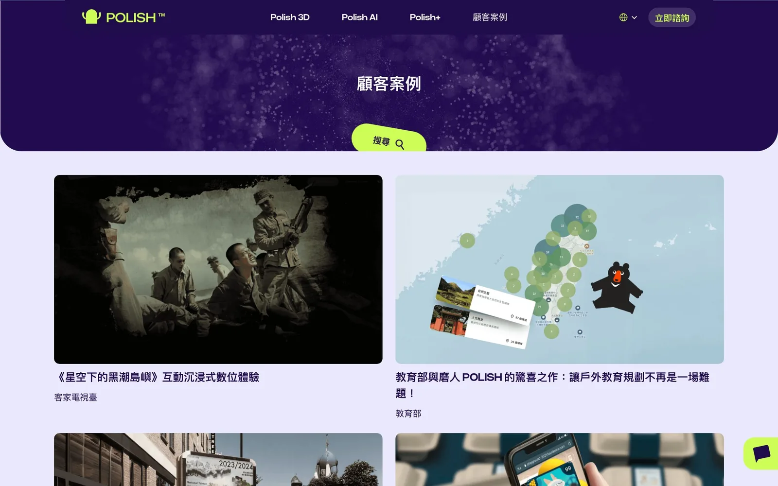
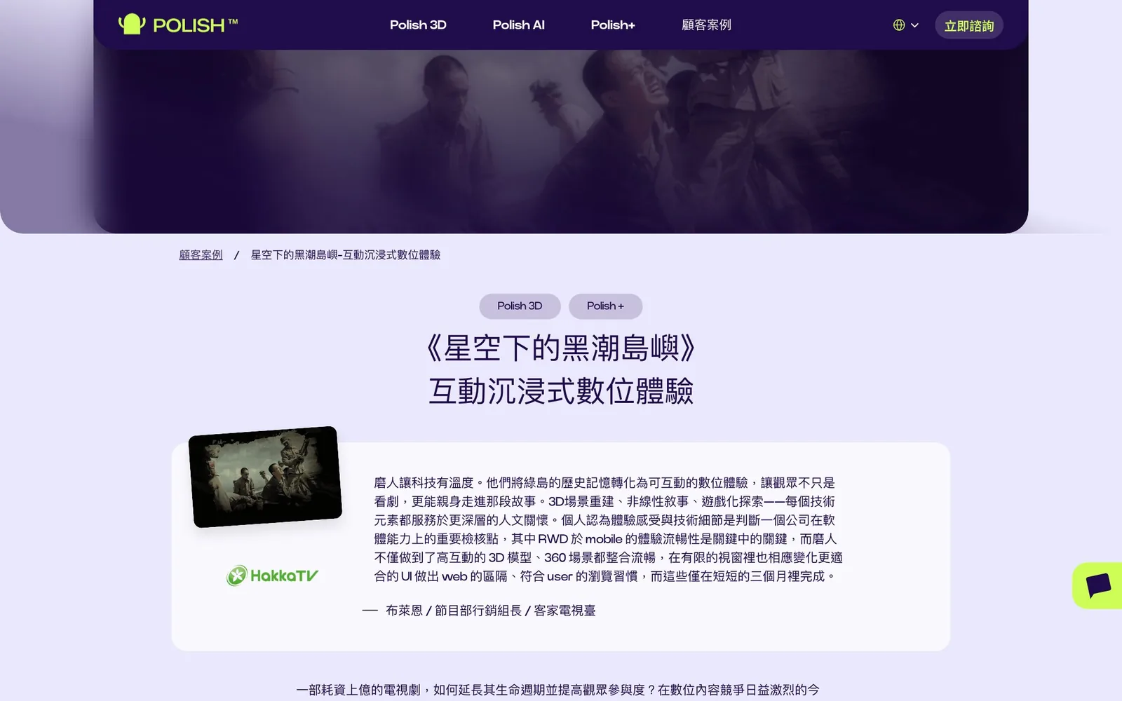
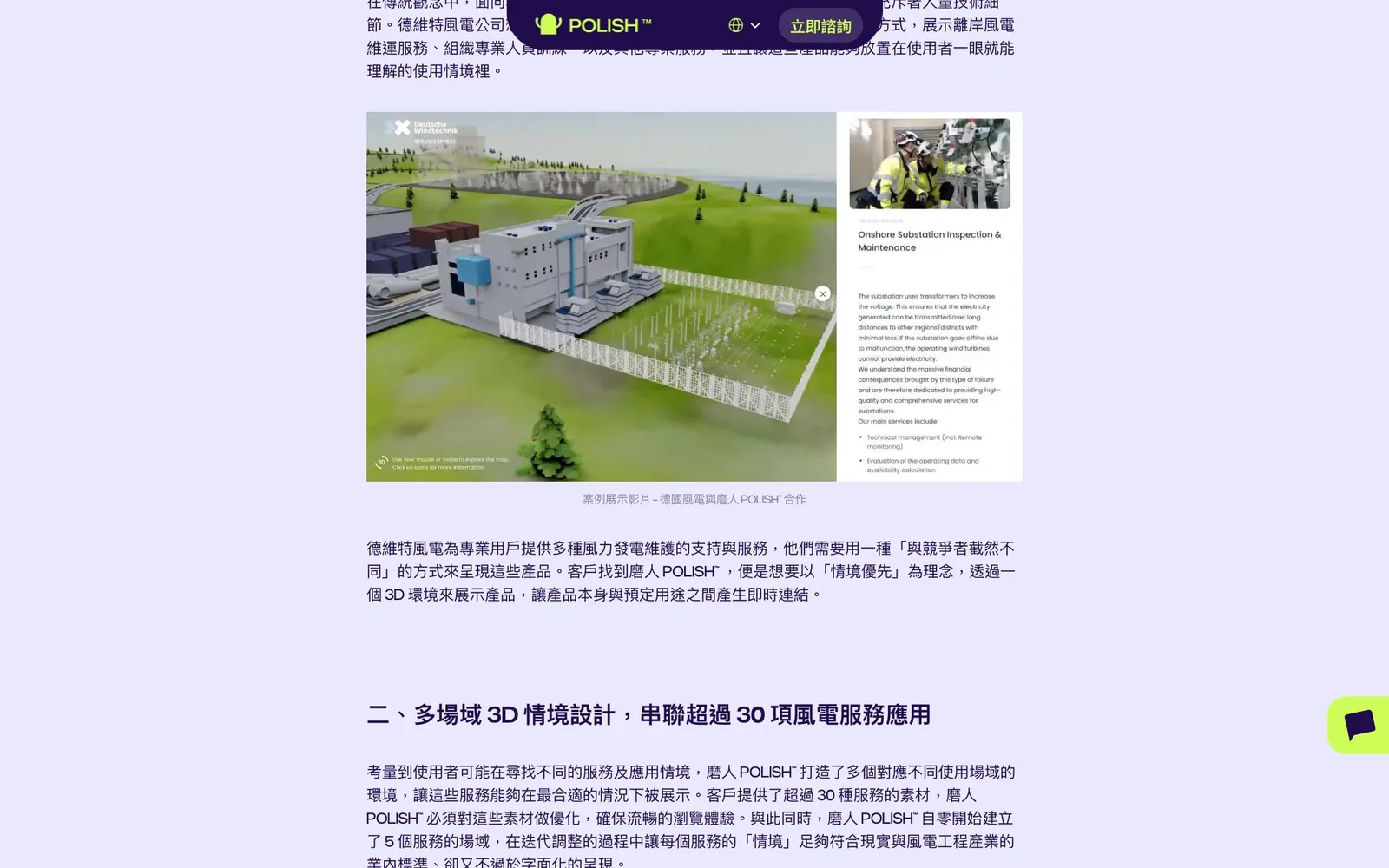
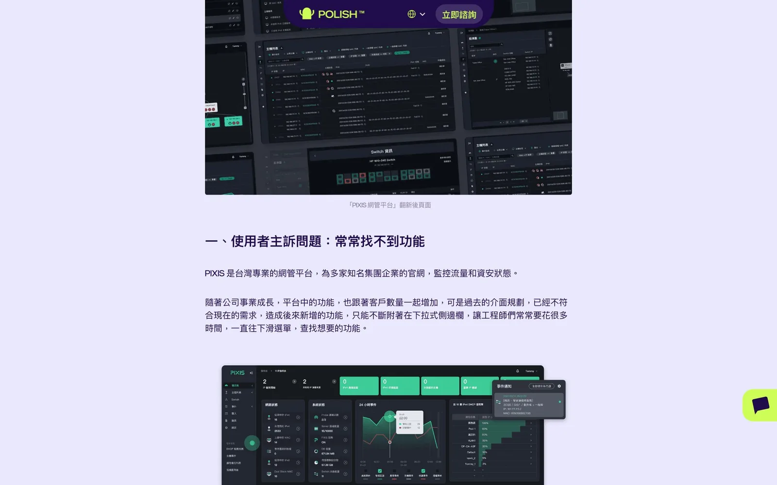
Five years of work and thinking needed a place that could keep growing. The case study and article system follows the categories and levels Polish planned: the list page has search, and each page follows the same order: breadcrumb, service tags, title, client quote card, and sectioned text, with captions under the images. Every new post has an obvious home, and readers move naturally from one to the next.
The form where people decide to get in touch
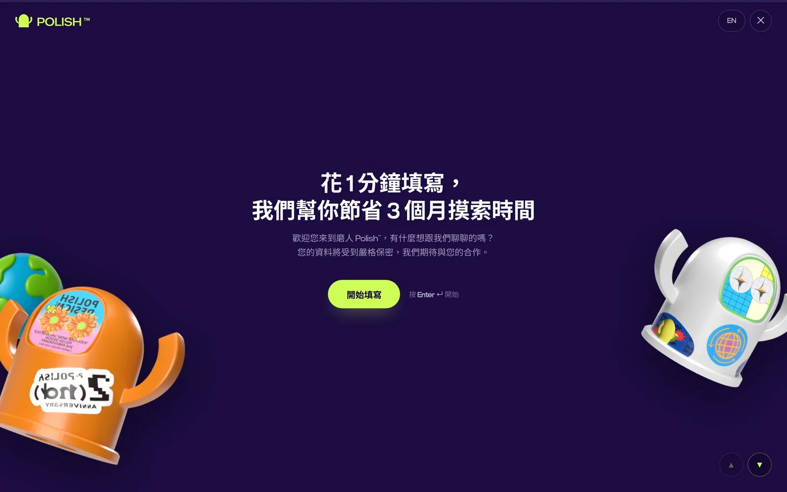
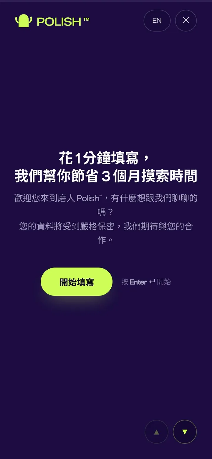
We built the inquiry form into the site, placed right after the work, when a visitor is most likely to reach out, and every page has "Inquire now" in its header. It asks one question at a time and opens with the line "Take 1 minute to fill this in, and we'll save you 3 months of trial and error," which lowers the barrier to getting started.
Results
- The engineering side of a shared rebuild, with the full custom design built in two months
- A home page rebuilt around a clear rhythm: position, proof, services, process, contact
- Case studies and articles with clear categories, search, and a fixed page template, easy to keep adding to
- An inquiry form built into the site, with "Inquire now" in the header of every page
- Separate desktop and mobile layouts, with visual quality that matches the depth of the work
Advice for similar brands
If your company has also been around for a number of years and its work and capabilities have long outgrown its current website, ask three questions before a refresh:
- Which represents you better today: your work or your site? If it is the work, the site should step back and let it lead.
- Do you publish regularly? If so, plan the categories and structure for case studies and articles from the start, so they don't become a mess as you add more.
- Is the contact option in view when someone wants it? Many inquiries are lost in the seconds spent looking for a button.
Next caseWakerGet a quote“留白設計 BLANK DESIGN understood exactly the feeling we were after… the experience of the whole site went beyond what we expected.”