Client cases Case 12
Japanese makeup artist TANAKA: giving a personal brand website a Japanese soul of beauty and poise
TANAKA


Industry
Makeup, fashion, and personal brandingServices
Personal brand website, visual identity, stylized image treatmentDuration
1 monthResult
A personal brand website in 1 month
Background
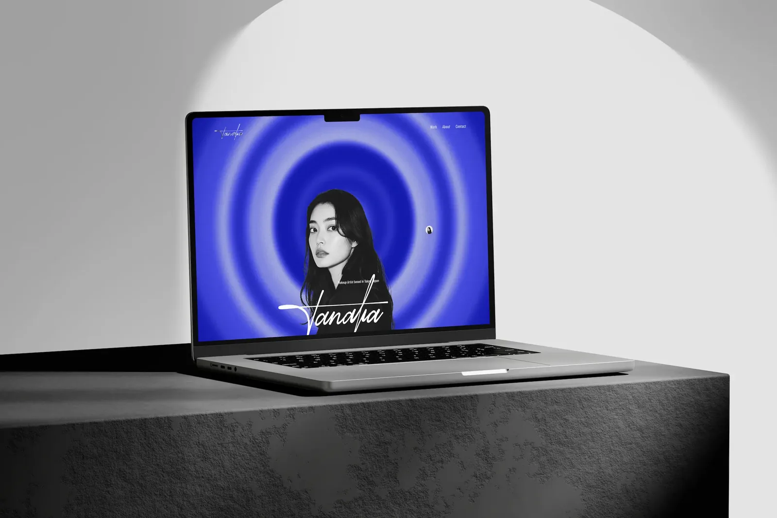
When TANAKA, a professional makeup artist from Japan, came to 留白設計 BLANK DESIGN, she wanted a personal website that truly represented her. For an artist, a personal website is a digital extension of their style, taste, and soul. It cannot just be a list of work; it has to be a space where visitors can feel who the artist is.
The site is in Japanese and covers her profile, her studio, her approach to makeup, and her track record. It took 1 month from setting the direction to completion.
The challenge
TANAKA was clear about what she wanted: the site had to feel like her. The hard part is that a feeling is difficult to pin down. Hers blends her Japanese background with what the Japanese makeup world strives for: beauty with poise.
Standard portfolio templates lead with thumbnail grids and bullet lists, and every artist ends up looking the same. Our job was to turn a feeling into a concrete visual language that holds from the first screen to the footer.
What we did
With TANAKA we first broke "beautiful, with poise" into things we could discuss: the warmth of color, the light in photos, type size, and how much space to leave. That narrowed down to three decisions: Japanese blue as the base color, a stylized treatment for every image, and layouts that put style first, with anything unnecessary removed so the attention stays on her and her work.
Desktop
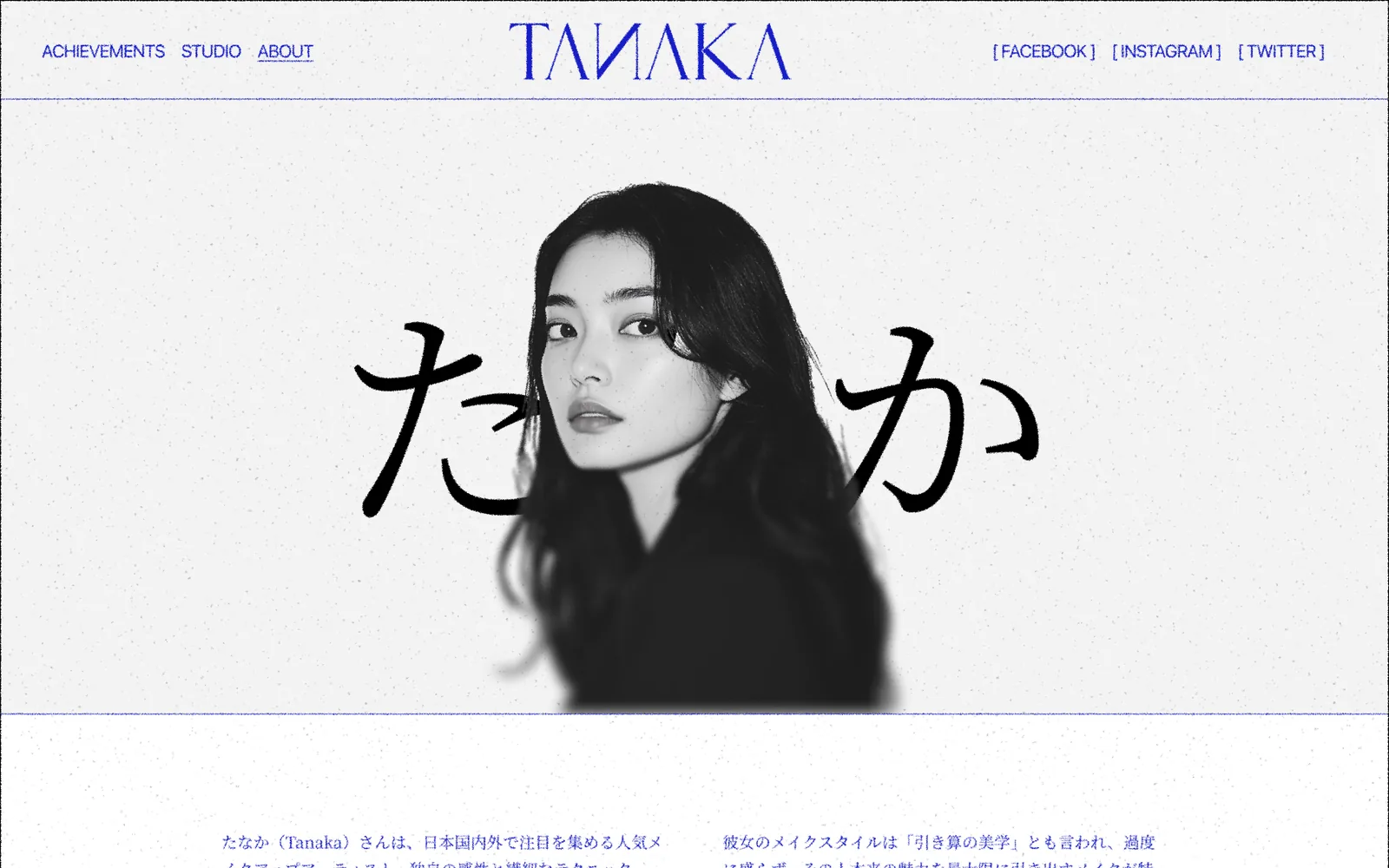
The first screen keeps text to a minimum. A black-and-white portrait sits in the center, with her name in hiragana, たなか, set as tall as the portrait. Name and person overlap, so visitors remember her before they read anything. The header has three links on the left (ACHIEVEMENTS, STUDIO, and ABOUT), social links on the right, and the wordmark in the middle, with a hairline separating it from the content.
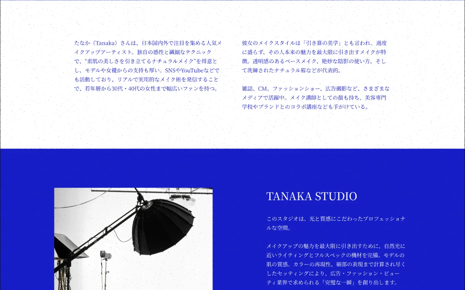
Below the portrait comes a two-column profile in Japanese. The text is set in a light weight, in Japanese blue, inside generous white space, with no headings or icons, so it reads like the foreword of a magazine.
Mobile
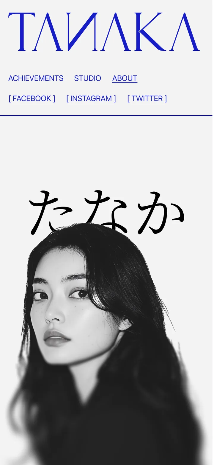
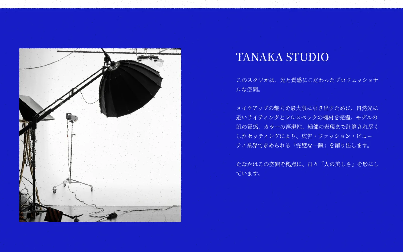
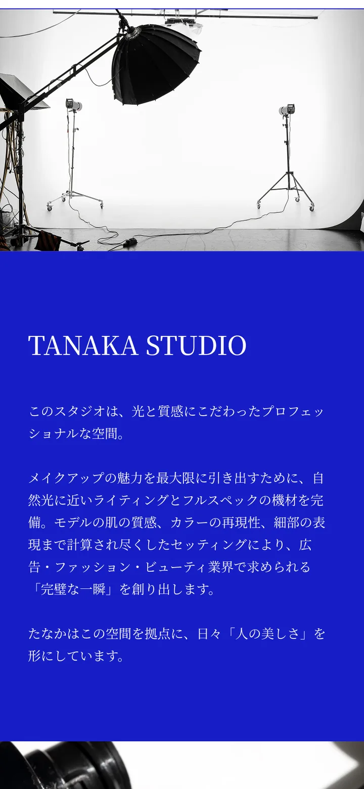
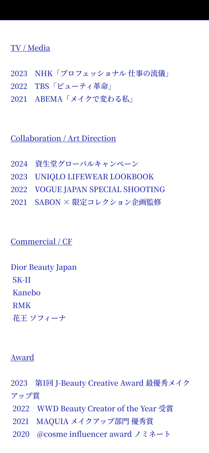
On phones the wordmark runs the full width of the screen, and the three links and social links sit right under it rather than behind a menu button, so the whole site is visible at a glance. Image-and-text pairs that sit side by side on desktop stack into a single column, with images kept full width and color blocks running to the edge of the screen, so the rhythm matches the desktop.
Key design decisions
Define the feeling before designing
"Beautiful, with poise" is a feeling, and hard to draw directly. Instead of starting with layouts, we first agreed with TANAKA on the warmth of color, the light in photos, the weight of the type, and how much space to leave. Every choice came back to one question: does this feel more like her? That question became the test for everything that followed. Any element that made the page busier without making it more like her was removed.
Why Japanese blue
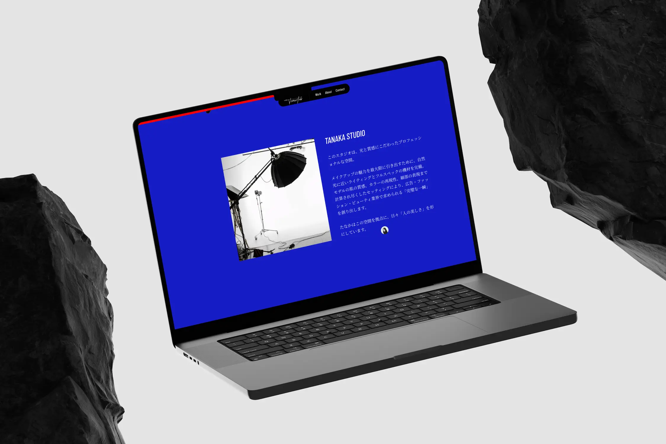
Blue carries deep meaning in Japanese culture and is TANAKA's own favorite. As the base color it signals a Japanese aesthetic at first glance without piling on traditional motifs; the feeling comes from the whole, not from decoration. The studio section is one solid block of Japanese blue with a black-and-white studio photo on top: a single color, with a strong presence.
Blue and black, two rhythms
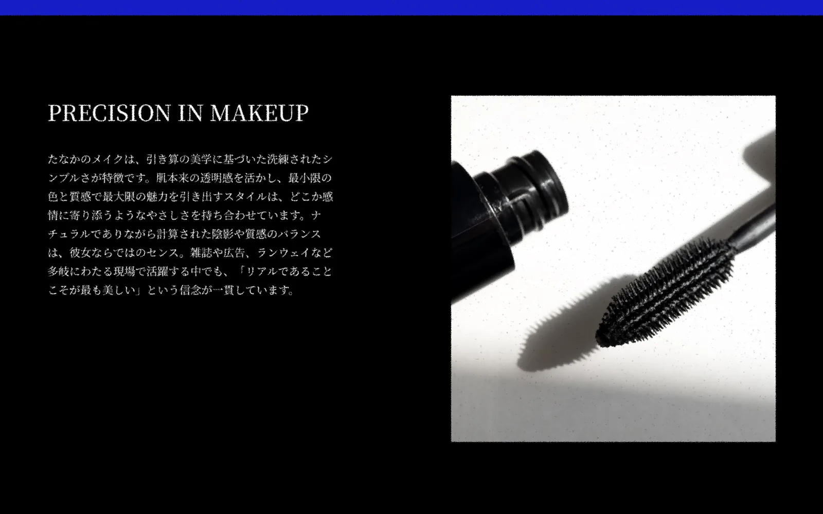
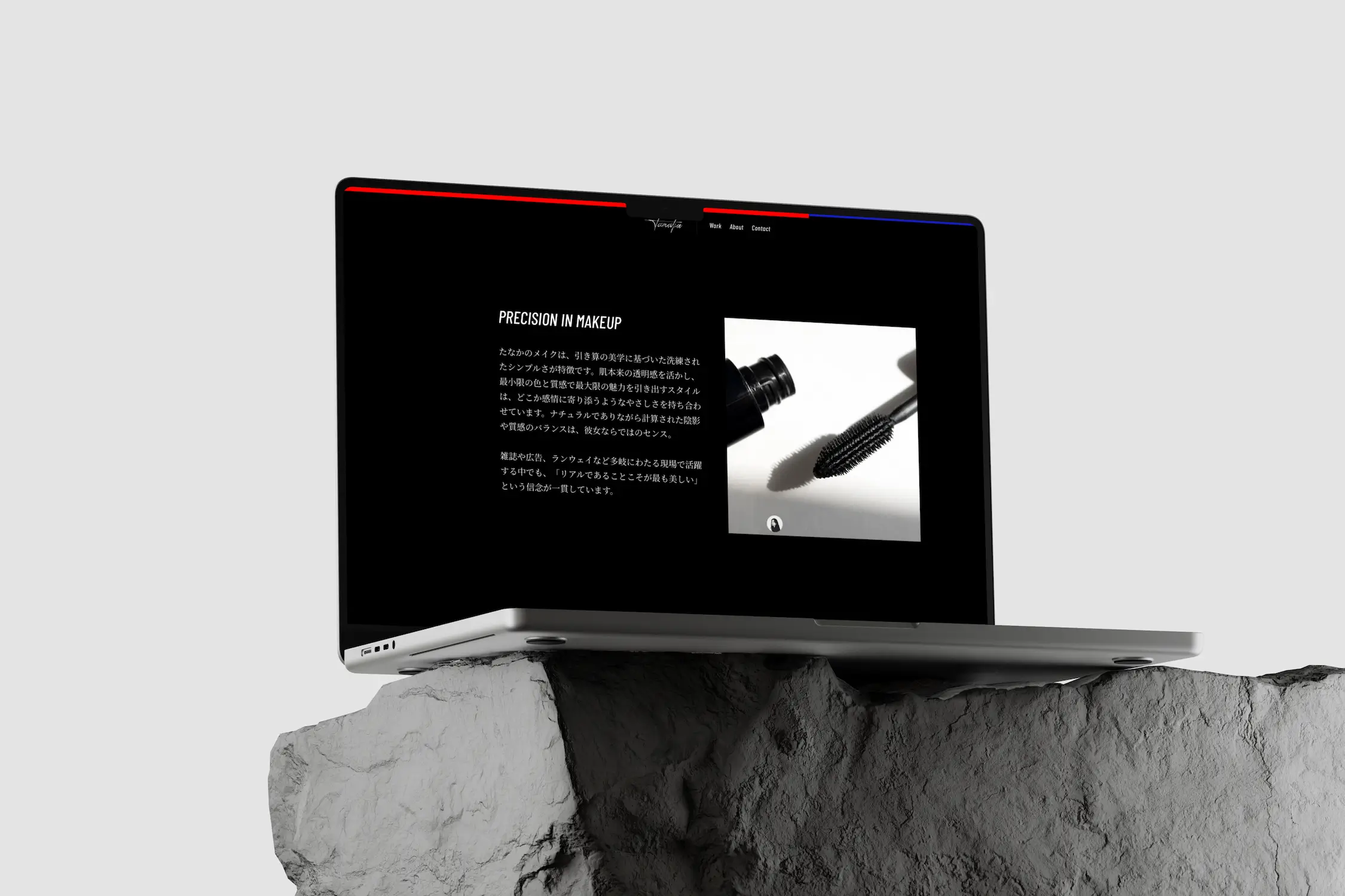
Her approach to makeup, PRECISION IN MAKEUP, switches to white type on black, alternating light and dark with the blue section before it. Image and text swap sides, so scrolling has room to breathe instead of the same layout repeated all the way down the page.

One visual language for every image
Photos on a personal site often come from different shoots. We retouched them to a shared light, tone, and texture: portrait, studio, and makeup tools all share the same high-contrast black and white, so the site reads as one portfolio rather than a stack of photos from different years.
A list, not a wall of logos
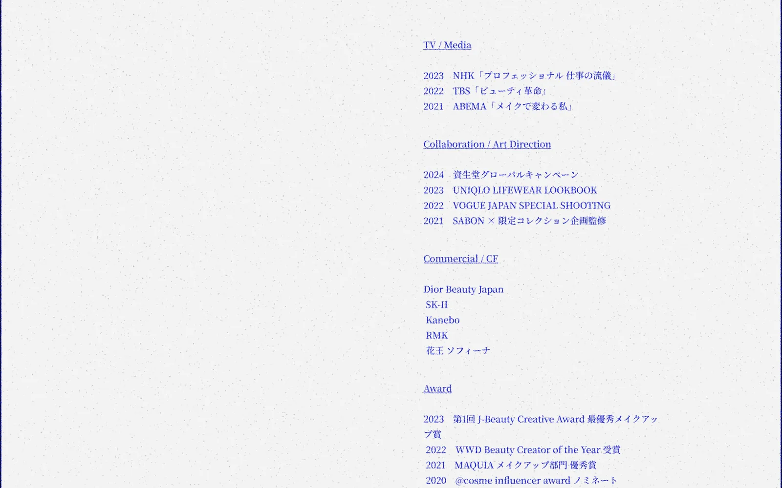
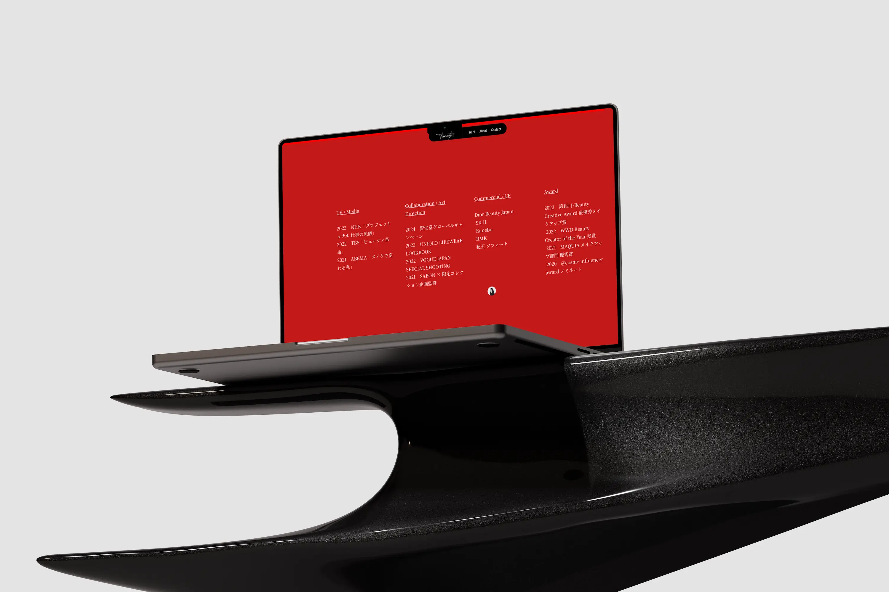
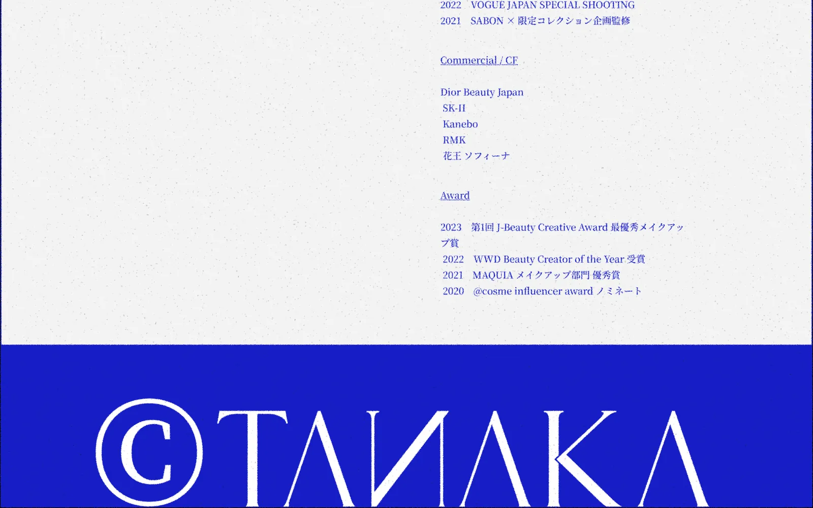
Media, collaborations, commercials, and awards are grouped as TV / Media, Collaboration / Art Direction, Commercial / CF, and Award, each listed as plain text by year and name, without brand logos. The page stays quiet, the information carries its own weight, and it matches the restrained tone of the rest of the site.
Ending on the wordmark
The footer has no form and no block of text, only a ©TANAKA wordmark scaled almost to full width on Japanese blue. The last thing a visitor sees before leaving is her name.
Results
- A personal brand website with a Japanese sensibility and the polish of professional makeup, completed in 1 month
- Japanese blue as the base with consistently treated black-and-white imagery, giving a clear identity
- A home page led by her name and portrait, keeping the focus on her and her work
- Profile, studio, approach, and achievements unfold in order, like walking through a gallery
- Desktop and phone keep the same rhythm of color blocks, and the mobile menu is visible at a glance
Next caseMalaysia Home GuideGet a quote“留白設計 BLANK DESIGN really understood what I wanted. They weren't just designing a website; they were shaping a persona for me. From the color to the feel of the photographs, every detail captures my style perfectly. It's like having a version of myself online.”