Work
Malaysia Home Guide|An MM2H webinar site that answers the questions before it asks for a sign-up
Work C12:Malaysia Home Guide

Industry
Overseas property advisory, online webinarsServices
Webinar site redesign and build, sign-up and email flow, content management and SEOBuilt with
Fully custom
Background
Malaysia Home Guide is a 90-minute online webinar run in Mandarin by Nicholas Tan, a senior property adviser at IQI Realty Malaysia, for families in Taiwan: the new MM2H rules and the real costs and risks of buying in Kuala Lumpur, covered in one go.
The old sign-up page ran on WordPress: one designed banner image, two rows of icon cards, a headshot of the speaker and a form at the bottom. There was plenty of content, but few sign-ups. We judged that the problem wasn't traffic. The page didn't answer what visitors were really wondering: who is speaking, is this about the new rules or old news, is it for me, and what happens after I sign up?
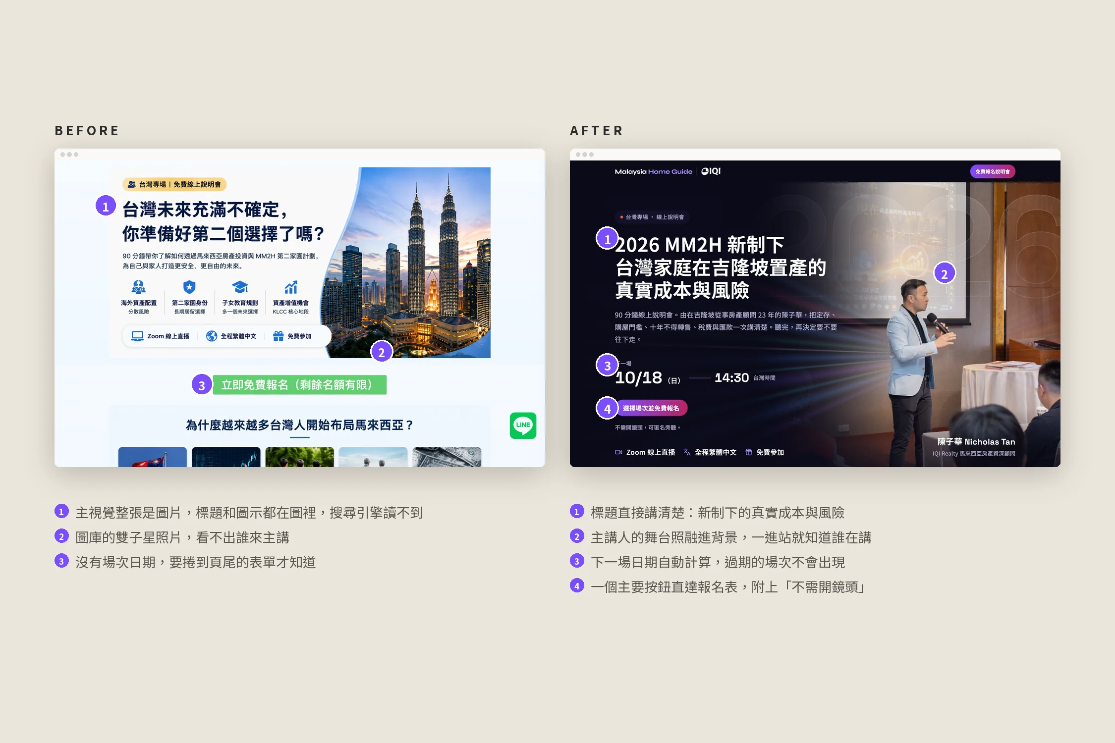
What wasn't working
A site set up wrong: one page needed, three extra
The site only ever needed one page: the webinar sign-up. But the default content WordPress ships with was never removed:
- The homepage was WordPress's default post list, so visitors to malaysiahomeguide.com saw a post called "Hello World!".
- The sample "About" page and the sample "Hello World!" post were also live.
All three were open to search engines and listed in the sitemap. To Google this was a site about "Hello World", the webinar page was diluted, and anyone arriving at the brand domain couldn't find the webinar.
Content made of pictures, not text
The webinar page looked full, but the headline, the five "why Taiwanese families are looking at Malaysia" cards and the five "what you'll learn" points were all baked into three large images, with empty alt text.
Looking at the page source: the whole page held only about 600 characters of real text, mostly form labels, and no H1 at all. Its only three headings were the speaker's name, the form title and "Organiser".
That does serious damage to SEO, GEO and AEO:
- SEO: Google couldn't read the headline or content, so phrases like "MM2H webinar" or "buying property in Kuala Lumpur" simply weren't on the page.
- GEO (generative search): AI search such as ChatGPT, Perplexity and Google's AI Overviews only reads text, so what the webinar covers and who it's for was a blank to them, never cited.
- AEO (answer engines): when someone asks "what changed in the new MM2H rules?", answers come from pages written in text. This page had no chance of being one.
Text inside images also shrinks on phones and becomes hard to read.
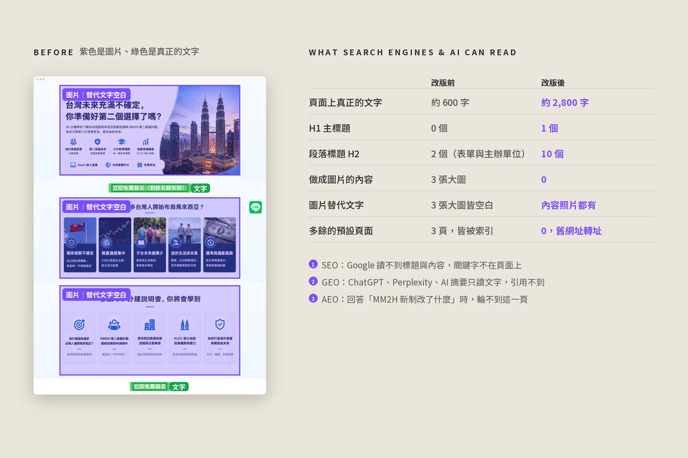
Other problems
- No speaker in sight: the first screen showed a stock photo of the Twin Towers; the speaker only appeared halfway down.
- No session dates: you had to reach the form at the very bottom and open a dropdown to see when sessions ran.
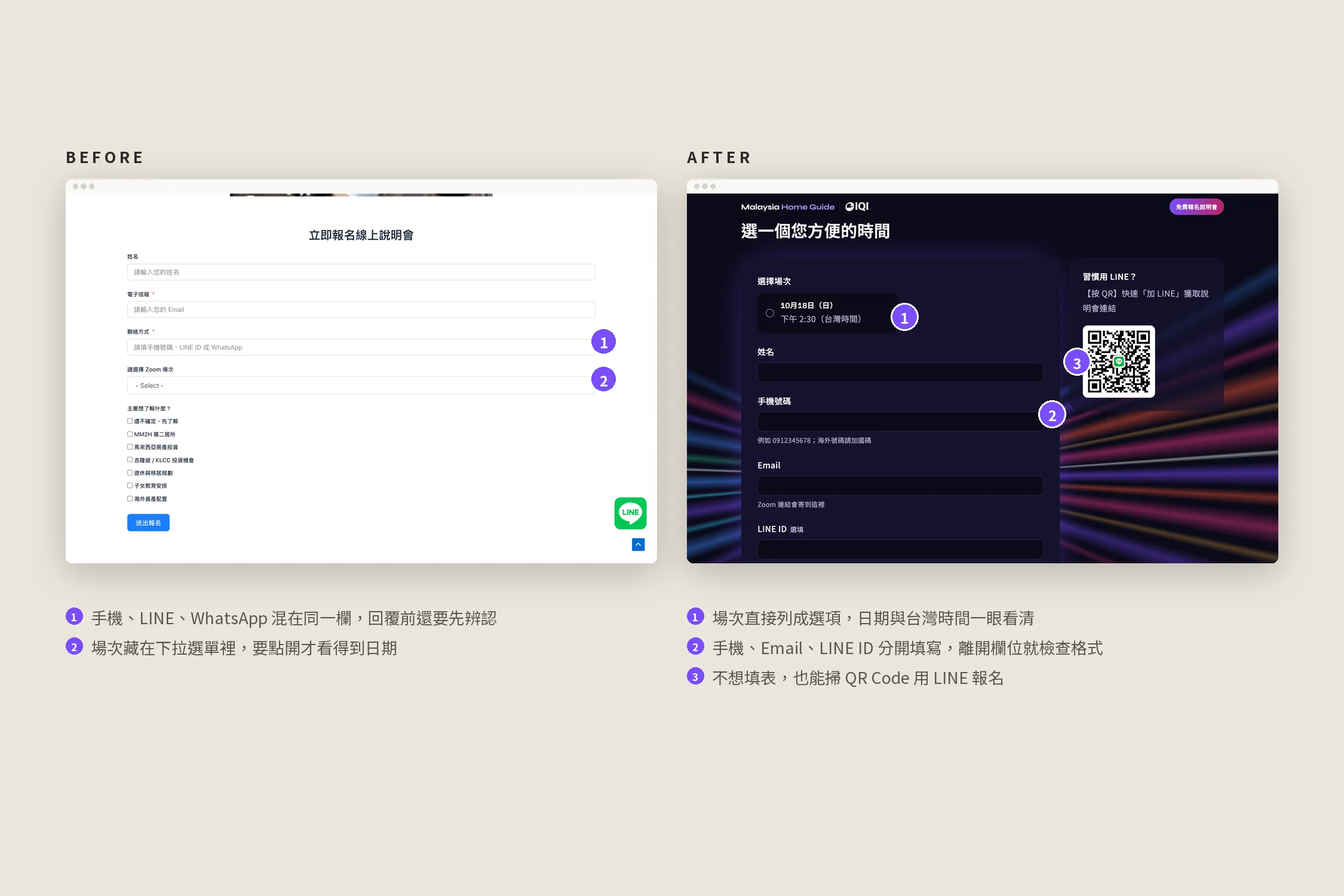
- One box for every contact method: phone, LINE and WhatsApp all went into one field.
Before and after
| Before | After |
|---|---|
| A "Hello World!" homepage plus a sample page and post, all three indexed | One page only, with every old URL 301-redirected to the webinar |
| Headline and content baked into 3 images: ~600 characters of text, no H1 | Everything in real text: ~2,800 characters, one H1, an H2 per section, readable by search engines and AI |
| A stock photo of the Twin Towers | The speaker's stage photo, blended into the dark background |
| Sessions hidden in a dropdown in the form | The next session on the first screen, and every session listed in the form |
| Phone, LINE and WhatsApp in one field | Separate phone, email and LINE ID fields, checked as you leave each one |
The solution
Every word is real text
The headline, cards and key points that lived inside images are now written as page text: one H1 for the topic, an H2 per section, alt text on every content photo, and the page text has grown from about 600 to about 2,800 characters, plus a proper page title, description and share image. Search engines and AI search can read what the webinar covers and who it's for. The WordPress homepage, sample page and sample post are gone, every old URL 301-redirects to the webinar, and the site is down to the one page it needs.
Preloader: the wordmark assembles and hops twice
On a first visit the Malaysia Home Guide and IQI wordmarks rise into place letter by letter, hop twice with a slight squash on landing, then fade to reveal the speaker and headline. Page animations wait until it finishes; later page changes play a short version.
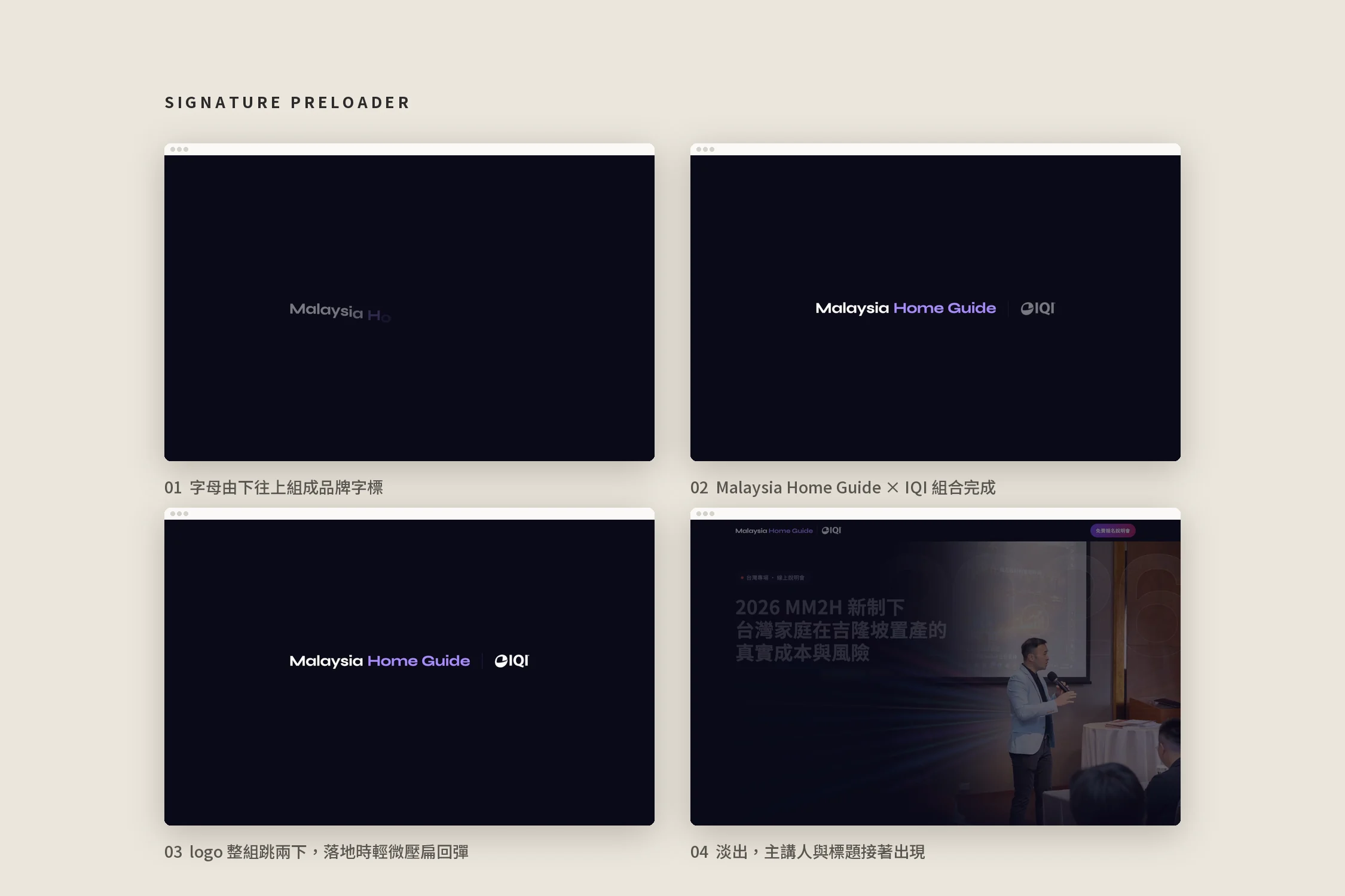
Putting the speaker on the first screen
A webinar sells one thing: whether this person is worth 90 minutes. The hero is now Nicholas on stage at a Taiwan session, recropped from the original photo and faded into the dark background on its left and bottom edges. The speaker section uses the same treatment, with his story beside the photo.
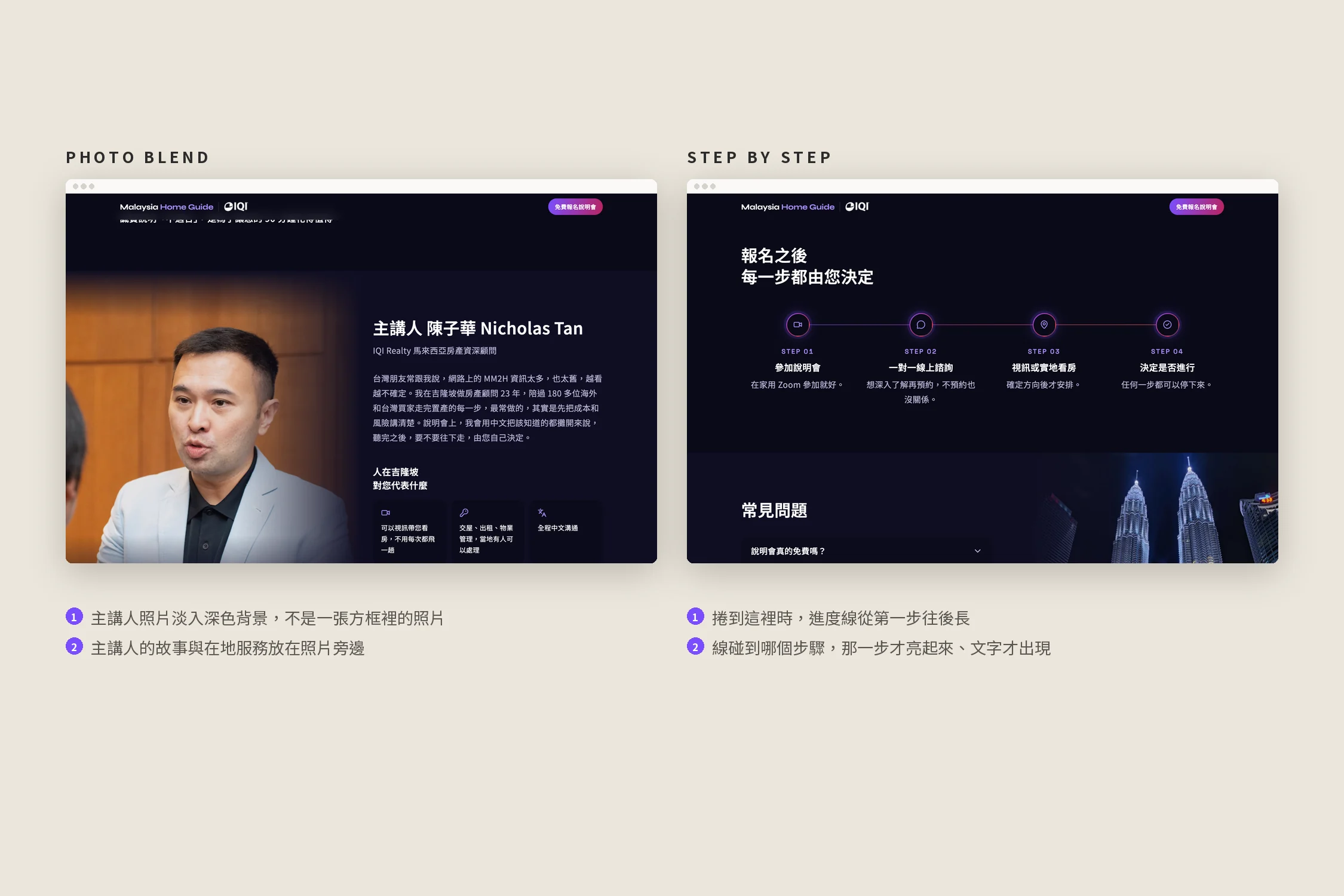
Answer first, then ask
The page follows the questions a Taiwanese family has: why Malaysia, is what I read online out of date, what the session covers, whether it's for me, who the speaker is, what the risks are, and what happens after I sign up. Each section answers one question; the form comes last.
"After you sign up" is four steps on one progress line: it grows as you scroll, and each step lights up only when the line reaches it.
Sign up on one page
The form lists every session with the date and Taiwan time. Sessions are set by hand in the dashboard; past ones disappear on their own, and the "next session" on the first screen follows. Phone, email and LINE ID are separate fields, checked as you leave each one, and anyone who prefers LINE can scan the QR code beside the form.
After submitting, the visitor gets a confirmation email with a calendar file and the Zoom link, the organiser gets a notification, and the sign-up is saved to the dashboard. The Zoom link is only ever in the email, never on the page.
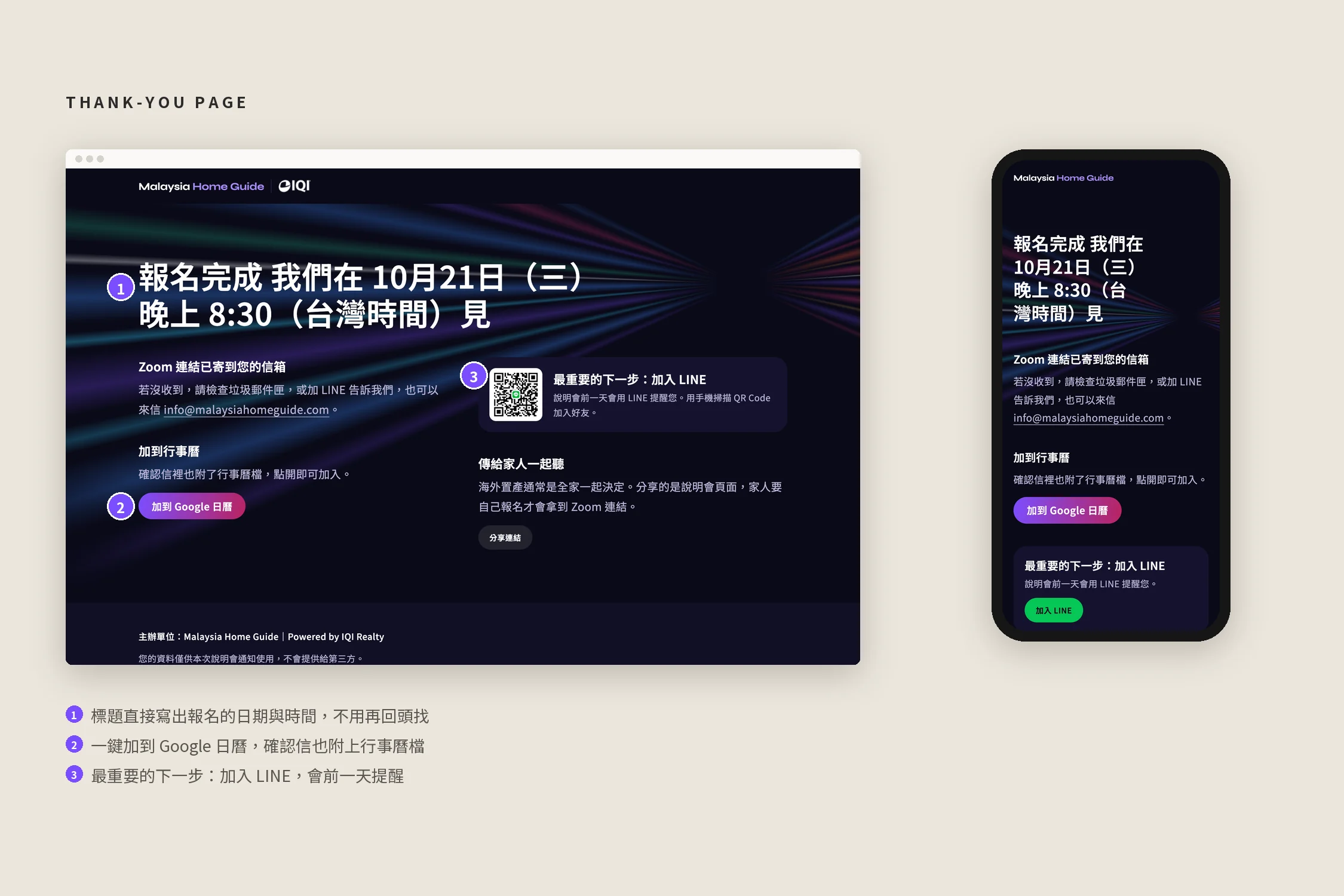
A thank-you page with the date in the headline
The thank-you headline reads "You're in, see you on Wednesday 21 October at 8:30 pm", so nobody has to look the date up again. Below it: add to Google Calendar, join LINE for a reminder the day before, and share the session with family.
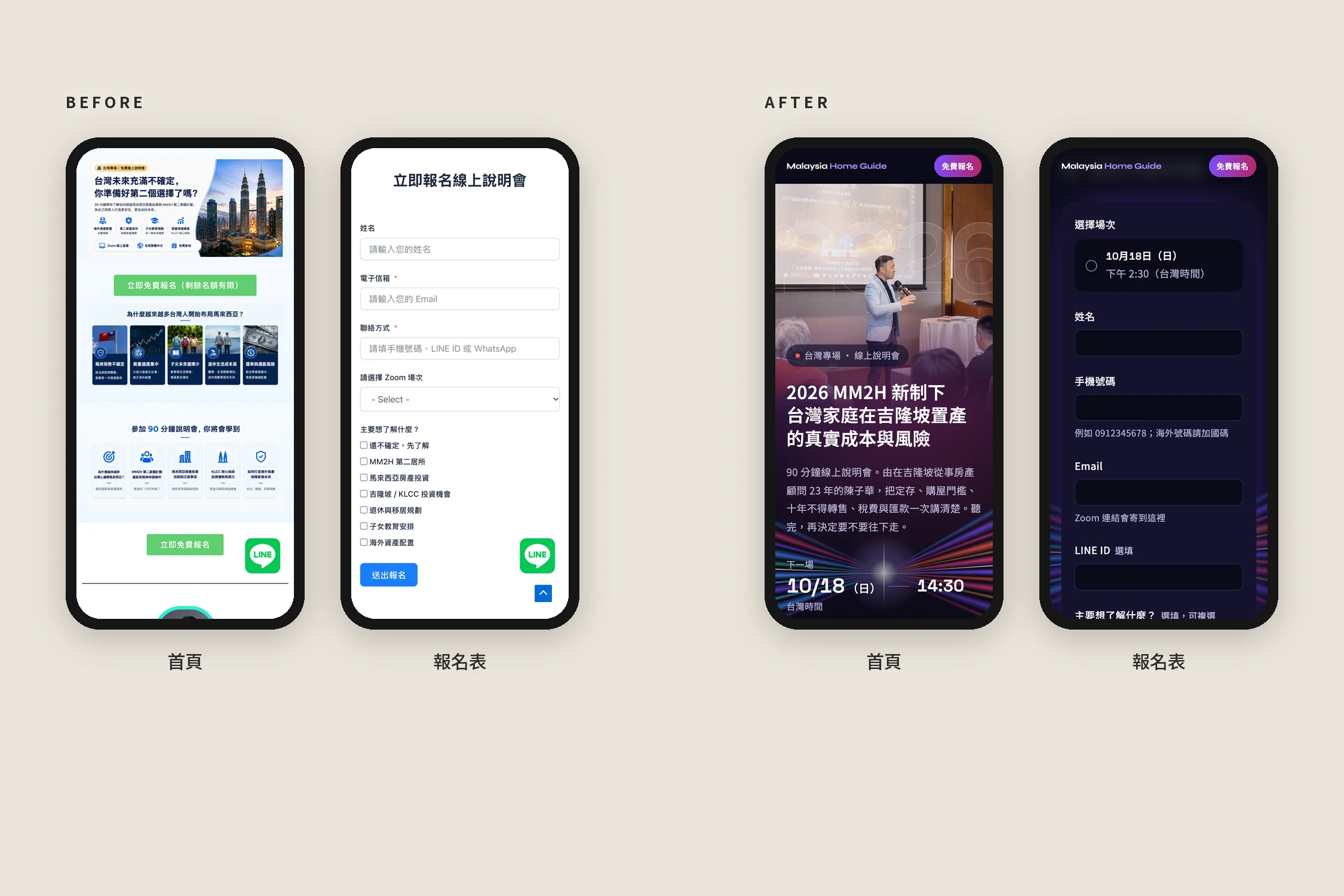
Built for phones too
On phones the speaker photo sits on top with the headline and next session right below, the steps run vertically, and every session in the form is a large, easy tap target.
Results
- Content rebuilt from images into real text that search engines and AI can read, and the leftover WordPress pages removed
- The speaker, the topic and the next session date are all on the first screen
- The page is ordered by the questions families have, so they're answered before the form
- One-page sign-up, with the confirmation, calendar file and Zoom link emailed automatically and the sign-up saved to the dashboard
- Sessions, sign-ups, copy, photos and SEO are all managed in the dashboard, on the existing domain and company mailbox