Punto Gelato: A Dripping Scoop That Makes a Hong Kong Back-Alley Gelato Shop Unforgettable

- 產業
- 手工義式冰淇淋店(香港中環)
- 服務項目
- 品牌識別(Logo)設計、官網設計與開發、互動動畫、響應式版面
- 專案時長
- —
- 開發工具
- 全客製化
Background
Punto Gelato is a handmade gelato shop tucked into an alley in Central, Hong Kong. When they came to us they had no logo, no brand color and no website. "Punto" means "point" in Italian, and the brand wanted to say one thing: take one turn and it gets sweet.
The Challenge
- The shop sits in an alley with no street frontage, so the website has to solve "easy to find, easy to remember" first.
- Gelato is an impulse purchase: flavors and prices must be reachable in as few clicks as possible.
- There is no original photography yet, so the page has to hold up with stand-in photos and survive a later photo swap without touching the layout.
The Solution
Brand identity: a scoop that drips
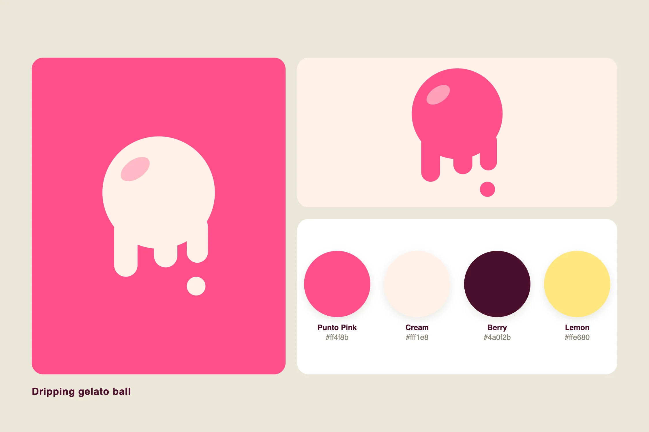
The logo is an abstract scoop of gelato with a few drips running off its lower edge, with no wordmark and no outline. The primary color is a saturated pink, paired with cream, deep berry and lemon yellow. The typeface is a rounded sans-serif that keeps everything light and easy to read.
Hero: the headline arrives first, the description follows the scroll
On desktop the hero is a full-bleed wall of four vertical photo columns, each fading on its own rhythm; on mobile it collapses to a single image that keeps cross-fading. "PUNTO GELATO" is on screen from the first moment in large pink type at the center. As the visitor scrolls, a cream-framed description fades in. There is no overlay on the photos.
Layout: text left, graphic right, details centered
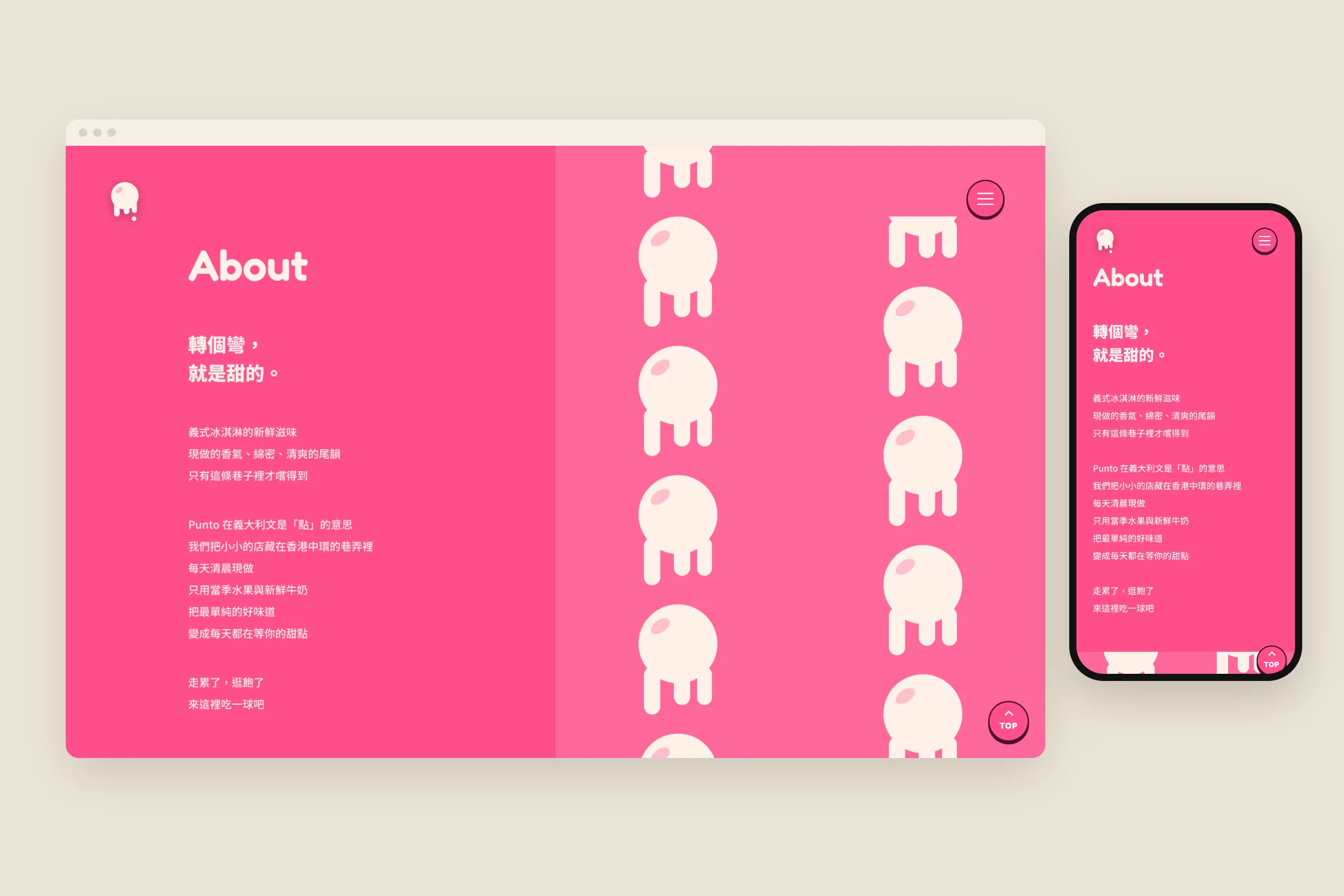
About is a two-column layout with text on the left and a parallax pattern of dripping scoops on the right. Address keeps only the street address, opening hours and phone number, centered, with no map, so the page stays clean. Section titles are larger and have no underline.
Menu: four cards in a row, details in a popup
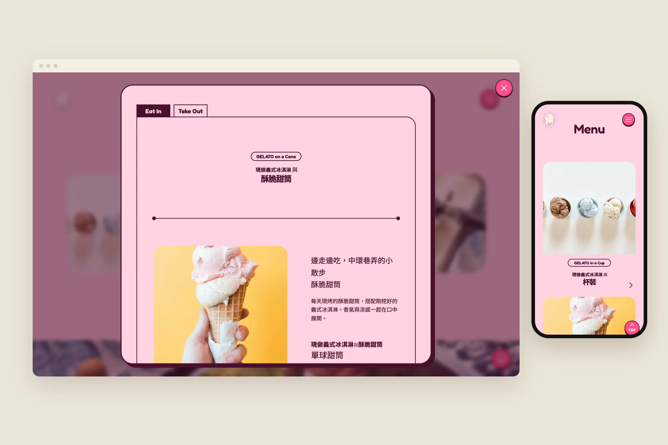
Four items sit in one row. On hover a pink overlay covers the entire card, and a click opens a centered popup with items, prices in Hong Kong dollars and descriptions. Click the backdrop or press Esc to close.
Responsive: four, two and one column
The menu goes from four columns to two to one by screen width, and About and Address stack on tablet and below. We checked every width from 320 to 1440 px, one by one, and found no horizontal scrolling.
Results
- A complete brand identity: logo, color and type
- A hero that shows the brand name from the first second and brings in the description on scroll
- A single-page website that works on phone, tablet and desktop