Waker: step by step, a nonprofit website that walks people to where help is needed

- Industry
- Nonprofit, international volunteering and child companionship
- Services
- Website redesign and build, content migration, registration flow, content management and SEO
- Type
- Concept proposal
- Built with
- Fully custom
Background
Taiwan Waker Association (Waker) was founded in 2012. It starts from keeping children company, and leads teams of volunteers, one trip after another, into underserved communities in Taiwan and abroad. So far that adds up to 32,682 volunteer trips, 186,993 children accompanied and 103 service sites.
Their website is hosted by their CRM provider, with donations, registration and membership all tied together, and over a decade it has gathered hundreds of news posts, stories and events. This is a concept proposal by Blank Design: if we started again, how should a nonprofit website lead people to their next step?
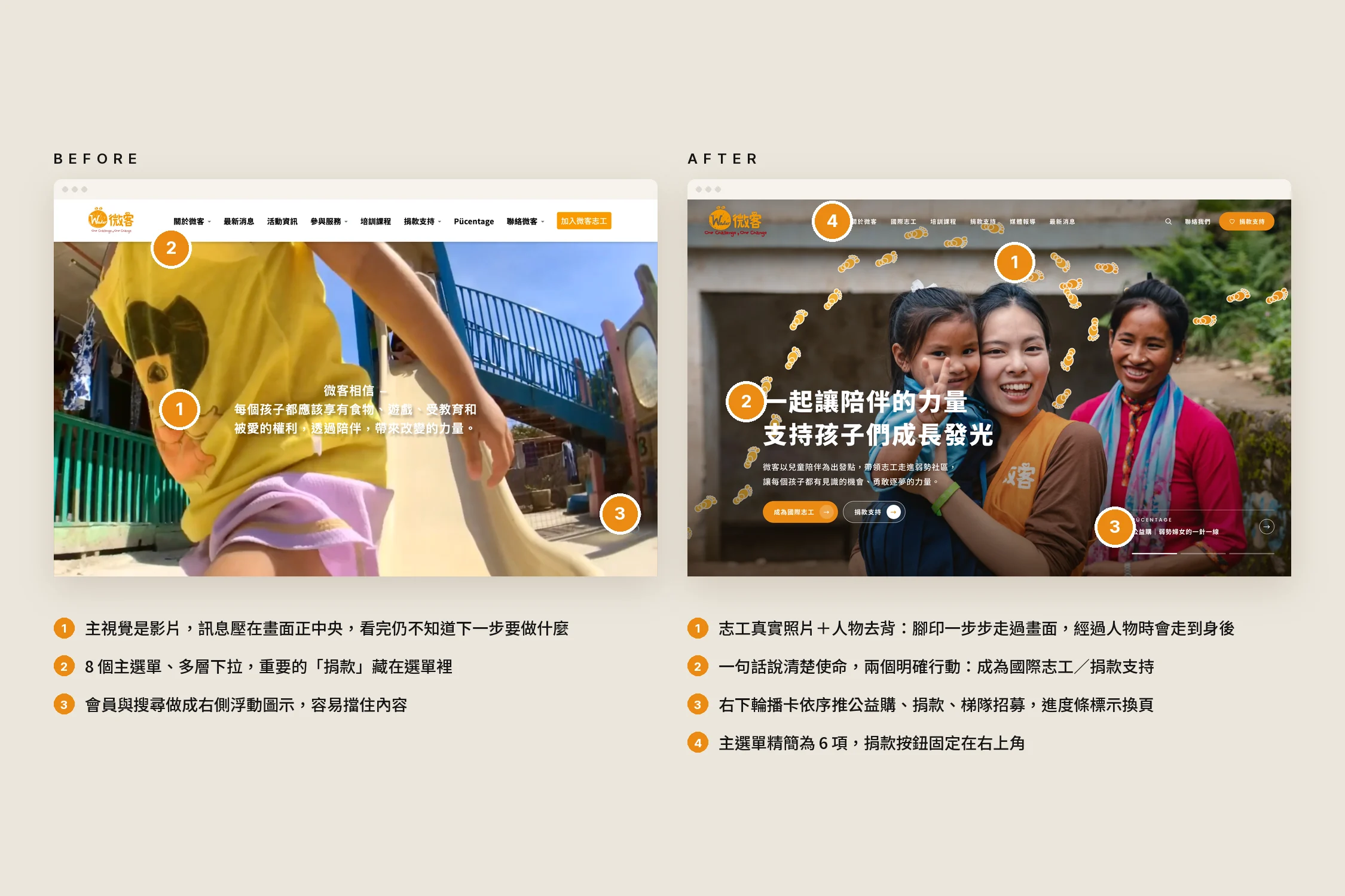
The original design
We took the original site apart before redrawing anything. Waker already had a clear brand: an orange logo, the line "One Challenge, One Change", and a wealth of real photos taken by volunteers at their sites. The brand was never the problem; the path through the site was:
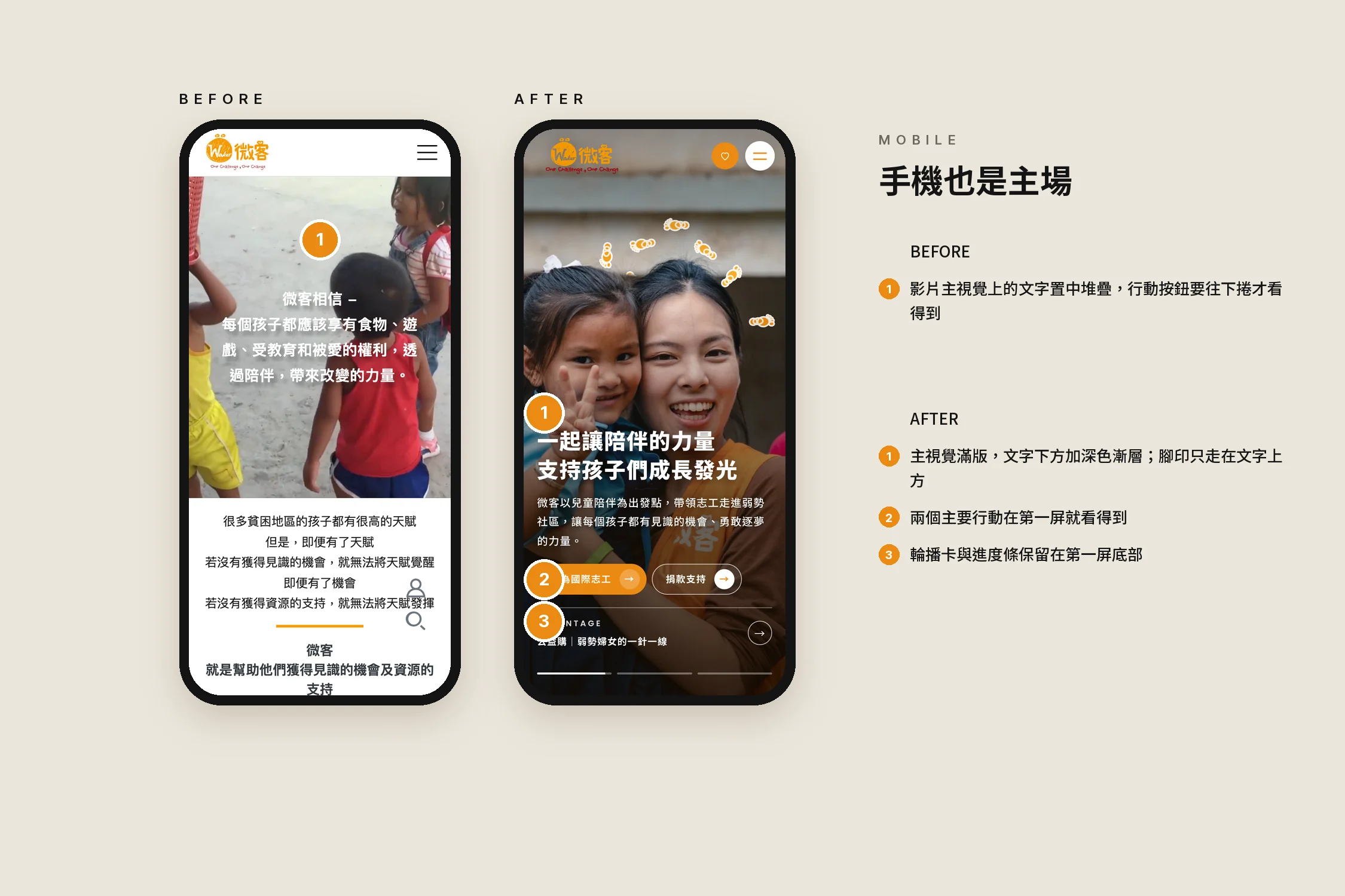
- The hero was a video with the slogan centred over it; after watching, you still didn't know what to do next.
- The menu followed the organisation chart: eight top-level items with nested dropdowns, and "Donate" hidden inside one of them.
- Every page used the same template, a large banner with a centred title, so pages were hard to tell apart.
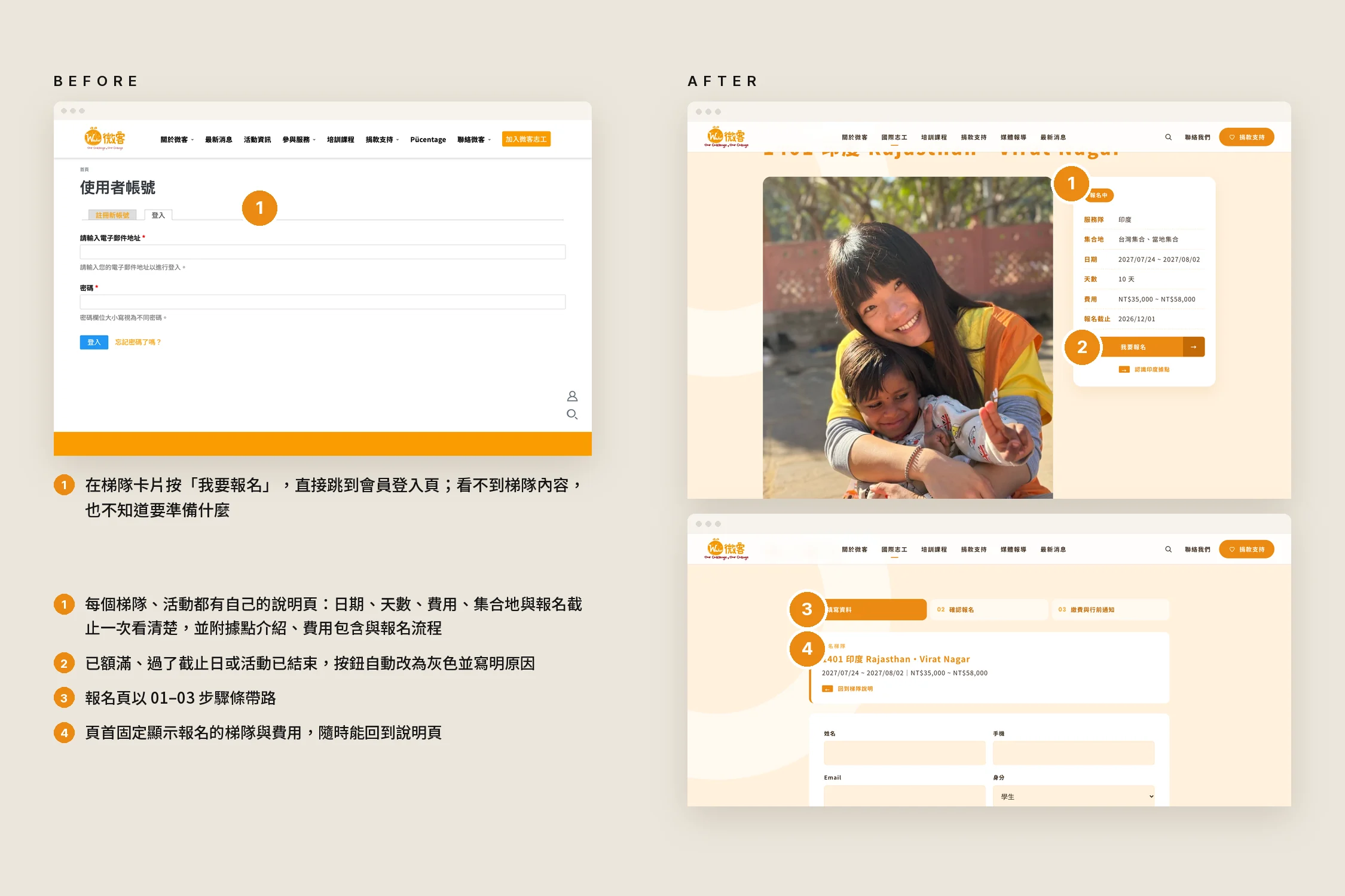
- "Register" went straight to a member login: people interested in a trip had to sign up before seeing its dates or fees.
So this redesign keeps the brand colour, the logo and the real photography, and changes every step a visitor takes once inside.
The challenge
A nonprofit website serves two kinds of people at once: those who want to join a volunteer trip, and those who want to give. They need completely different information, yet both make their decision on the same homepage.
At the same time, donations, event registration and member records all live in the existing CRM and can't, and shouldn't, move; over a decade of content had to come across without losing a page; and with no in-house engineer, the organisation had to be able to update the site itself.
Before and after
| Before | After |
|---|---|
| Video hero with a centred slogan, no clear next step | Real volunteer photo, one line stating the mission, two actions: volunteer / donate |
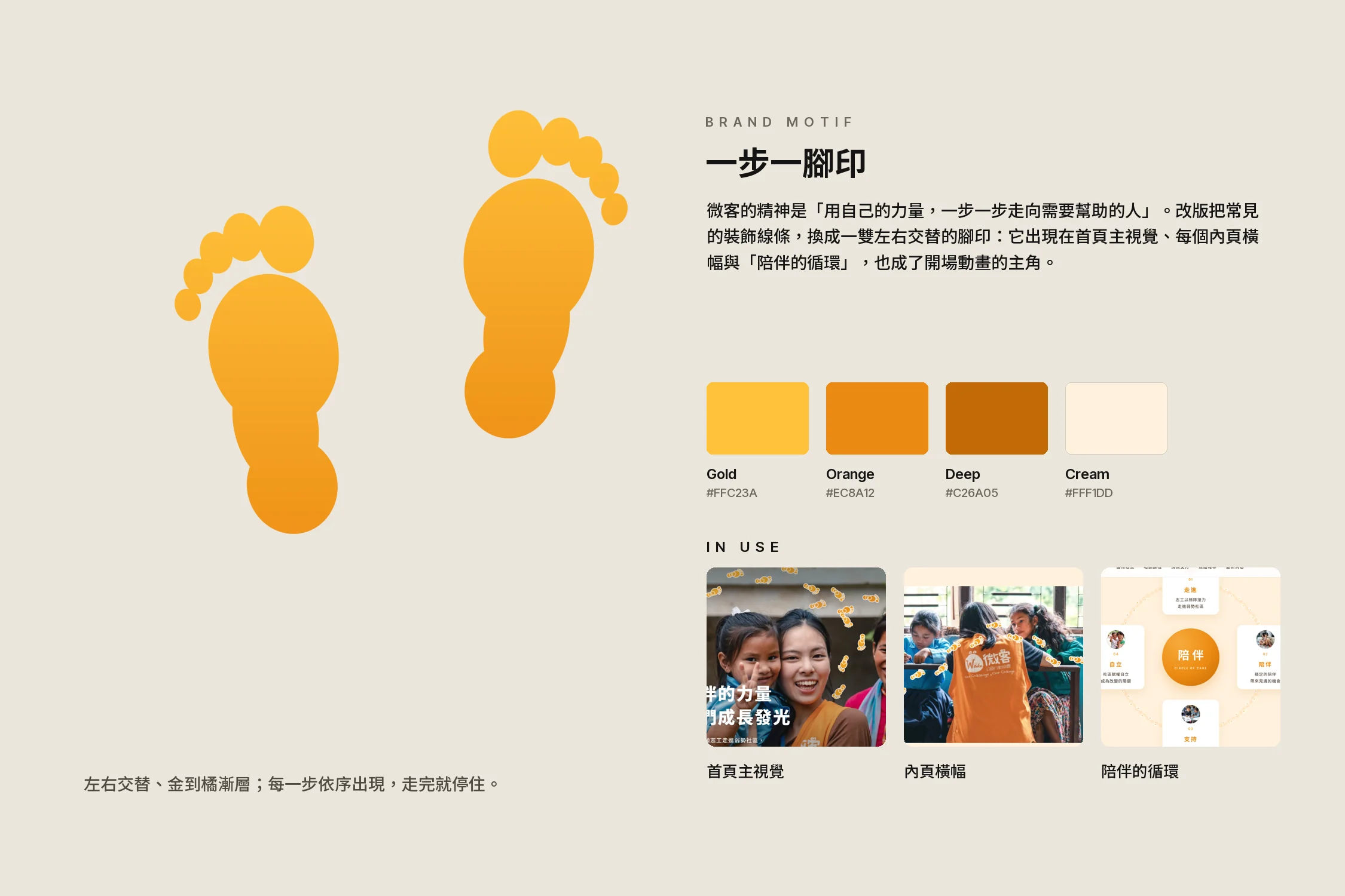
| Decorative lines and blocks of colour | A pair of alternating footprints, running through the homepage, inner pages and the opening animation |
| Eight menu items with nested dropdowns | Six menu items; the volunteer menu lists all 11 service teams |
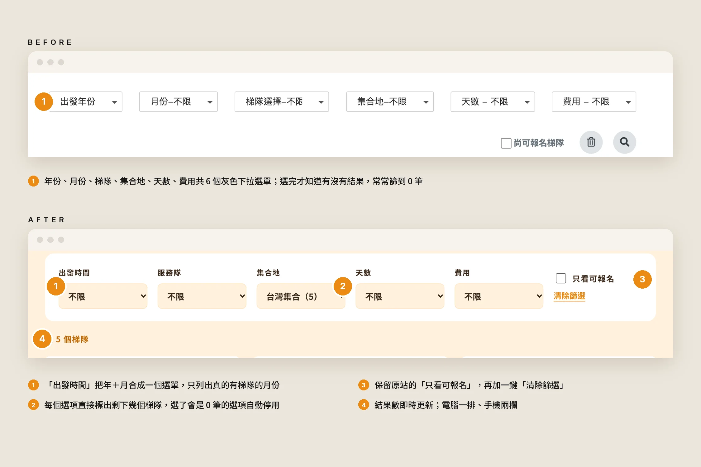
| Six dropdowns to filter trips, often ending in zero results | Year and month merged, each option shows how many trips remain, empty options disabled |
| "Register" went straight to a login page | Every trip has its own page: dates, fees, meeting point and the service site, before sign-up |
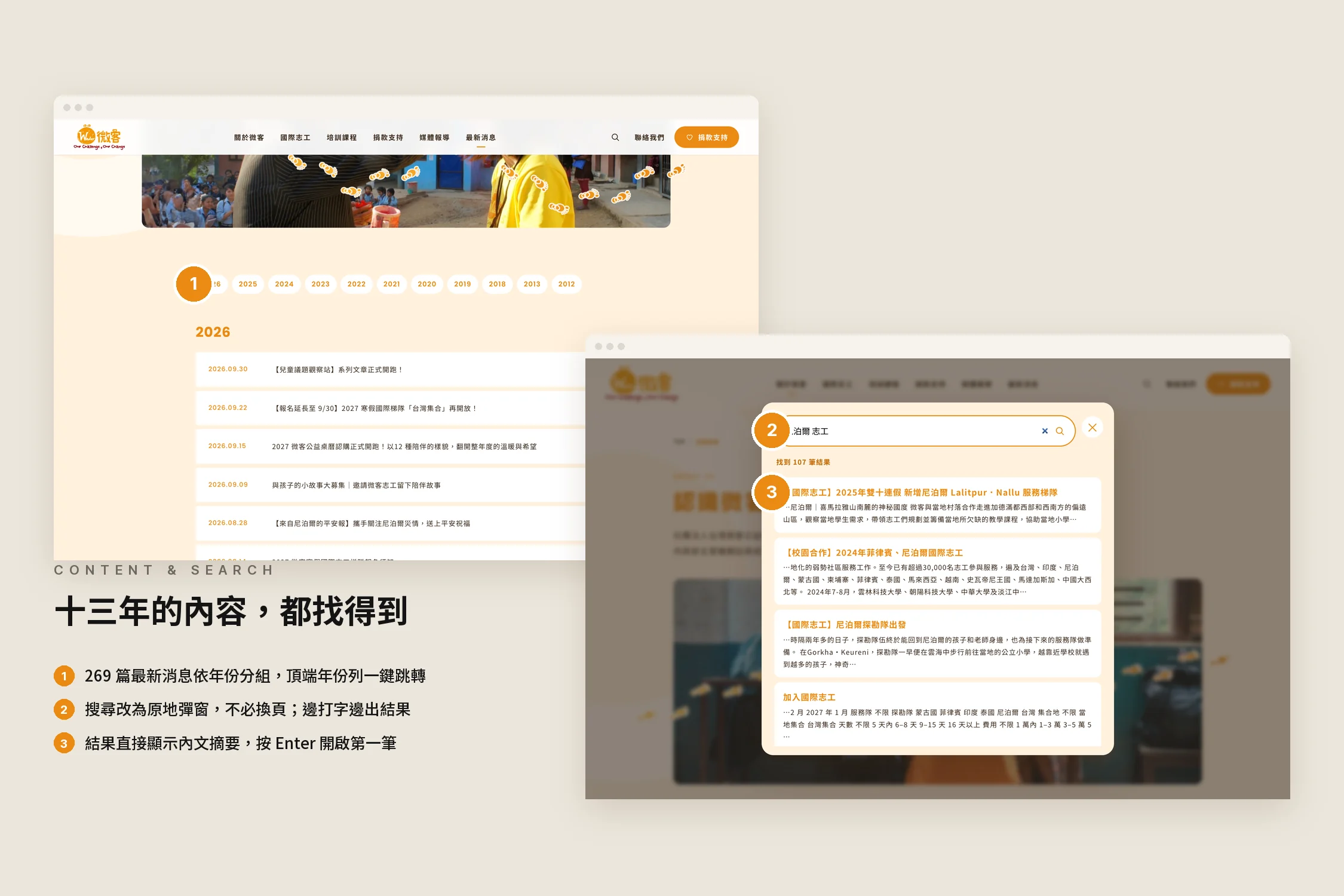
| Search on a separate page | Search in an overlay, with results as you type |
| Content changes needed the system provider | Self-managed back office, with SEO and GA4 entered directly |
What we did
Step by step: turning a belief into a symbol
Waker's belief is to walk, step by step and under your own strength, towards the people who need help. We replaced the usual decorative lines with a pair of alternating footprints in a gold-to-orange gradient that appear one step at a time and stop once the walk is done. They cross the homepage hero, every inner-page banner and the "circle of care", and step behind people in the photos, giving the image depth.
Real people, real companionship
The hero is no longer a video but real photos of volunteers and children, chosen from more than a decade of original uploads for the highest resolution, so they stay sharp on large screens. The people in each photo are cut out so the footprints can pass behind them. The slogan is down to one line, "Let the power of companionship help every child grow and shine", with two action buttons right beneath it.
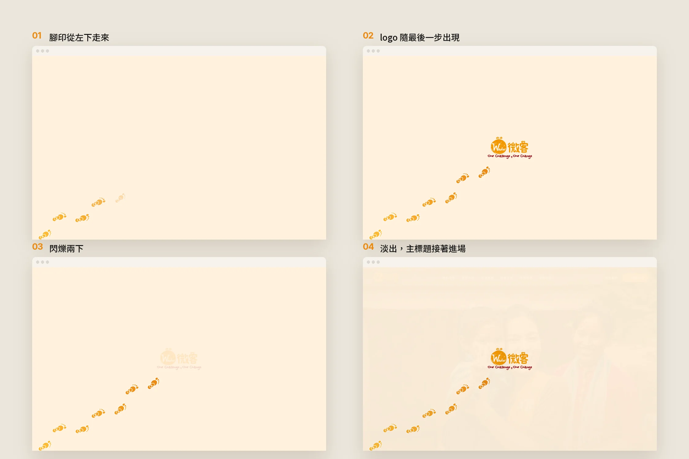
Opening animation: footprints walking to the logo
On the first visit, a trail of footprints walks in from the bottom left; as the last step lands, the logo appears, blinks twice and fades to reveal the homepage. The headline and the footprint walk wait for the opening to finish, so nothing plays unseen, and it doesn't repeat as you move between pages.
Trip finder: tell people how many first
We kept the original six filters, but merged year and month into a single "Departure" list showing only months that actually have trips. Every option shows how many trips would remain, options that would leave none are disabled, and one click clears everything. Visitors no longer have to guess where there's still a place.
From "log in first" to "understand first"
On the original site, "Register" on a trip card went straight to a member login. Now every trip and event has its own page with dates, length, fees, meeting point and deadline at a glance, plus the service site, what the fee covers and how registration works. When a trip is full, past its deadline or over, the button greys out and says why; the sign-up page guides people through three steps and keeps the trip and fee in view at the top.
More than a decade of content, nothing left behind
269 news posts, 68 impact stories, 24 media reports, past events, publications and annual reports all moved into the new site, and links that used to point elsewhere now lead to pages on the site itself. News is grouped by year, and search opens in place with results as you type.
Mobile as a first-class home
On mobile the hero fills the screen, a dark gradient sits beneath the text and the footprints stay above the headline; both main actions are visible without scrolling. Each country page gains a sticky tab bar for the site, trips, volunteer stories, how to register and FAQs, each one tap away.
Service map: from a picture to an interactive map
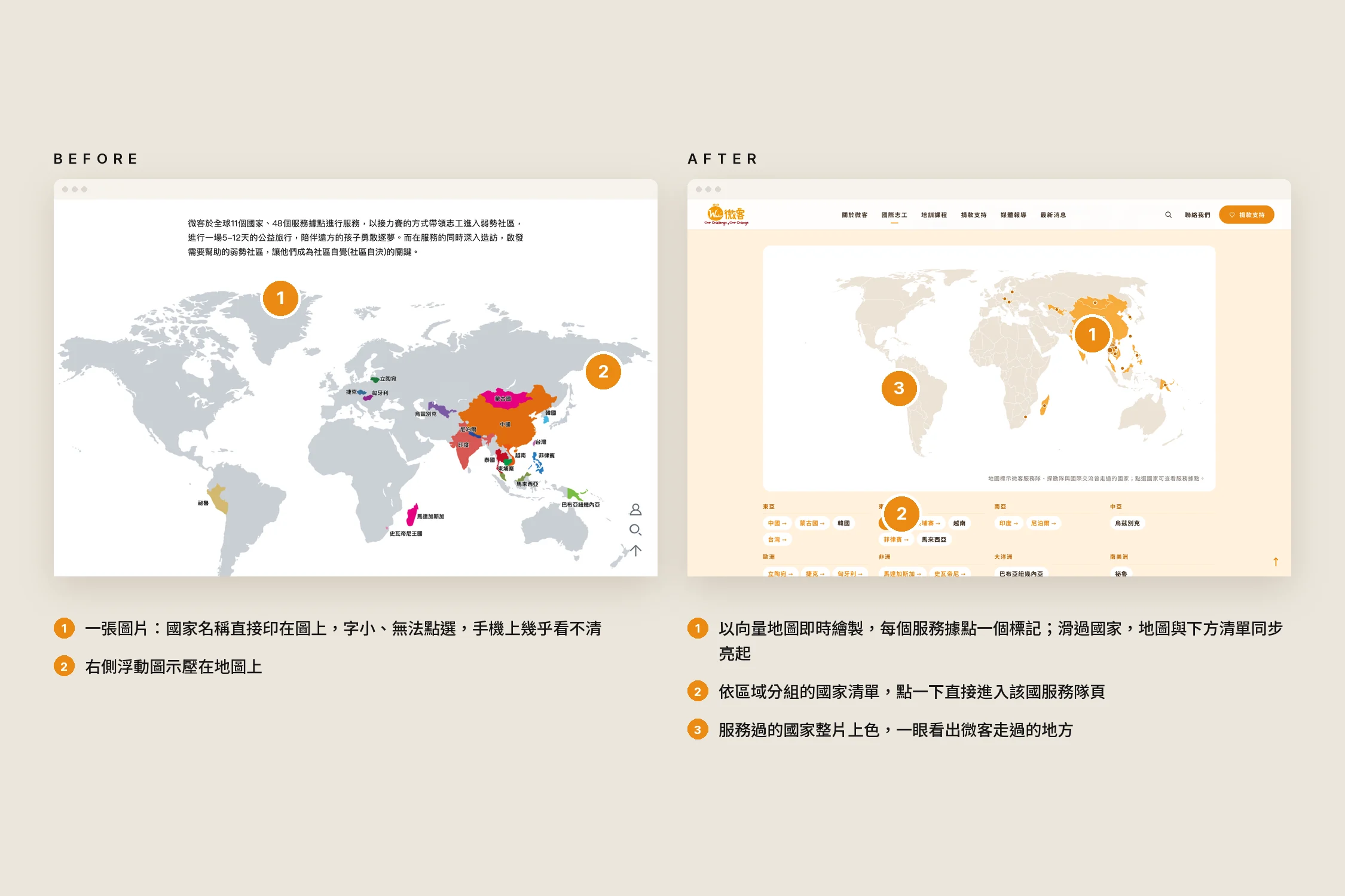
The original service map was an image with country names printed onto it: tiny, unclickable and nearly unreadable on a phone. Now it is drawn as a vector map with a marker for every service site. Countries Waker has served are filled in; hovering a country lights it up on the map and in the region list below, and one click opens that country's team page.
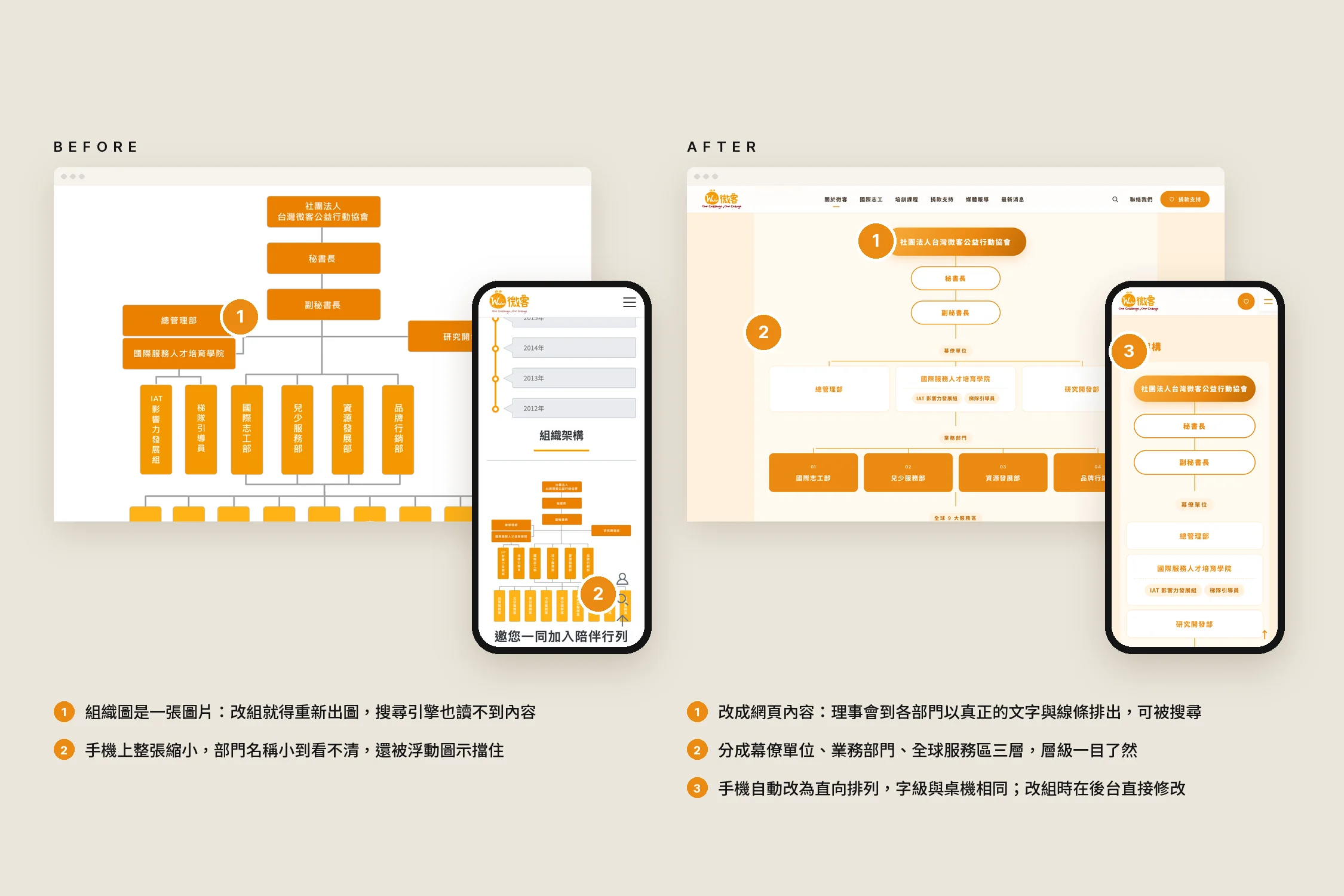
Organisation chart: from an image to real content
The organisation chart was also an image: every restructure meant redrawing it, search engines couldn't read it, and on a phone the department names were too small to make out. Now it is built from real text and lines in three tiers, support units, departments and global service regions; on mobile it stacks vertically at the same type size as desktop, and changes are made directly in the back office.
Results
- "Step by step" reinterprets Waker's belief as a symbol that runs through the whole site and its opening animation
- Both main actions, volunteer and donate, are visible on the homepage's first screen
- The trip finder and trip pages answer questions before registration, with no login needed to see a trip
- More than a decade of content carried over in full, no outbound links, and search in place
- The service map and organisation chart are now real web content rather than images: readable and clickable on mobile, and editable in the back office