Client cases Case 03
Chinese Taipei Athletics Association | A one-page website that grew the association's following 8×
Chinese Taipei Athletics Association


Industry
Sports eventsServices
Website development, one-page design, UX optimizationDuration
2 monthsResult
Facebook page 600+ → 5,000+ (8×) · live in 2 weeks · 100% registration success rate
Background
The Chinese Taipei Athletics Association runs international meets every year. This was our third year working with them, and the brief was the official site for the New Taipei International Athletics Open, held at Banqiao Stadium. Competitors, media, and spectators from Taiwan and abroad all needed one place to find the schedule, start lists, and live coverage.
A second problem was just as pressing. The association's Facebook page had just over 600 followers, far too few for an event of this size. Once the meet was over, its visitors would simply drift away, and the association had no channel for keeping in touch with them.

The challenge
An event site lives a short life on a tight schedule, and its traffic is concentrated in the days before and during the meet. We had two weeks to go live, and two jobs to do at once:
- Get the schedule, start lists, and live coverage to visitors by the shortest possible route, whether they're on a desktop or a phone
- Keep that burst of traffic, and turn it into a community the association can look after long term
The two are connected. When people find what they need, they warm to the event, and only then does an invitation to follow feel welcome rather than pushy.
What we did
We reduced the site to a single page: an opening screen, the key visual, event information, the organizers and co-organizers, and the footer. Scrolling from top to bottom is the whole information path. The visual language carries the speed of the key visual, but every decorative element gives way to the information.
Desktop
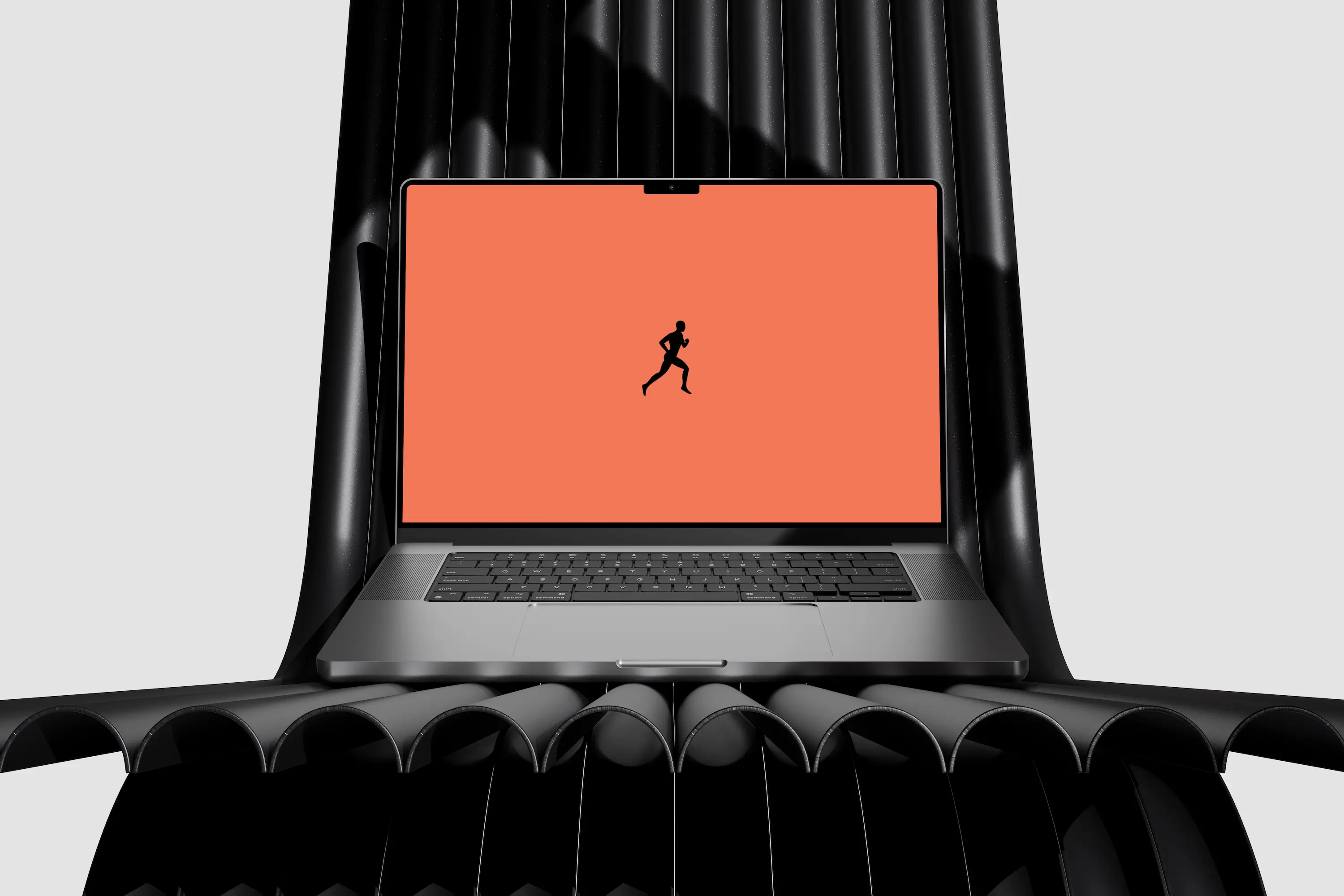
While the site loads, a short opening screen shows a runner's silhouette on the event color, so the second or two of waiting still says athletics rather than showing a blank page.
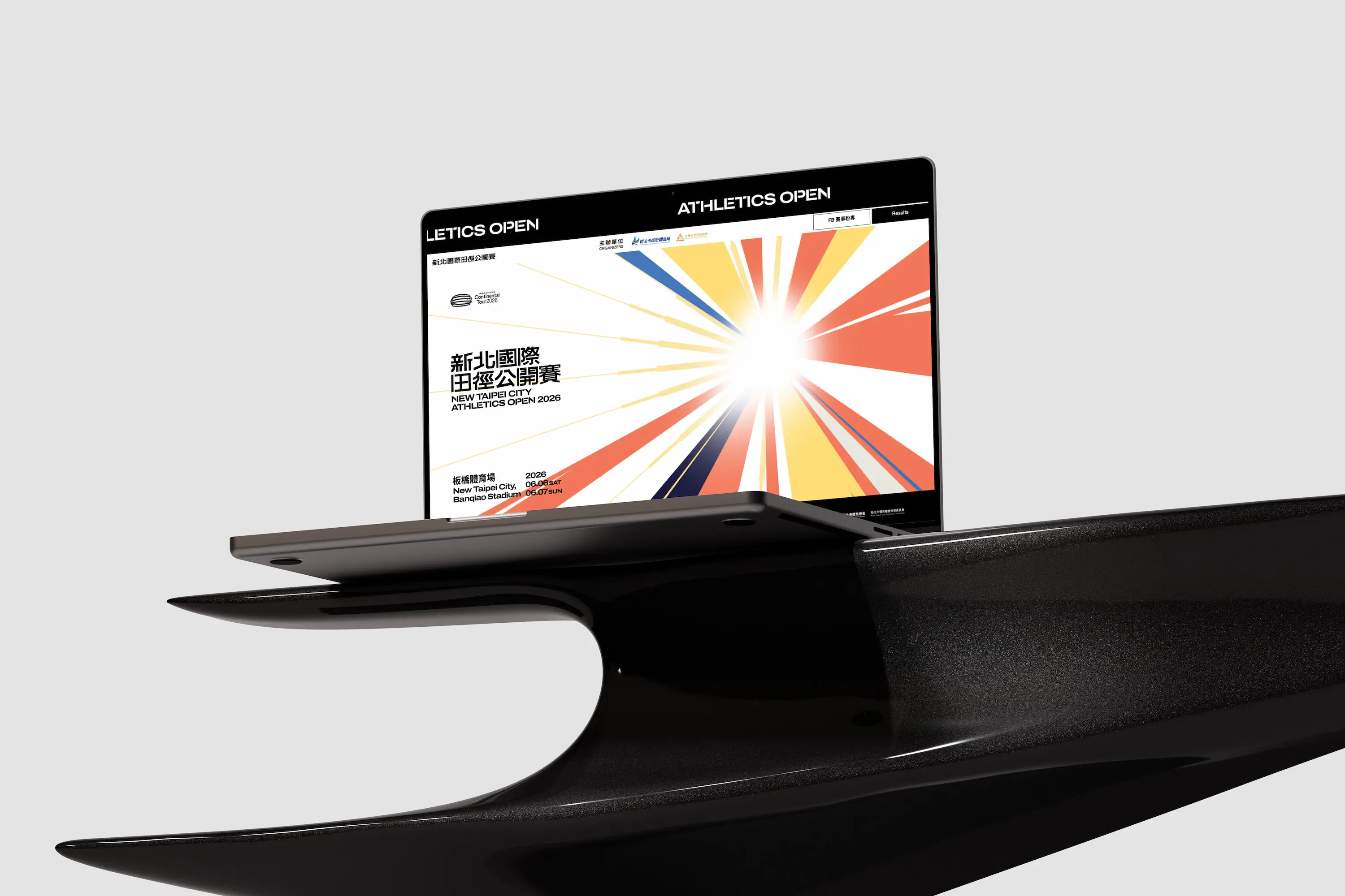
The first screen puts the event name, dates, and venue where they cannot be missed, over the radiating bands of the key visual. Without scrolling, visitors know which meet it is, when, and where.
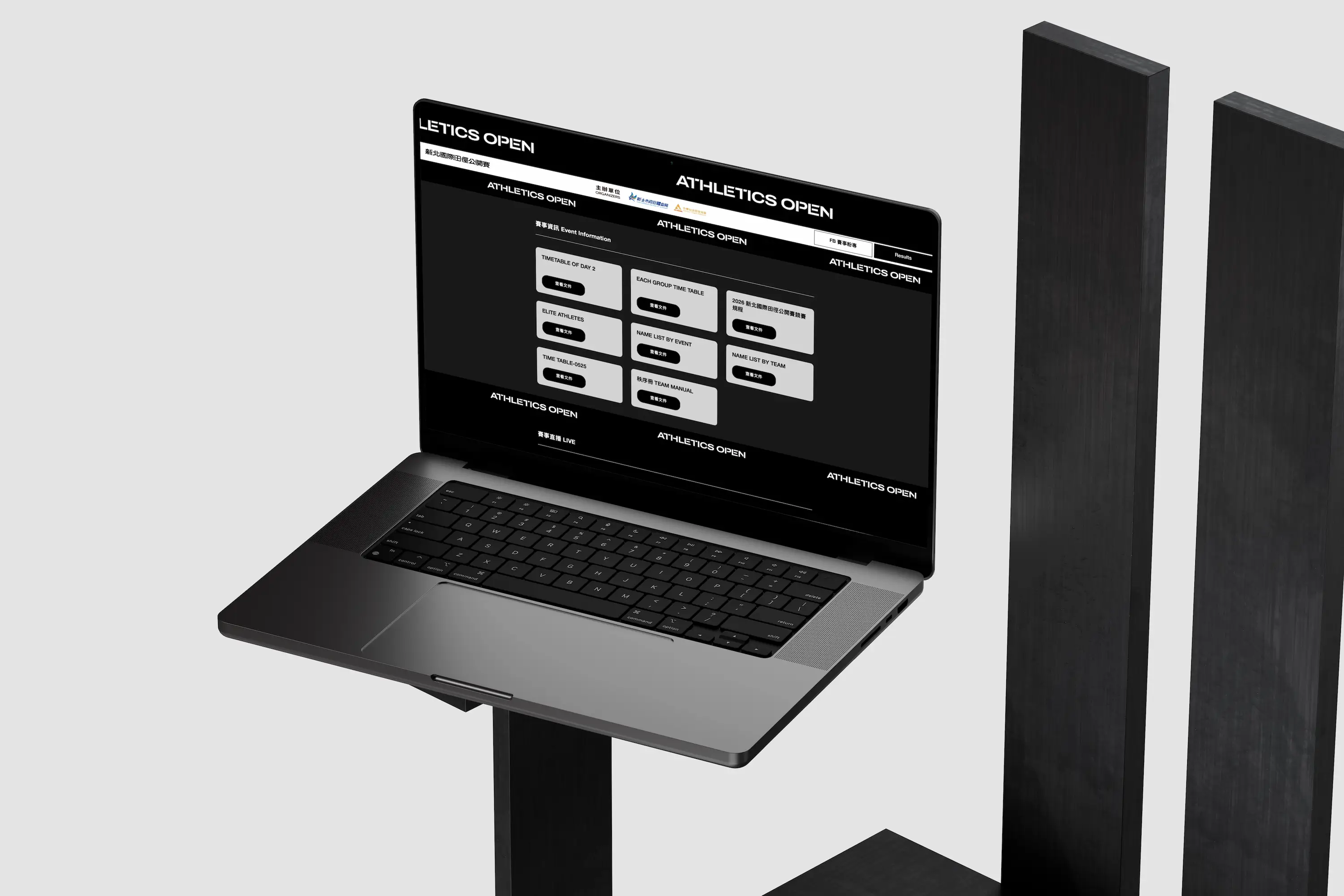
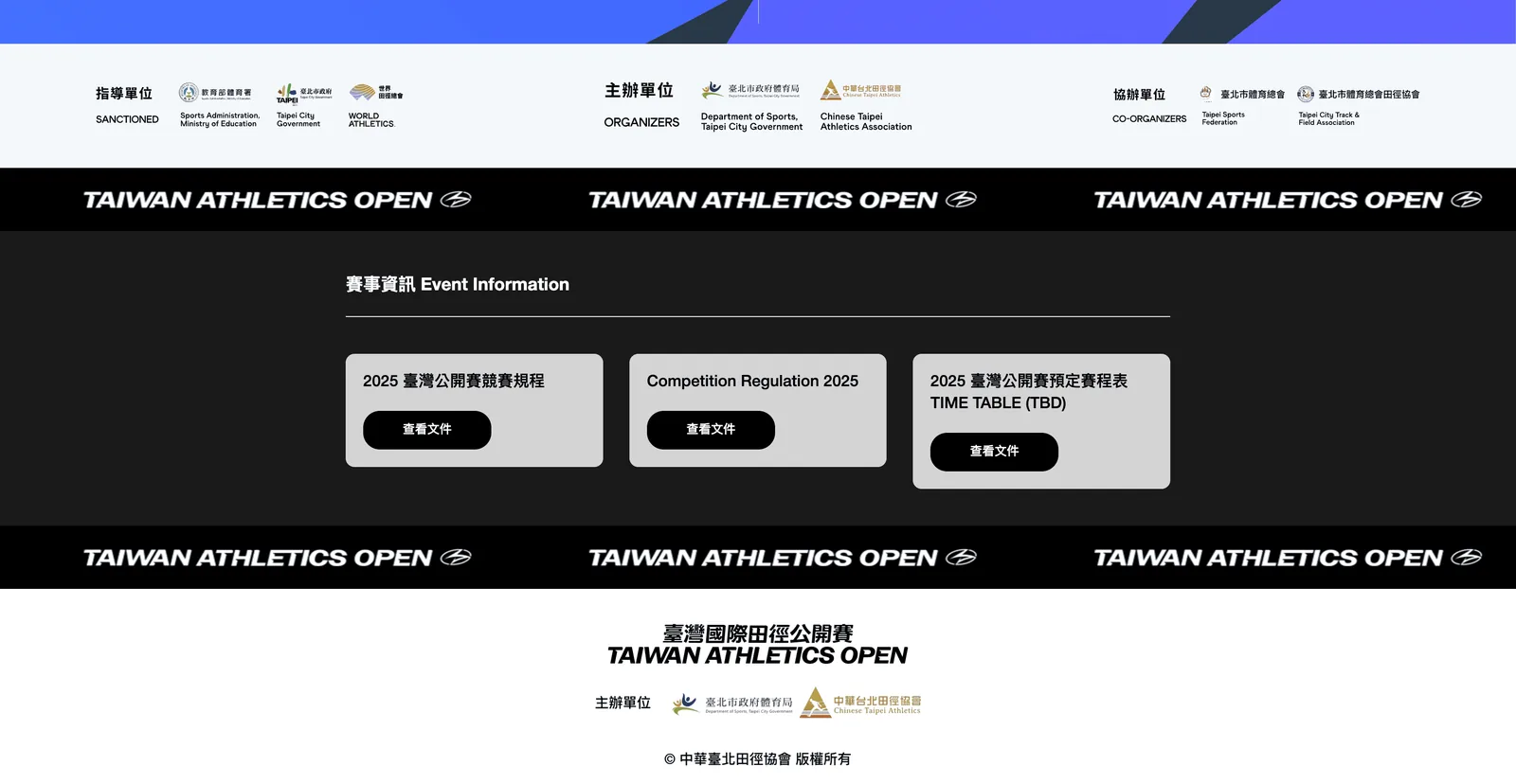
One screen down is the event information. Each document, such as the competition regulations and the schedule, is its own card with a clear title and a single button, so visitors from anywhere can open exactly the one they need.
Mobile
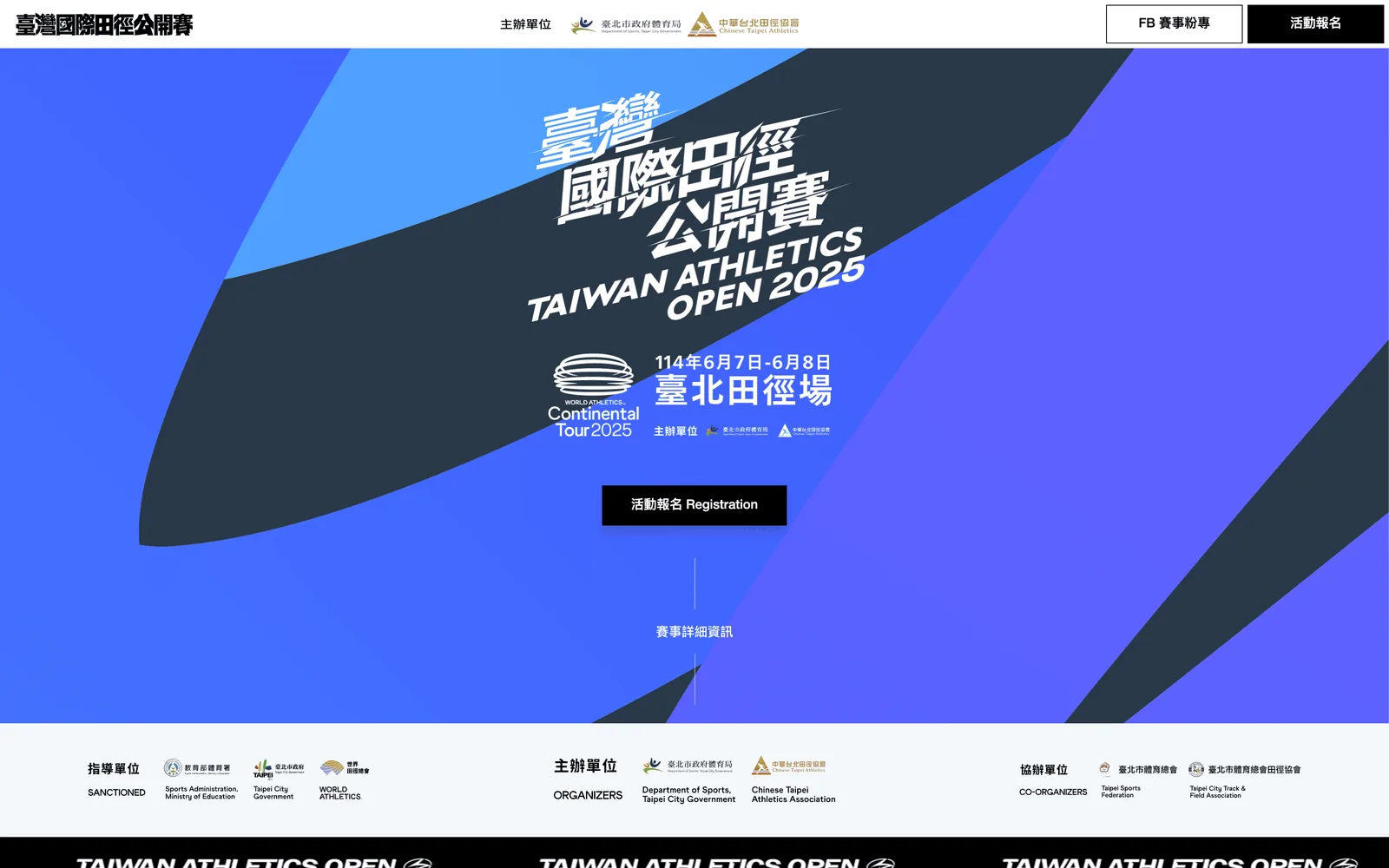
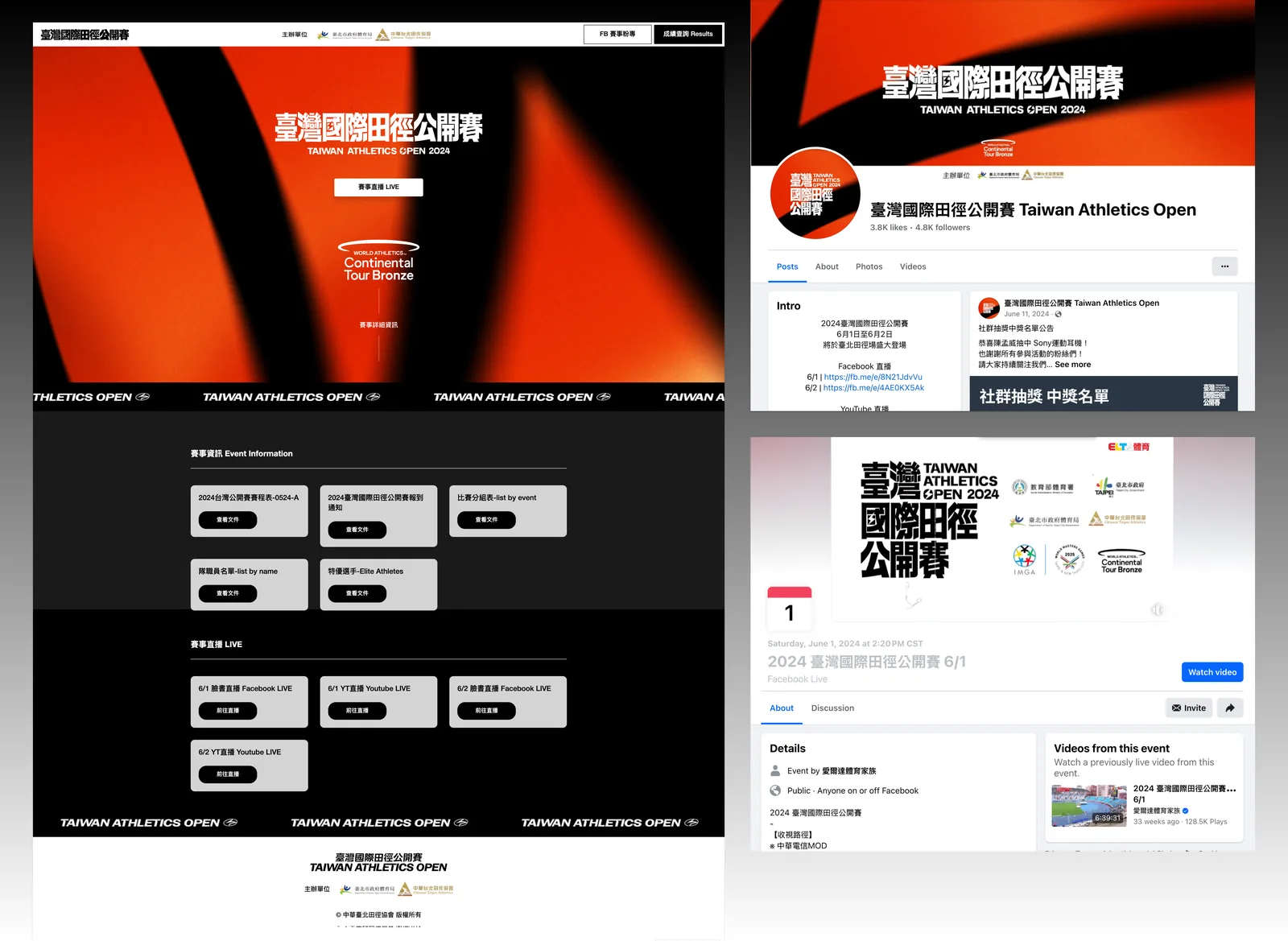
The same one-page structure was also used for the association's Taiwan Athletics Open site. Its desktop and phone screens below show that, even on a small screen, the first view keeps the event name, dates, venue, and registration button, with a thin line drawing the eye down to the event details.

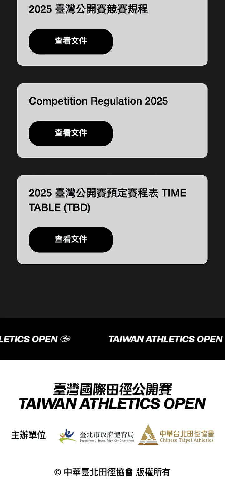
On the phone, the three-column document cards stack into a single column, and every "View document" button has a comfortable tap area. The logos of the supervising body, organizers, and co-organizers sit together in one section, and the footer lists the organizers and copyright notice again.
Key design decisions
One page, because visitors come for a few things
Visitors to an event site want the schedule, the entry list, and the live stream. Every extra click is one more chance they won't find it. With everything on one page, athletes, press, and spectators from Taiwan and abroad just scroll; nobody has to figure out how the site is organized. It is also what made a two-week launch possible: we built only what was needed.
The most important information in the first second
The most-searched details sit at the visual center, where visitors spot them the moment the page loads. Flowing lines and radiating bands echo the speed of track and field, but they stay in the background and never take the place of text or buttons. The information section switches to a dark background with light cards, so the contrast holds up even on a phone outdoors.
A marquee band to pace a long page
A one-page site can easily become one long strip with no sections. Between the main blocks we placed a scrolling band carrying the event name. It works as a divider, and it keeps the name in view as people scroll, so they always know which event they are looking at.
The button that grew the community
The Facebook page link is placed deliberately, at the point where visitors have found what they came for and taken an interest in the event. An invitation to follow at that moment feels natural rather than pushy. From that one small spot, the page grew from about 600 followers to more than 5,000.
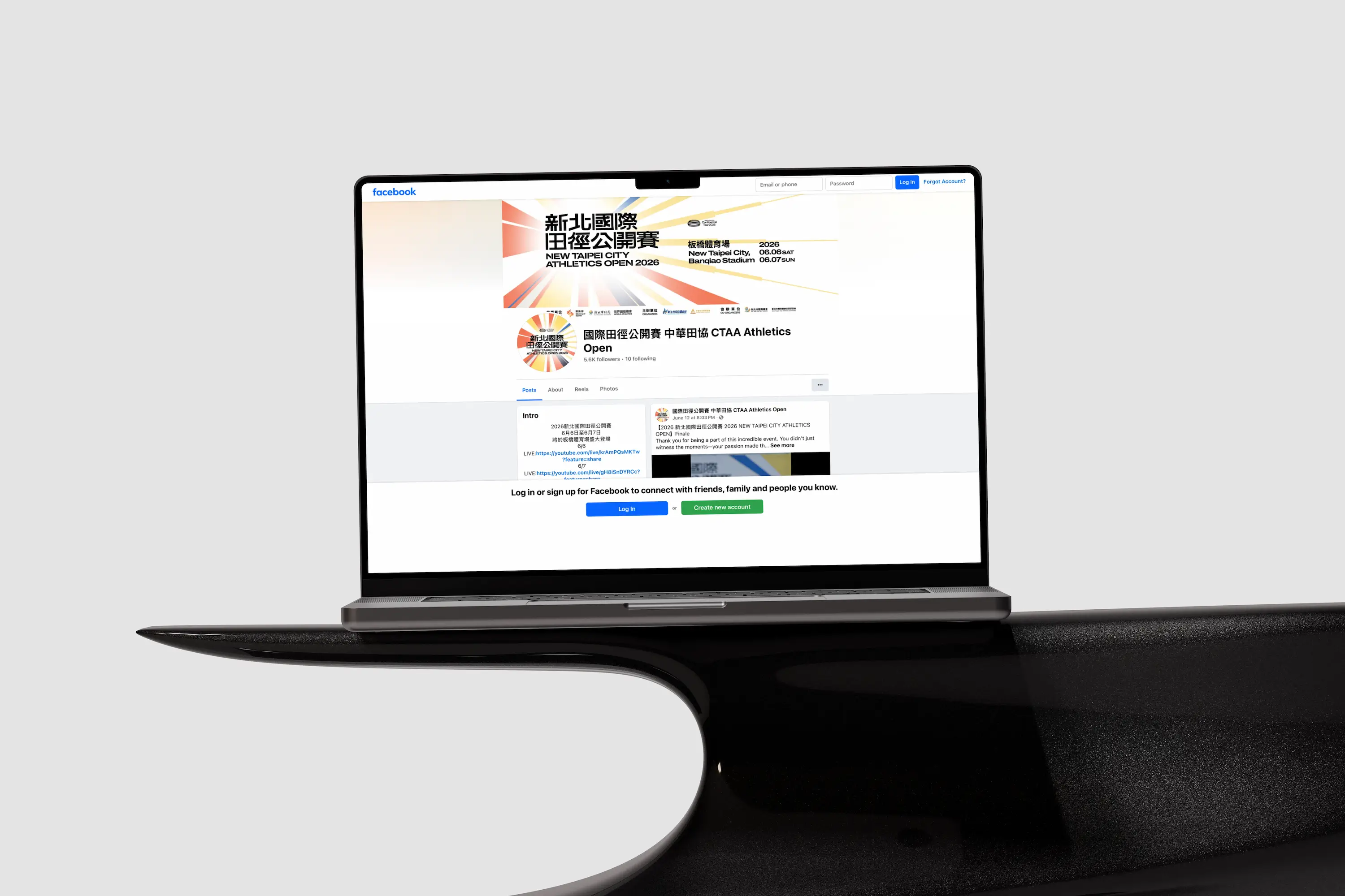
The same approach carried over to the association's other meets. The Taiwan Athletics Open site has a Facebook button in its header, linking the site, the event listing, and the Facebook page into one path.
Results
- Facebook followers grew from 600+ to 5,000+ (8×)
- Live within two weeks
- 100% registration success rate, with no failed registrations
- The same one-page structure also serves the association's Taiwan Athletics Open site
Advice for events and associations
An event website is different from a brand website: it has a short life, tight deadlines, and concentrated traffic. When planning one, think of it like this:
- Visitors come for a few things: list them and put them all on the first screen or within one page.
- Keep the event's audience: after the event the site goes quiet, but social media can keep those people. Invite them to follow when they're most satisfied; that works far better than a link in the footer.
- Short timeline? Cut scope: shipping in two weeks comes from building only what's needed, not from overtime.
Next caseHsieh Ming Chin Face SalonGet a quote“留白設計 BLANK DESIGN's professionalism and speed were impressive… and one small, thoughtful idea brought us community growth we never expected.”