Work
Hsieh Ming Chin Face Salon|A clean, trustworthy site for a 30-year-old salon
Work C03:Hsieh Ming Chin Face Salon

Industry
Skincare, men's facials, hair careServices
Logo, web design and development, UI/UX, imagery, information architectureBuilt with
Fully custom static site
Background
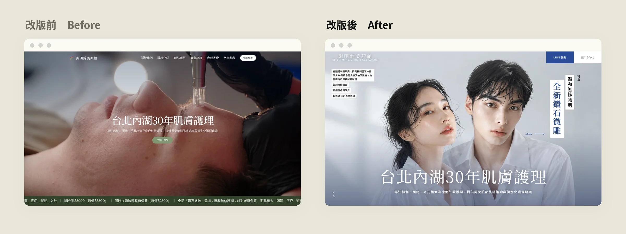
Hsieh Ming Chin Face Salon has been treating blackheads, acne, enlarged pores and scarring in Neihu, Taipei, for nearly thirty years, and many of its clients are men getting their first facial. The old site had plenty of content (services, before/after photos, hair care and a regular column), but it was laid out as tick-box lists and scattered photos. None of it looked like a salon with three decades of experience.
The challenge
People trust a skincare salon before they book it. A visitor needs to feel cleanliness and expertise within seconds, then see real results, then find the way to book. On the old site, services, results and articles sat in separate places with mismatched photos, and booking was buried in the menu.
What we did
A new logo
A horizontal wordmark in serif Chinese with an English subline replaced the old icon. A round HMC monogram serves as the site icon. The main colour is a steady blue (#2B4C99), which reads as clinical and clean on white while keeping the warmth of a neighbourhood salon.
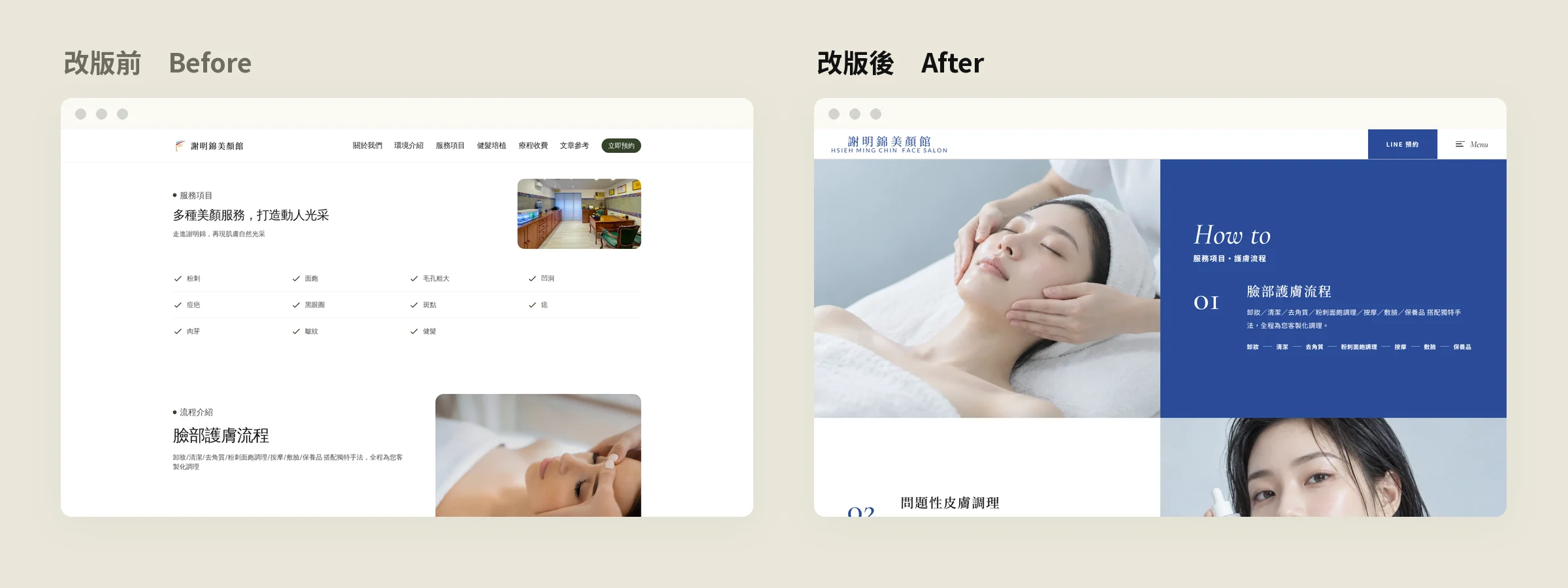
Full-bleed 2–3 column layouts, no white borders
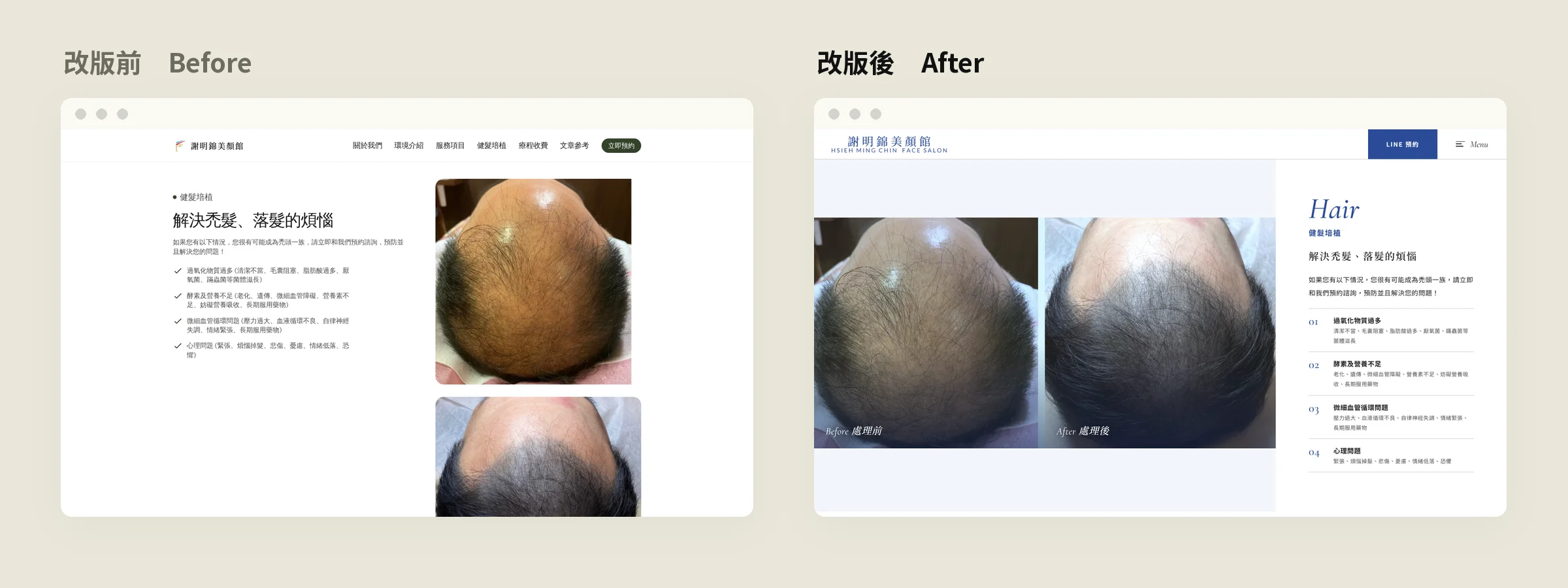
The whole site uses full-bleed two- and three-column grids. Photos run to the edge, text gets generous space, and the fussy white frames between cards are gone. The facial routine, problem-skin treatments, hair care and the salon itself all follow the same grid, so the site reads like a catalogue.
A before/after gallery you draw like cards
Nine before/after photos sit in a 3×3 deck. Each card lifts as you hover it, and clicking one opens it large on the right with a note. Real results are the most persuasive thing a salon can show, so this became the most playful part of the home page.
Consistent photography and article covers
All service photos, products and the covers of 14 articles were brought into one cool, natural-light style. Products were cut out, photos were colour-matched, and article covers were re-made per topic without the obvious AI look. The column now reads like a publication rather than a loose blog.
Every page leads to booking
A fixed LINE button in the header, a booking link in each section and a full-width booking block before the footer mean visitors can get in touch from anywhere.
Design decisions
Why blue, not pink
Beauty sites usually go pink and gold. A large share of this salon's clients are men, and its focus is problem skin. Blue says clean and professional, lets anyone feel comfortable clicking in, and sets the salon apart from typical beauty parlours.
Put the content into a grid, don't fill the grid
We kept every piece of the old site's content and changed only how it is seen. Full-bleed grids let the photos carry the page, and each block of text does one job. The site got quieter, and the results and services became easier to read.
A photographic style matters more than any single photo
One good photo cannot carry a website; a consistent style can. From the hero to the service images to the article covers, every image follows the same light, colour temperature and framing, so every page feels like the same brand.
Advice for skincare and beauty businesses
- Before/after photos are your best content. Put them on the home page and design them well; they beat ten adjectives.
- Keep one photographic style. Matching colour across service, product and article images instantly lifts the whole site.
- Keep booking in view. When a client decides to book, they should not have to look for the button.