Work
Win Sing: architecture with a human heart, two directions for forty years of work
Work C07:Win Sing Development(concept proposal)
Industry
Property development, urban renewal and constructionServices
Website redesign and build, bilingual content migration, logo vectorisation, SEOType
Concept proposalBuilt with
Fully custom
Background
Win Sing Development was founded in 1977. Over four decades it has built projects across Taipei, among them Win Sing - Xinyi, Win Sing - AIT and Win Sing - Rih Rih, and its group includes Archit Construction, the Winsing Arts Foundation and Win Sing Art Place. Its website holds 26 projects, 3 urban renewal projects in progress and 38 news posts: 232 URLs across Chinese and English.
This is a concept proposal by 留白設計 BLANK DESIGN: for a developer whose core value is humanity, how should a website let the buildings speak for themselves? We proposed two directions. Option 1 is a complete website in light, humanist tones; Option 2 is a dark, immersive brand site.
The original design
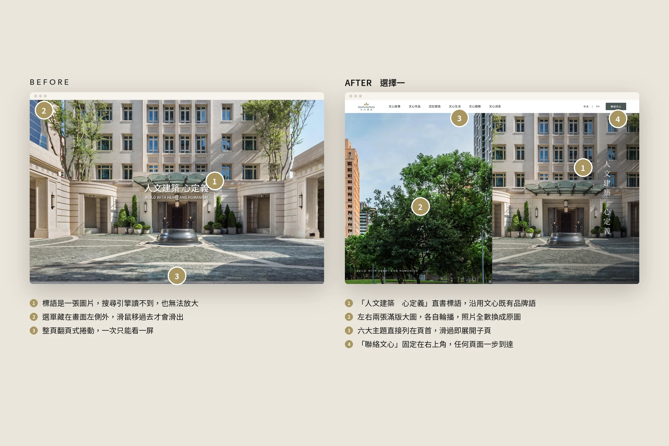
We took the original site apart before redrawing anything. It had a strong foundation: the line "Build with heart and humanism", a distinctive gold-leaf logo, and a wealth of professional architectural photography. The problem was not the material but how it was presented:
- Full-screen paged scrolling: one screen at a time, with projects and news cut into separate frames.
- The menu hidden off the left edge: it only slides out on hover, so first-time visitors cannot see what the site holds.
- The slogan was an image: search engines cannot read it, and it blurs when enlarged.
- Mobile fixed at a 1024px width: no mobile layout, just the desktop site shrunk down.
- Background photos saved at around 15% opacity: beautiful photography reduced to a faint texture.
So the redesign keeps the slogan, the logo and the photography, and changes how the photos are seen and how people move through the site.
The challenge
A developer's website serves two kinds of visitor: home buyers who want to know how good the buildings are, and partners and press who want to know who the company is. Both need plenty of photography, without the photos drowning the information.
At the same time, none of the 232 bilingual URLs could break, every project's specifications, concept and gallery had to come across in full, and since the smallest project thumbnails on the original site were only 375px wide, the sharpest originals had to be recovered from the site's uploaded files.
Before and after
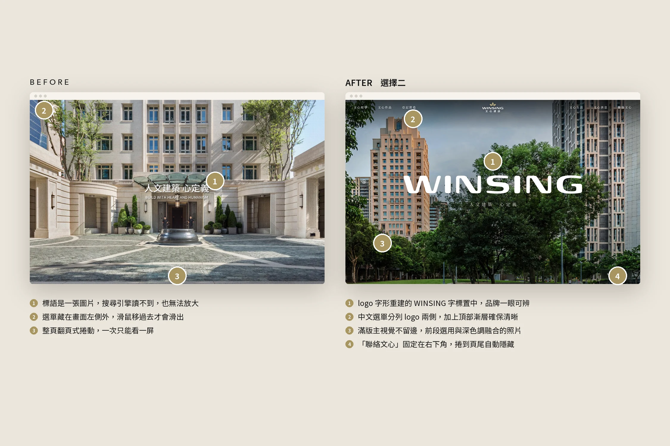
| Before | After |
|---|---|
| Full-screen paged scrolling, one screen at a time | Normal scrolling, projects arranged in chapters, with a fixed chapter index in Option 1 |
| Menu hidden off the left edge | Six main sections listed in the header; tablet and mobile use a menu button |
| The slogan was an image | The slogan is real text, set vertically in Option 1 |
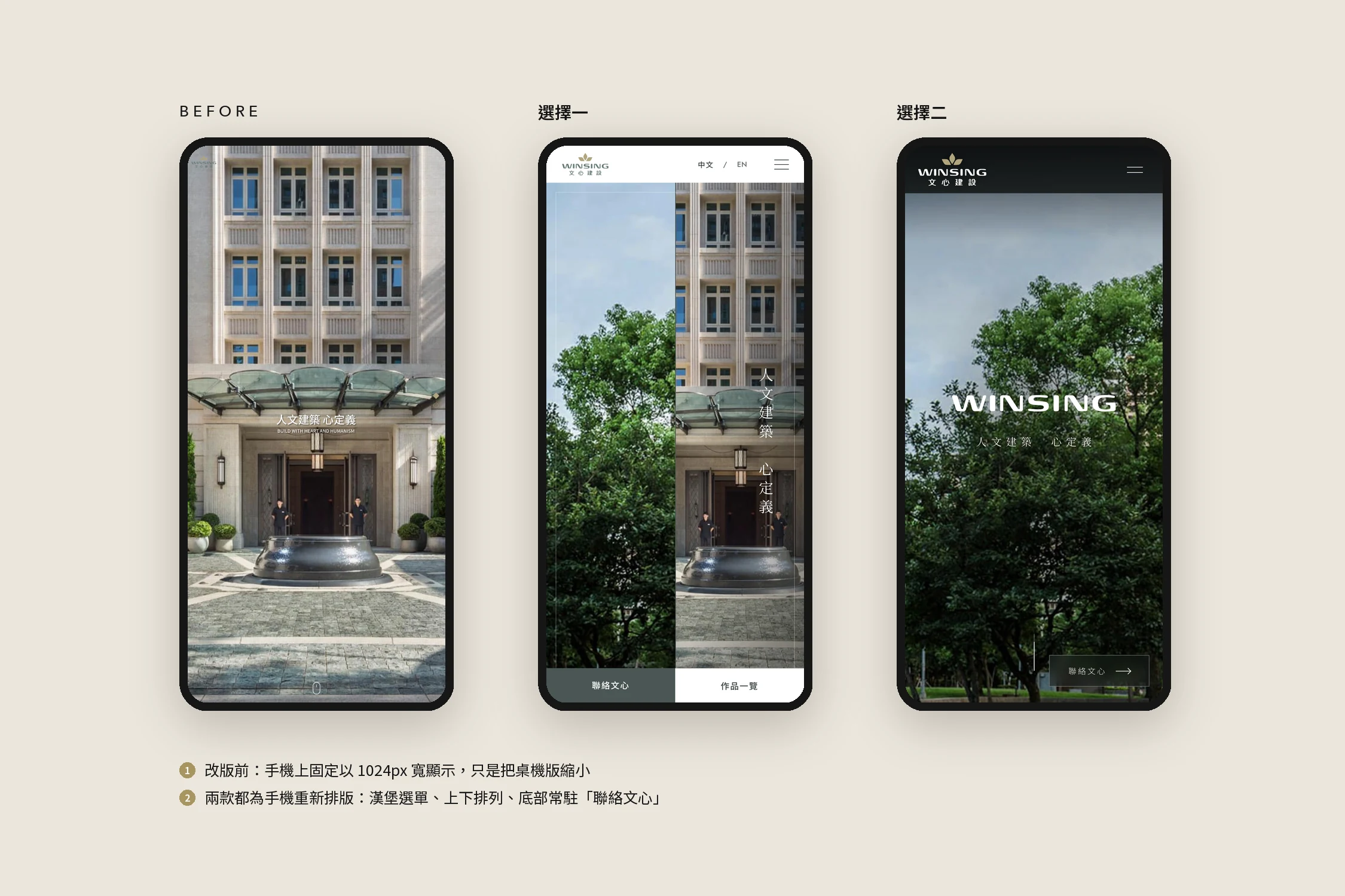
| Mobile fixed at a 1024px width | Both options have a dedicated mobile layout, with a persistent "Contact" button |
| Background photos at around 15% opacity | All replaced with the originals; hero images use photos 1200px wide or more |
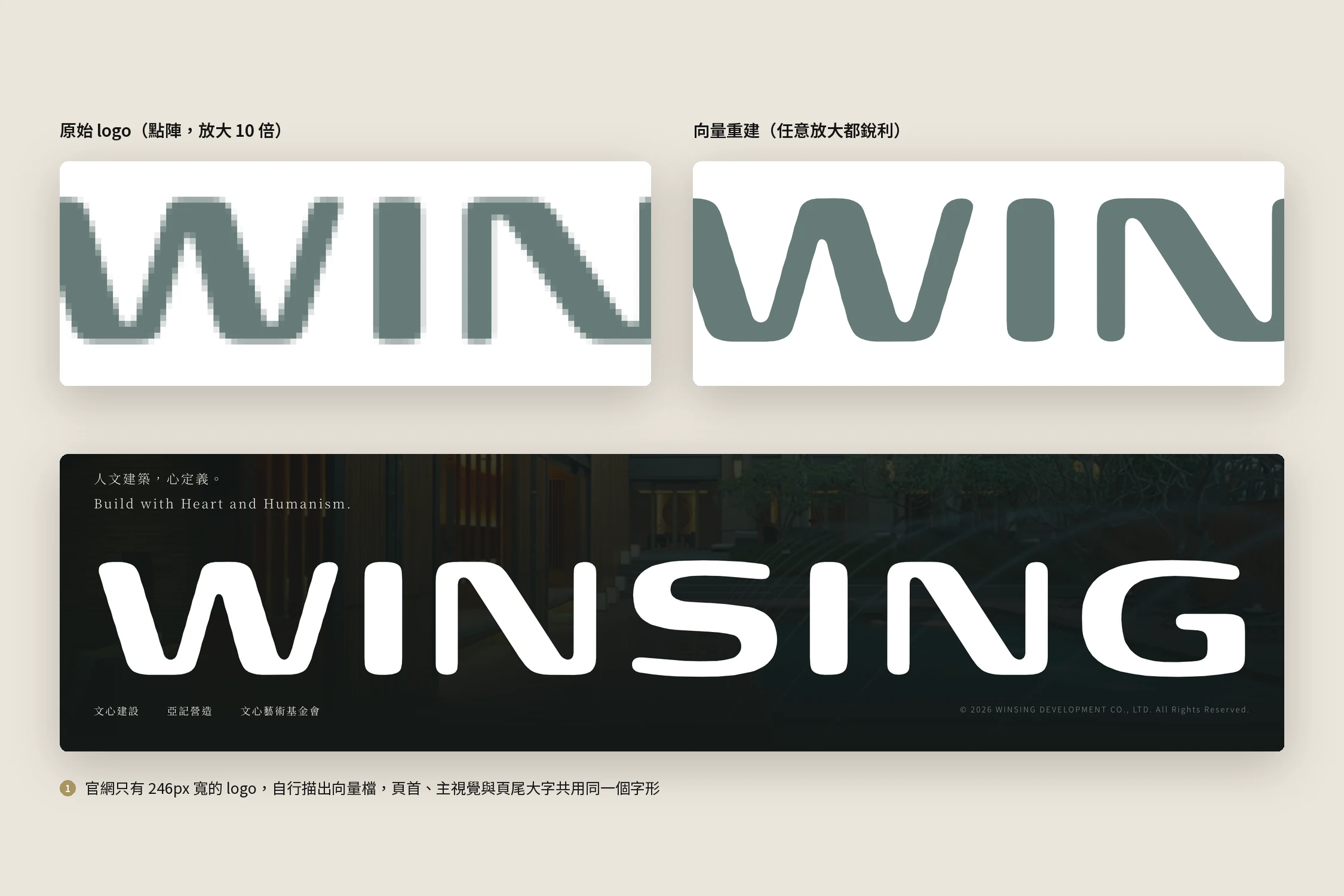
| The logo was a 246px-wide bitmap | Traced as a vector; the header, hero and footer wordmark share the same letterforms |
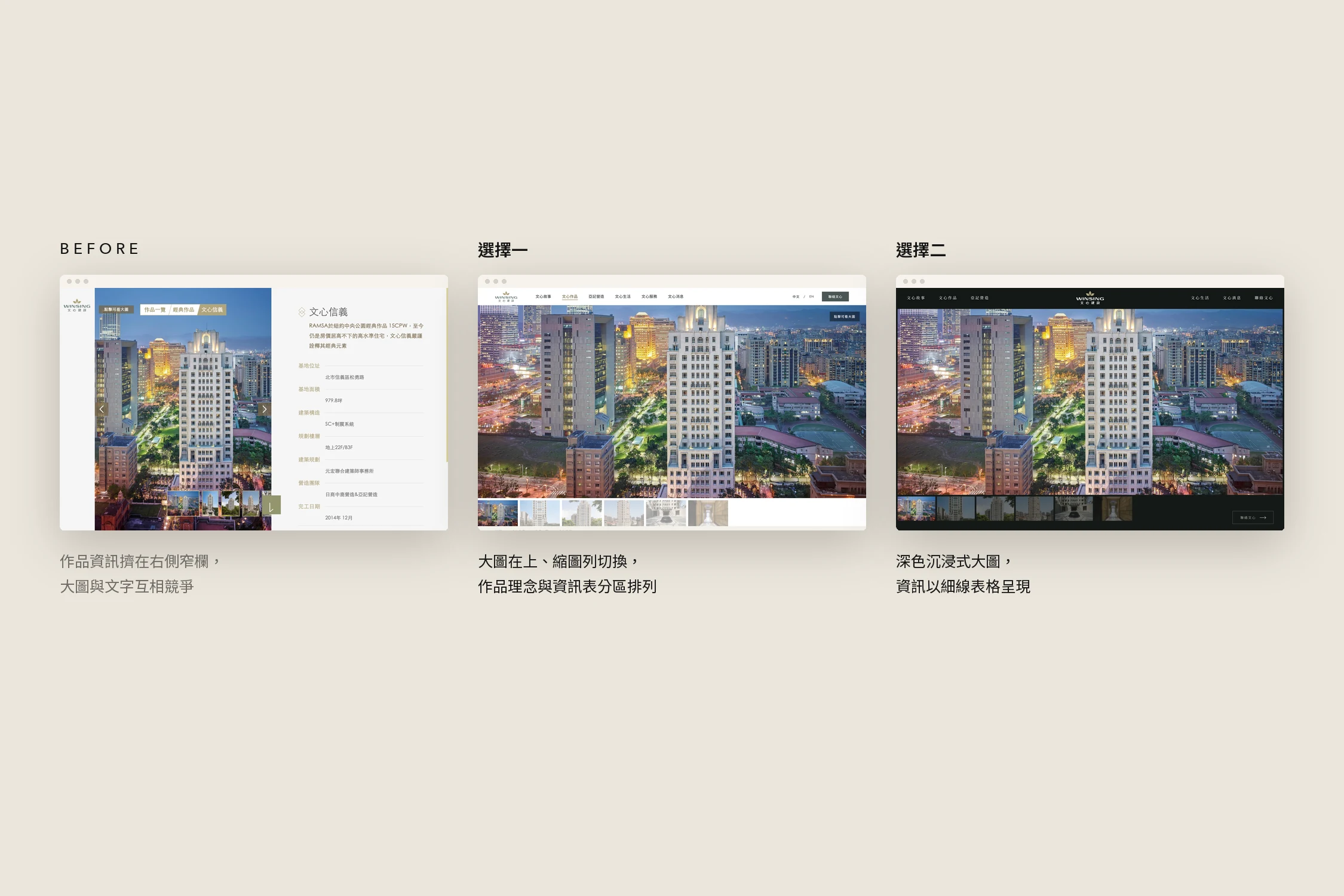
| Project details squeezed into a narrow right column | Large image on top with a thumbnail strip, concept and specifications in separate sections |
What we did
Two directions, two characters
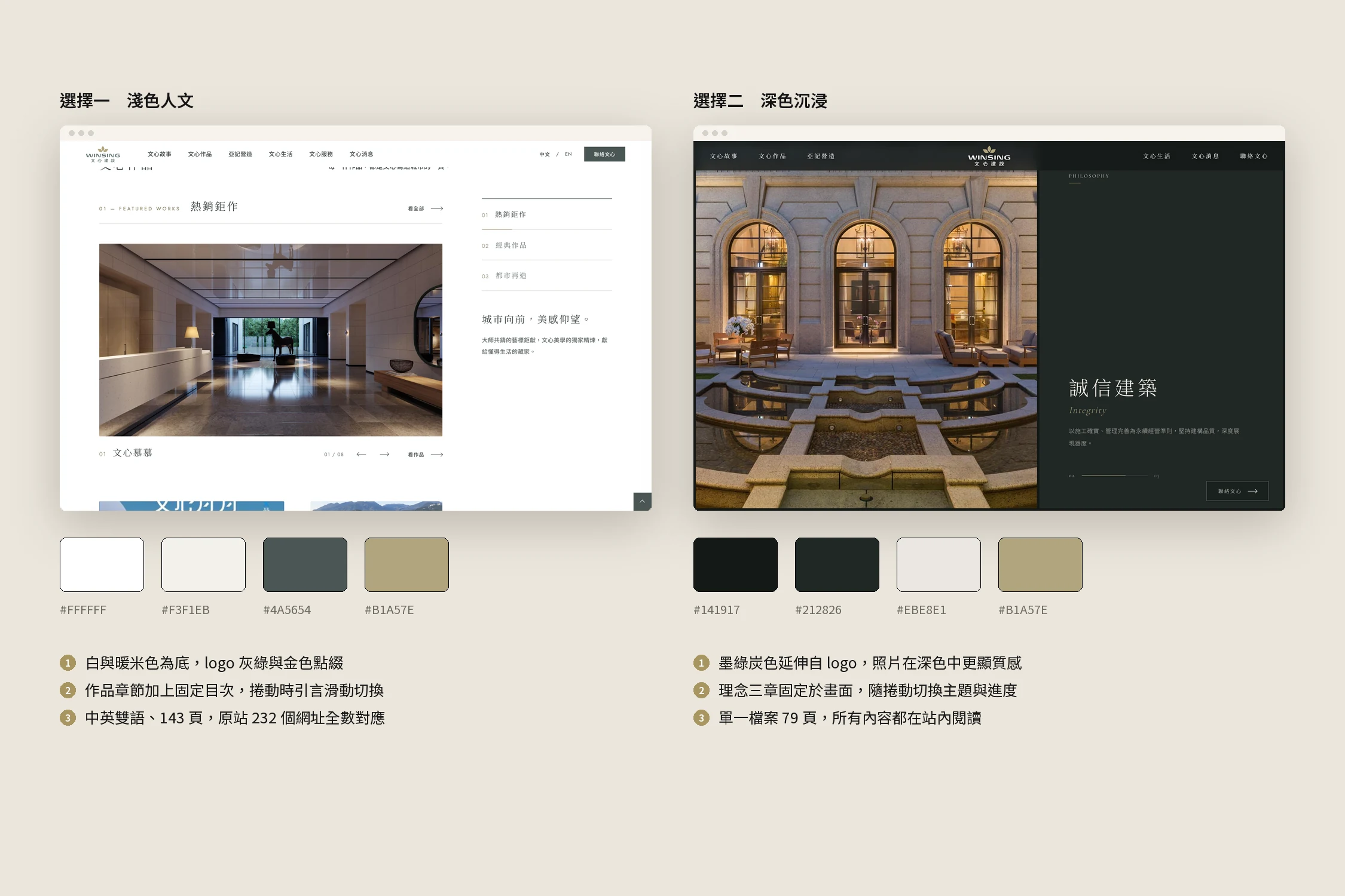
Option 1 sits on white and warm beige, extending the logo's grey-green and gold, as a complete 143-page bilingual website. Option 2 sits on a deep charcoal green, where the photography gains depth, and brings 79 pages into a single site where everything is read in place. Both share the same content and photos, so Win Sing can choose by the feeling it wants the brand to give.
The buildings come first
Every project page now leads with a large image and a thumbnail strip, and one click opens the gallery full screen. Below come the project concept and its specifications, separated by fine rules. The project list and featured cards used to show the site's small thumbnails; they now pick the highest-resolution photo of the same project automatically.
Telling the story as you scroll
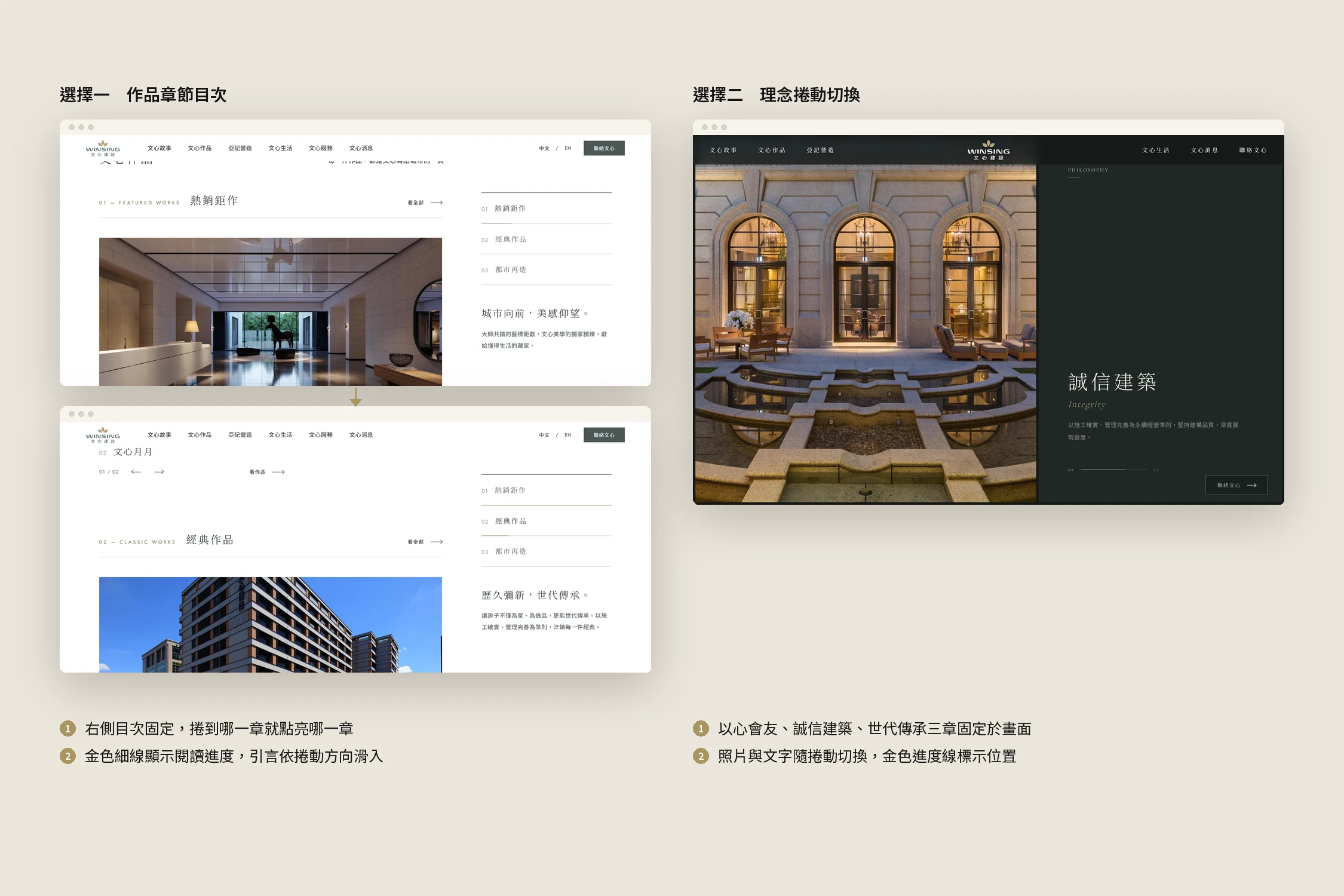
On Option 1's homepage, a chapter index stays fixed on the right: the chapter you are reading lights up, a thin gold line shows your progress, and the quote slides in with the direction of the scroll. Option 2 holds the three values, friendship, integrity and legacy, on screen while the photos and text change as you scroll.
Clear on mobile too
Both options were laid out again for mobile: a menu button, stacked sections, project photos cropped for the phone, and a persistent "Contact" button that hides when you reach the footer.
Bringing the logo back
The website only had a 246px-wide logo that blurred when enlarged. We traced its outline into a vector, and the header, the centre of the hero and the large footer wordmark all use the same letterforms, sharp at any size.
Not a single URL lost
All 232 bilingual URLs of the original site map to new pages: 26 projects, 3 urban renewal projects, 38 Chinese news posts, 3 Win Sing Life venues, plus the privacy and contact pages. Every build checks all internal links and images automatically, so no page is left broken.
Results
- Two design directions sharing one set of content and photos: Option 1 light and humanist, Option 2 dark and immersive
- Project pages rebuilt around large images, galleries and separate specifications, with every photo replaced by its original
- The homepage tells the story through a chapter index and scroll transitions, no longer one screen at a time
- All 232 bilingual URLs carried over, with a dedicated mobile layout
- The logo rebuilt as a vector, shared by the hero, header and footer