Work
Taiwan SPCA|An animal-welfare website where every way to help is one step away
Work C13:Taiwan SPCA(concept proposal)

Industry
Non-profit, animal welfareServices
Website redesign and build, preloader, Chinese and English, content migration, CMSType
Concept proposalBuilt with
Fully custom
Background
Taiwan SPCA was founded in 2009. Every year it handles more than a thousand cases of animal abuse and neglect, and runs welfare education, volunteer training and rehoming. Over the years its website grew to more than 3,600 articles and 50 pages, but the home page was a slideshow of event posters, and the things that matter most, donating, volunteering and reporting abuse, were buried in menus and long text.
This is a concept proposal by 留白設計 BLANK DESIGN: if an animal-welfare website started again from scratch, what should it look like?
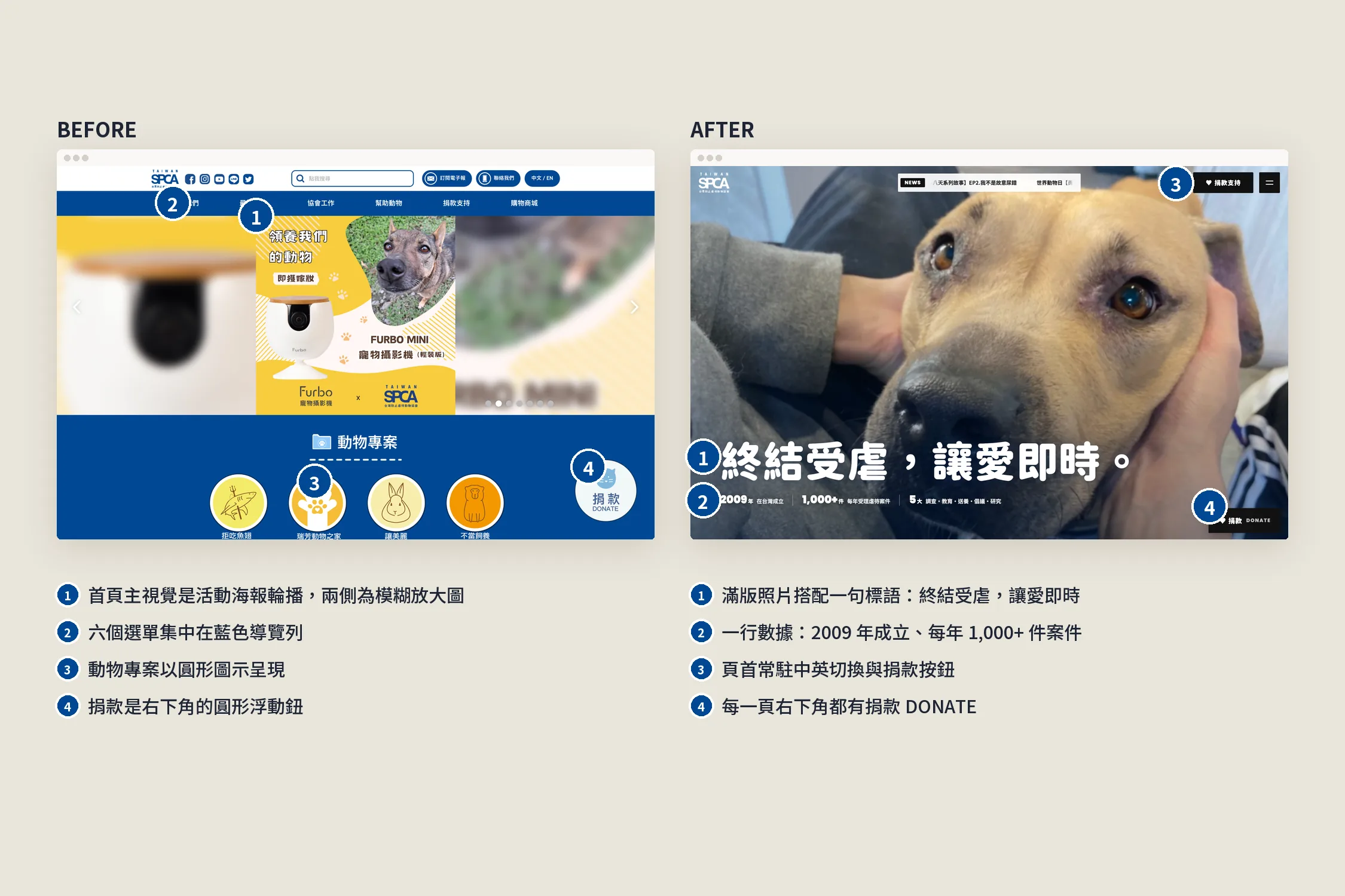
Before and after
- Home: a slideshow of event posters → a full-bleed photo with one line, "It's Time for Change.", and the society's numbers below it
- Donating: a round floating button → Donate in the header and in the corner of every page, and a page of its own for the 1772 donation code
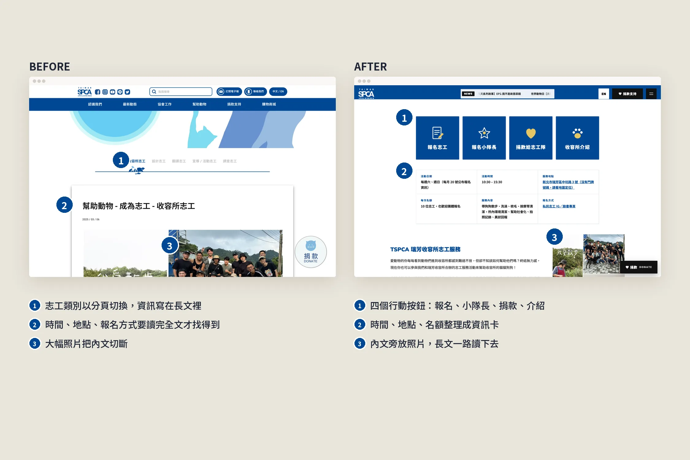
- Volunteering: details buried in long text → time, place and places left on an info card, with the sign-up buttons at the top
- Reporting: a link to another website → six kinds of report filed on the site itself
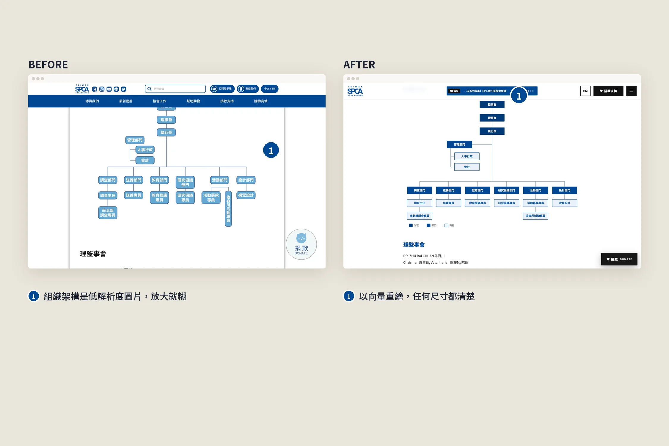
- Charts: low-resolution images → the org chart, Five Domains and funding redrawn as vectors, with portrait versions for phones
- Languages: two separate websites → one site with an EN/中 switch
- Updates: call a developer → a CMS the society runs itself, including SEO and Google Analytics
What we did
Preloader and English
The logo appears in the centre, and white cat and dog paw prints walk in from both sides as the page loads; then the page opens from the centre in a circle. EN/中 in the header switches language and replays the preloader. The English content comes from the society's existing English pages.
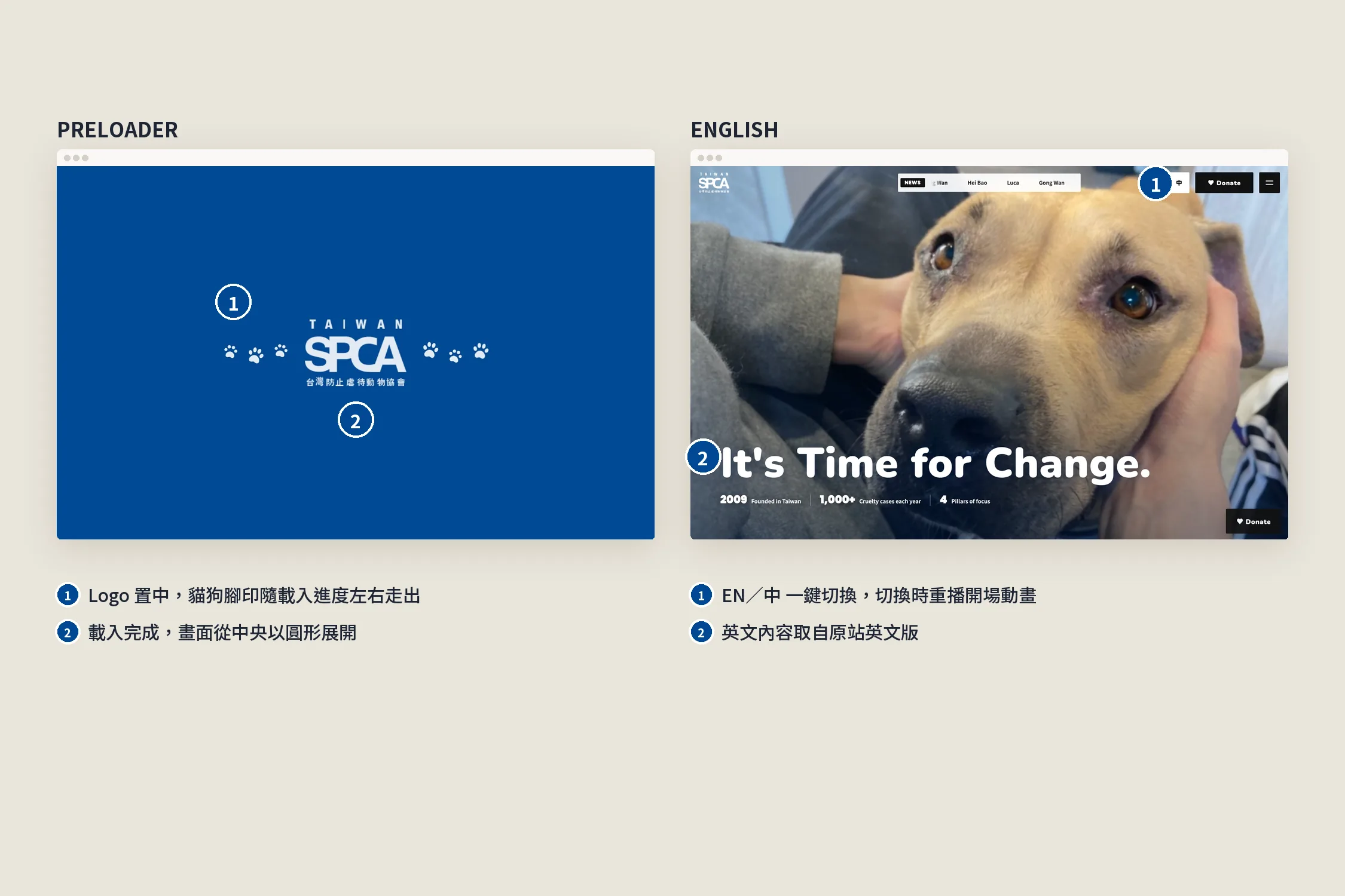
For people who want to help
The five volunteer pages, shelter, investigation, promotion, design and translation, now share one layout: sign-up, team-leader and donate buttons at the top, time, place and places left on an info card, and photos beside the text so the long read flows.
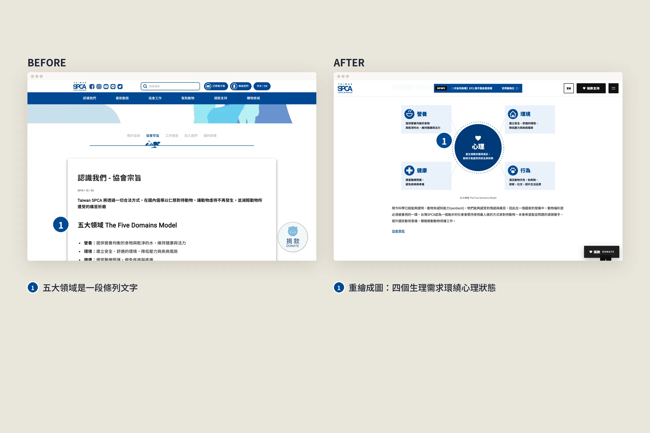
Text into pictures: the Five Domains
The Five Domains of animal welfare used to be a bulleted paragraph. We drew it: nutrition, environment, health and behaviour around the mental state in the middle, so the relationship is clear at a glance.
Sharp at any size
The org chart was a low-resolution image that blurred when zoomed. We redrew it and the funding chart as vectors, sharp at any size, with portrait versions on phones so there is no sideways scrolling.
Mobile first
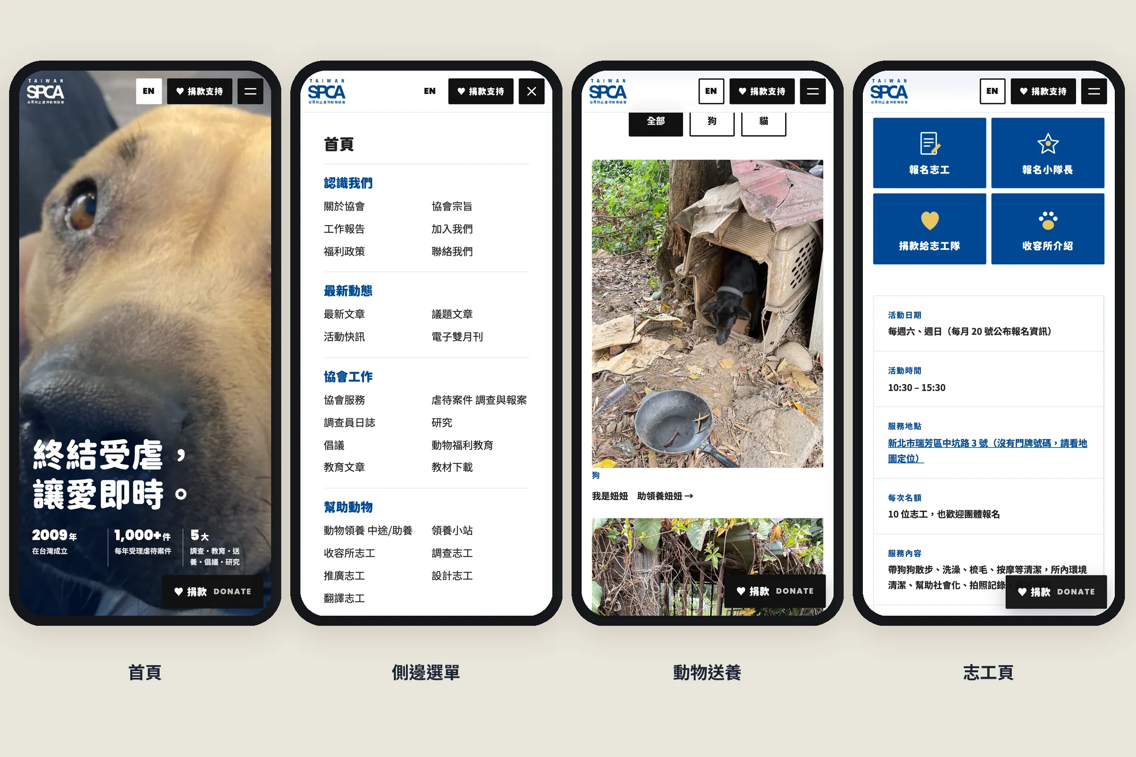
The home page, side menu, rehoming and volunteer pages were designed for the phone first: a full-height home page, a menu that slides in from the side, and Donate always within reach.
Every page carried over
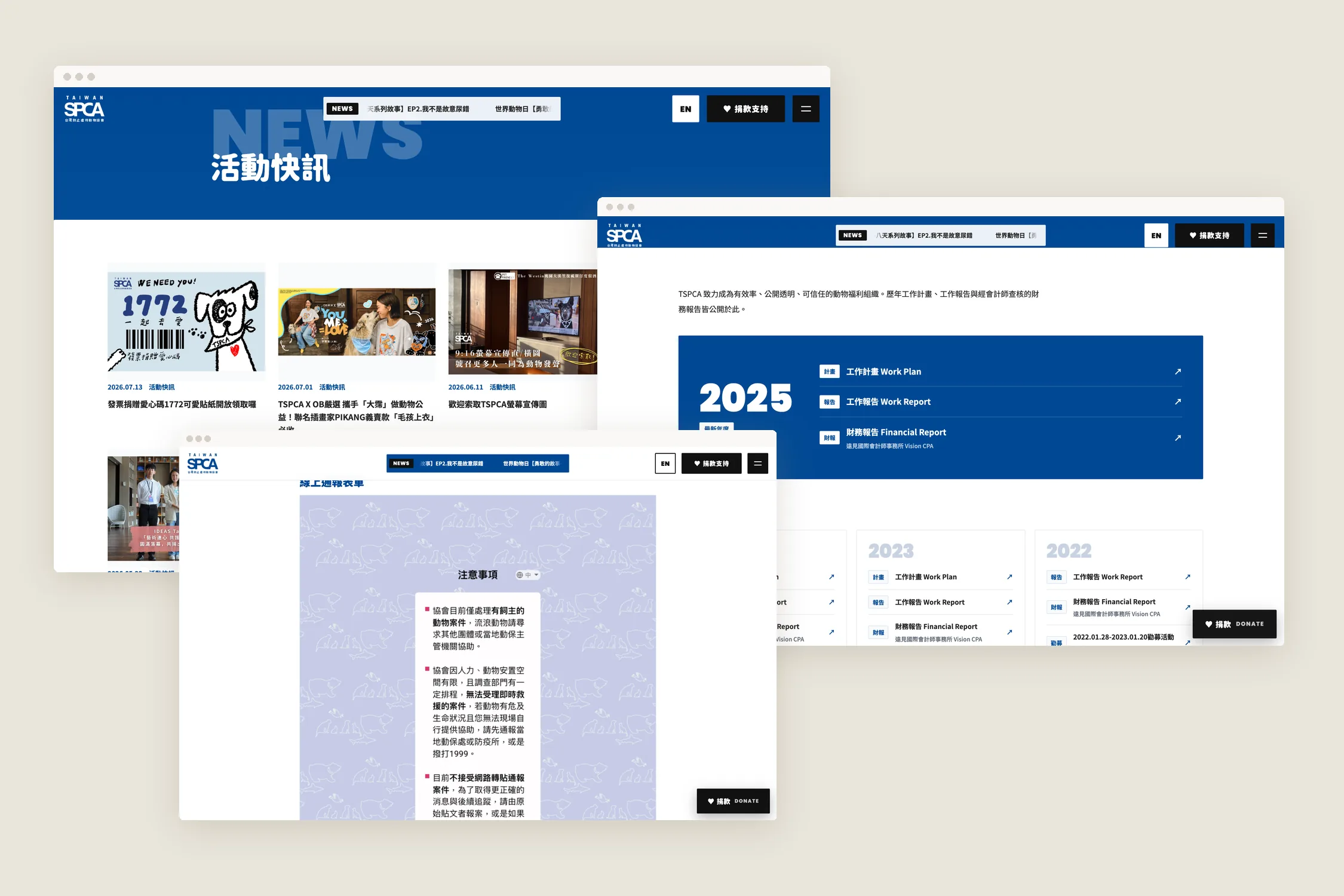
All 3,600+ articles, 50+ pages and the animals waiting for homes were carried over. Dead links and images were cleaned up, PDFs open in a new tab, and reports became on-site forms. The society can now post articles, list animals and edit SEO and Google Analytics in the CMS; save, and the site updates.
Results
- One line and one row of numbers on the home page say what the society does at first glance
- Donating, volunteering and reporting can be found on every page
- 3,600+ articles and 50+ pages carried over; nothing from the old site was lost
- One-click Chinese and English, and a CMS the society runs itself
Advice for non-profits
A non-profit's website is the front door for donors, volunteers and people asking for help. When you redesign:
- Put the actions first. Donate, sign up and report shouldn't wait at the end of a long article.
- Turn text into pictures. Mission, structure and funding are easier to understand and share as a drawing than as a paragraph.
- Old content is an asset. Years of articles are the basis of trust; carry all of them over.