Work
EkoCheras Mall|A 3D mall website: all of Cheras on the home page
Work C01:EkoCheras Mall(concept proposal)

Industry
Shopping mall, retailServices
3D website, redesign and build, three languages, CMSType
Concept proposalBuilt with
Fully custom (Three.js)
Background
EkoCheras Mall sits in Cheras, Kuala Lumpur, with a 180 m covered bridge to MRT Taman Mutiara, 285 stores and restaurants over four floors and more than 4,000 parking bays. Its website had stood still since 2018: stock photos up top, a floor map you had to search by eye, a paragraph for directions, and English only.
This is Blank Design's concept proposal: what if a mall's website were not a stack of pages, but a map?
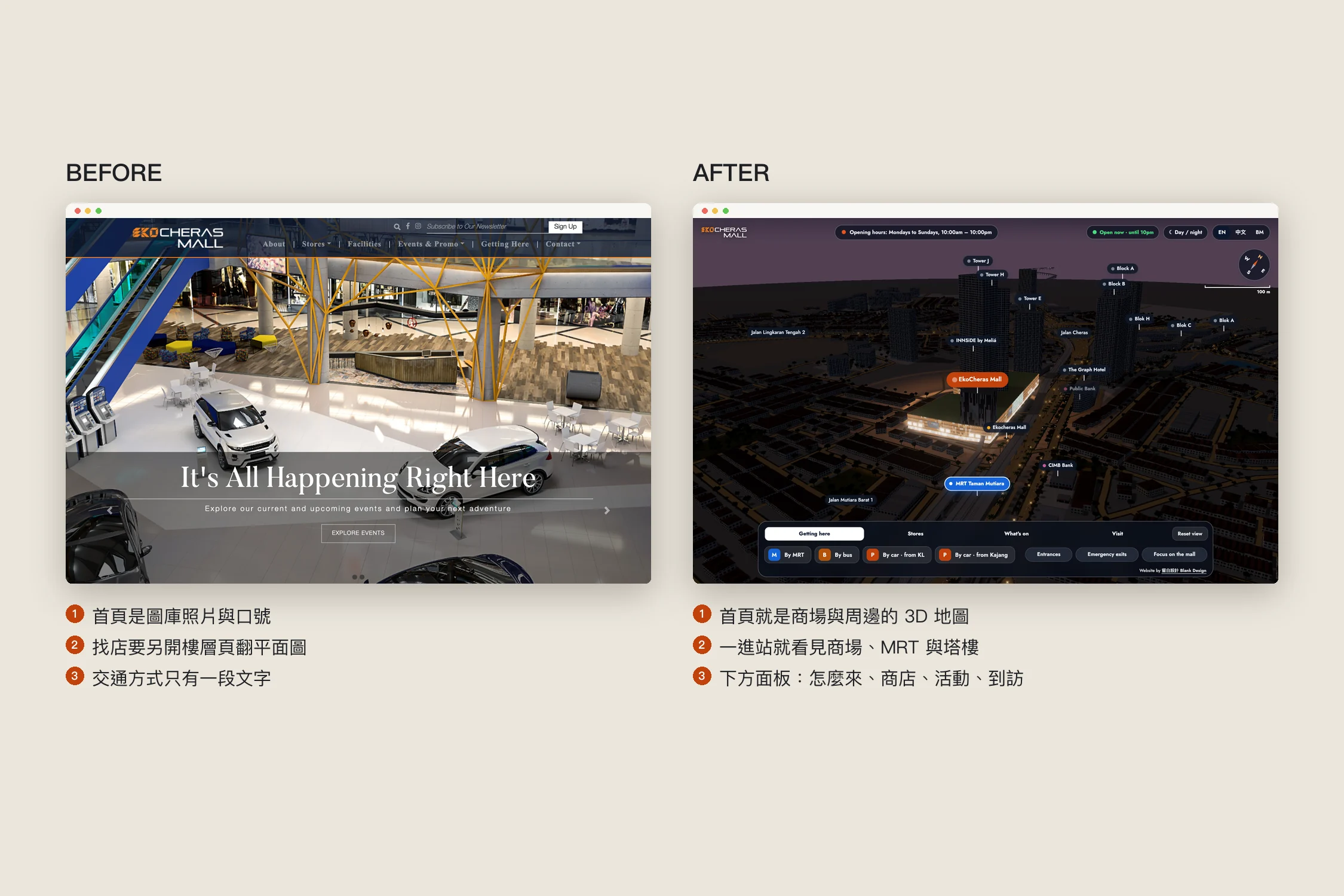
Start from what visitors ask: where is it, how do I get there
Visitors come to check whether a store is there and on which floor, and how to arrive by MRT, bus or car, mostly on their phones. The mall cares about its MRT bridge, its parking, its green building, and its tenants.
So the 3D map is not a feature of the website; it is the website. It opens on the mall and the streets around it, and everything is found on that map.
The solution
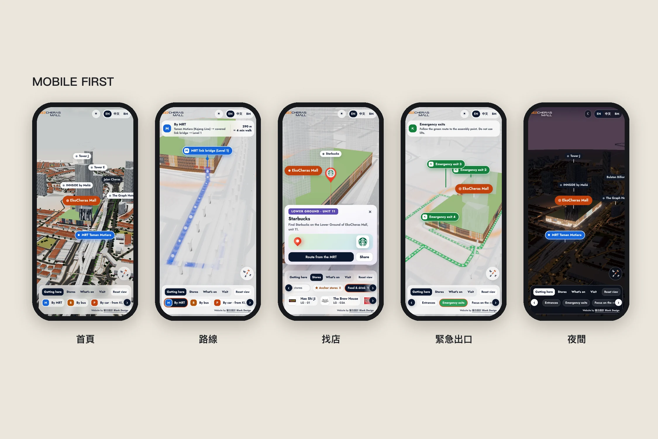
Getting here
By MRT, by bus, or by car from KL or Kajang: one tap draws the route along the real road network to the right entrance, a banner gives the distance and time, and the rest of the city turns see-through.
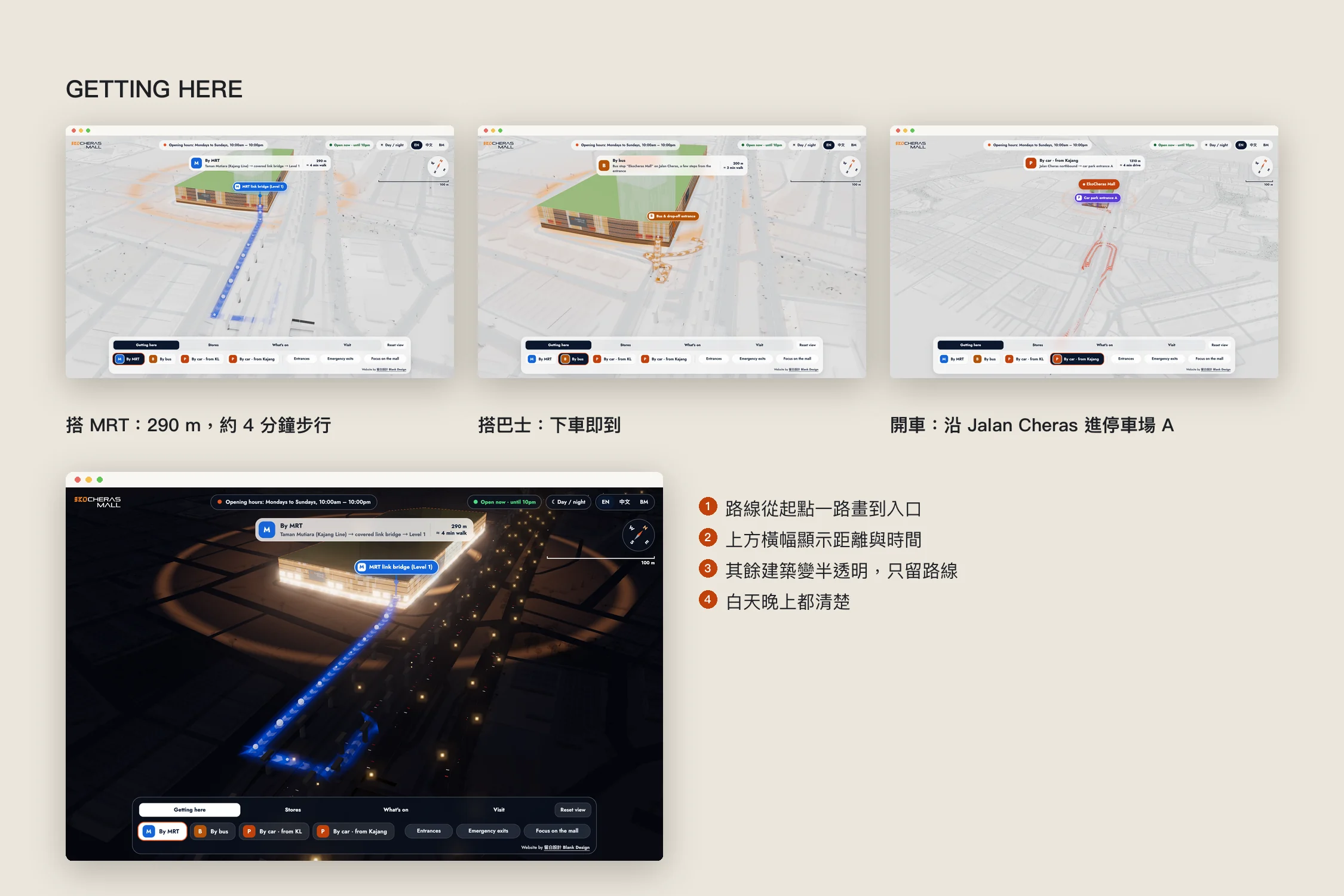
Entrances and emergency exits
All 8 entrances (MRT bridge, main entrance, bus stop, car parks) show at once, each with its own colour and icon, and stack instead of hiding each other. Emergency exits and evacuation routes to the assembly point are one tap away.
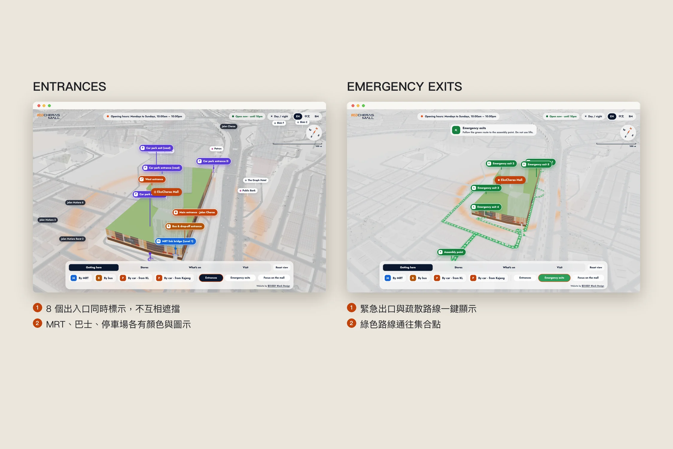
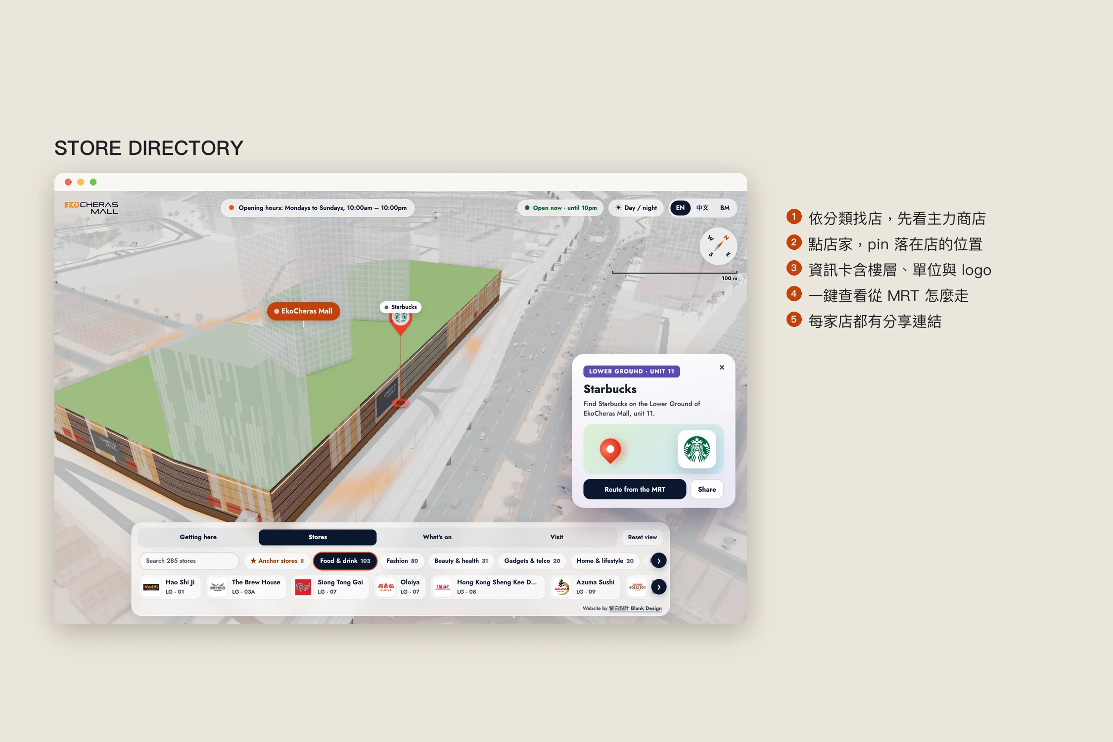
Store directory
285 stores by category, anchor stores first, or by name. Pick one and a pin drops on its spot, with a card for floor, unit and logo, a route from the MRT, and a link tenants can share.
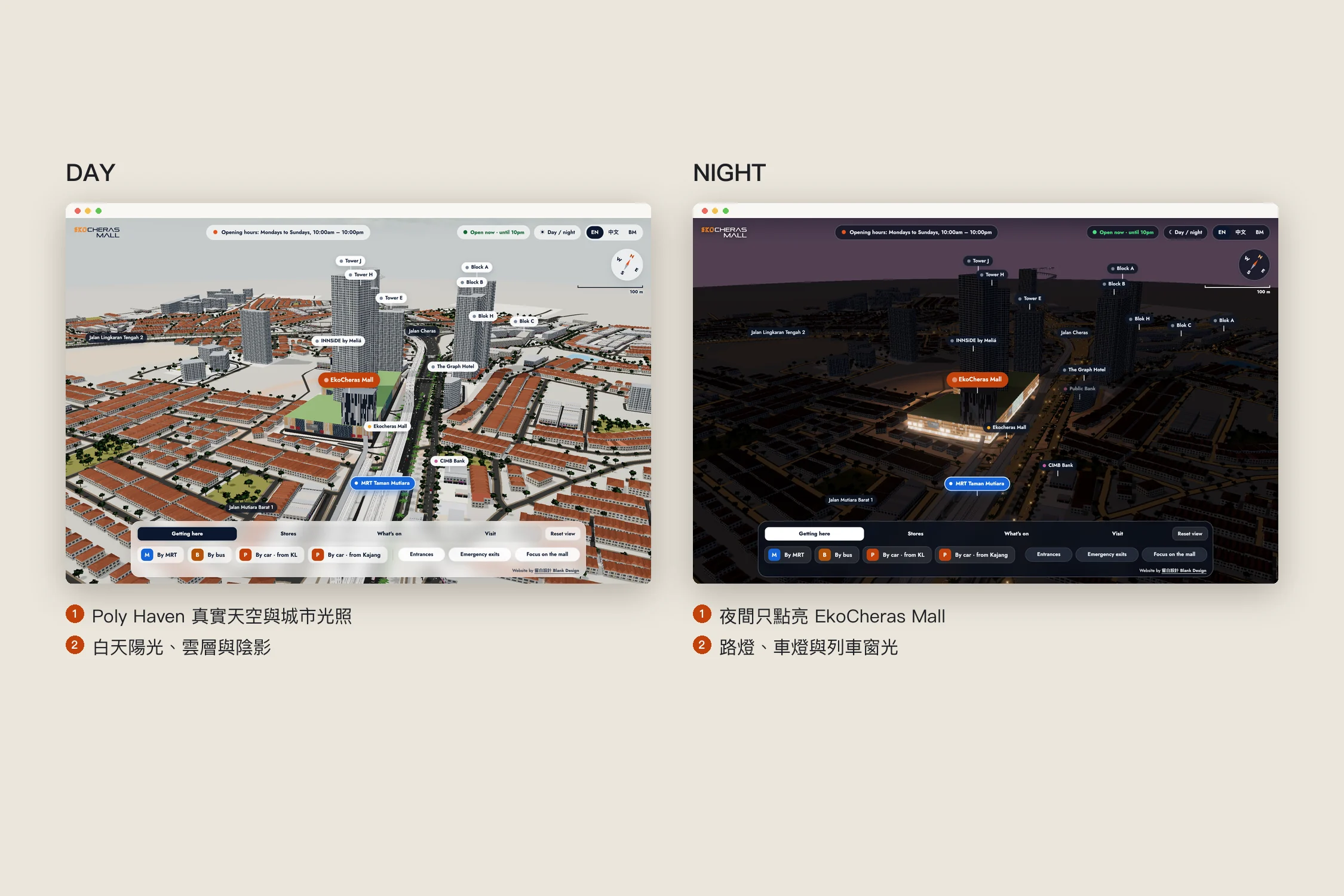
Day and night
One button switches between sunny day and night. At night only EkoCheras Mall lights up; street lamps, car lights and train windows do the rest.
Mobile first
Everything sits in one row of panels at the bottom that you swipe or drag, so the map keeps the screen. The phone version renders less, to stay smooth.
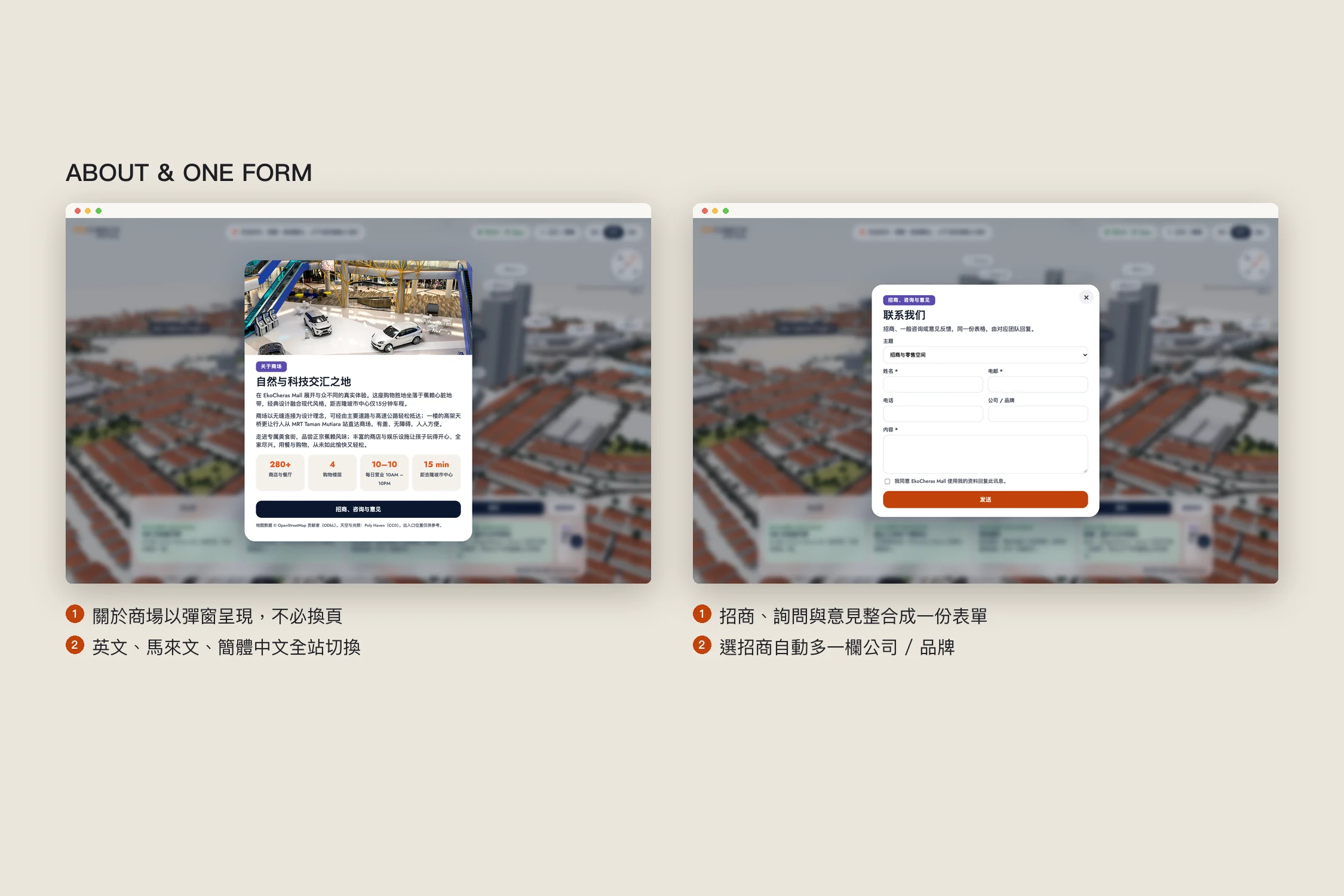
One map for the whole site
What's on, opening hours, directions and facilities live in the panels; About opens as a popup, and leasing, enquiries and feedback share one form. English, Malay and Simplified Chinese switch everywhere, labels and store cards included, and the mall updates stores, events and entrances itself in the CMS.
Results
- The home page is a 3D map of the mall, the MRT and the streets around it
- Animated routes by MRT, bus and car, with distance and time
- 8 entrances and the emergency exits marked clearly; 285 stores found by category and pinned
- Day and night, three languages and a CMS that keeps up with the mall
For malls and retail brands
A mall's website is really a moving guide map. When you redesign, consider:
- Answer "how do I get there" first: a map beats a paragraph.
- Make every store findable: categories, search and a pin should all lead to the shop door.
- 3D should serve the visit: it earns its place by getting people to the store faster.